resource preview
resource preview
resource preview
resource preview
resource preview
resource preview
resource preview
resource preview
resource preview
resource preview
resource preview
resource preview
resource preview
resource preview
resource preview
resource preview
resource preview
resource preview
resource preview
resource preview
resource preview
resource preview
resource preview
resource preview
resource preview
resource preview
resource preview
chevron_right
chevron_left
download Download this presentation

Download and customize 500+ business templates and translate PowerPoints

Go to dashboard to download stunning resources

Download

Preview

View all chevron_right

Synopsis

In his book "PowerPoint Surgery," Lee Jackson writes: "Your slides should be a billboard, not a document." To say more with less, use our Big & Clear Slides. All 50 slides in the deck are supported by large, easy to read fonts and plenty of space for visual aids, so you can be confident that your audience is comfortable and takes in the information without even noticing.

stars icon
Questions and answers
info icon

To make your slides more effective, you can use large, easy-to-read fonts and plenty of space for visual aids. This ensures that your audience is comfortable and can take in the information without even noticing. Additionally, you can use a minimalistic design approach, focusing on key points and avoiding clutter. Using relevant images and graphics can also enhance understanding and engagement. Remember, your slides should support your presentation, not be the presentation itself.

To make your slides more memorable, you can use large, easy-to-read fonts and plenty of space for visual aids. This will ensure that your audience is comfortable and can take in the information without even noticing. You can also use high-quality images and graphics to support your points, and keep your slides simple and uncluttered. Using a consistent color scheme and design throughout your presentation can also help to make it more memorable.

View all questions
stars icon Ask follow up
download Download this presentation

Download and customize 500+ business templates and translate PowerPoints

Go to dashboard to download stunning resources

Download

Slide highlights

Dale Ludwig and Greg Owen-Boger, the authors of The Orderly Conversation, say: "Well-designed visuals do more than provide information; they bring order to the conversation." Add a compelling visual to this slide for a strong start.

resource image

If you need to place a large chunk of text on your slide, use this one to ensure that it's easy to read and doesn't cause any discomfort to the reader. Make certain that there is a sharp contrast between the text and background colors.

resource image

Quotes are a great way to aid your arguments, claims and offers. A clever, funny or thought-provoking idea said by someone famous may greatly influence the audience to view a topic of your presentation in a whole new light.

resource image
stars icon
Questions and answers
info icon

The use of famous quotes in a presentation can significantly influence the audience's perception of the topic. Quotes from well-known individuals can lend credibility to your arguments and claims. They can also introduce new perspectives, provoke thought, or add humor, making the presentation more engaging and memorable. Therefore, they can change the audience's view by providing a different angle or reinforcing the presented ideas.

A well-designed slide deck plays a crucial role in the success of a presentation. It not only provides information but also brings order to the conversation. It can make the content easy to read and understand, prevent discomfort to the reader, and help to present arguments, claims, and offers in a compelling way. A clever, funny, or thought-provoking quote can also greatly influence the audience's perception of the topic.

View all questions
stars icon Ask follow up

Application

The author of "How Music Works," David Byrne, said: "Powerpoint presentations are a kind of theater, a kind of augmented stand-up. Too often it's a boring and tedious genre, and audiences are subjected to the bad as well as the good." Big and clear slides make better decorations for your "performance" and allow your audience to focus more on the topic of your speech.

stars icon
Questions and answers
info icon

Some strategies for using PowerPoint slides to focus more on the topic of a speech include: keeping the slides simple and clear, avoiding too much text or complex graphics, using bullet points to highlight key points, and using visuals like images or graphs to support your points. It's also important to ensure that the slides complement your speech rather than distract from it. Remember, the slides are there to support your speech, not to replace it.

To make PowerPoint presentations more enjoyable for the audience, you can incorporate a variety of elements. Firstly, ensure your slides are clear and concise, avoiding too much text. Use visuals like images, graphs, and charts to convey your message. Incorporate multimedia elements like videos or audio clips to engage the audience. Use a consistent and professional design theme. Make sure to rehearse your presentation to ensure smooth delivery. Lastly, interact with your audience, ask questions, and encourage participation to keep them engaged.

View all questions
stars icon Ask follow up

Big and Clear slides are quite versatile and can be used when large amounts of data are not required. For instance, a real estate agent can employ Big and Clear slides when putting together a portfolio with property pictures and blueprints for a client or event. Or a workshop lecturer, who doesn't need text-heavy slides, can use Big and Clear deck to provide supportive visuals and illustrate examples for the lesson.

stars icon
Questions and answers
info icon

There are several ways to incorporate audience interaction into a Big and Clear slide presentation. One way is to include interactive elements such as polls or quizzes in the presentation. This not only engages the audience but also provides instant feedback. Another way is to use the slides as a visual aid for a group discussion or activity. For instance, a slide could present a problem or scenario, and the audience could be asked to discuss or solve it. Additionally, the presenter could ask the audience questions related to the content of the slides, encouraging them to think more deeply about the information being presented.

Big and Clear slides can enhance storytelling in a presentation by providing clear and impactful visuals that support the narrative. They can be used to display images, diagrams, or key points that reinforce the speaker's message. For example, a real estate agent could use them to showcase property pictures and blueprints, or a workshop lecturer could use them to illustrate examples for the lesson. They are particularly effective when large amounts of text are not required, allowing the audience to focus on the speaker's words and the visual aids.

View all questions
stars icon Ask follow up
resource image

Do's and Dont's

"We're living in a visual culture," says Paul Jurczynski, the cofounder of Improve Presentation. "Everything is visual. Instagram is on fire, and you don't often see bad images on there. The same trend has come to presentations."

As one of the experts working with TED speakers to perfect their slides, Jurczynski came up with simple dos and don'ts that will help to improve any presentation:

Do

Keep your slides simple and succinct

"The golden rule is to have one claim or idea per slide. If you have more to say, put it on the next slide," says Jurczynski. He also recommends placing the words and images in a way that begins where the audience's eyes naturally go and then follow their gaze. "You don't just control what the audience sees; you have to control how they see it," Jurczynski says.

stars icon
Questions and answers
info icon

The Big & Clear deck can improve the readability of your presentation slides by adhering to the golden rule of having one claim or idea per slide. This approach ensures that the audience is not overwhelmed with information on a single slide. Additionally, the placement of words and images is done in a way that aligns with the audience's natural gaze, allowing for a more intuitive and comfortable reading experience. This not only controls what the audience sees but also how they see it, enhancing overall readability.

Having one claim or idea per slide in a presentation is important for several reasons. Firstly, it helps to keep the audience focused and engaged. When there are multiple ideas on a slide, it can be overwhelming and confusing for the audience. Secondly, it allows the presenter to delve deeper into each idea, providing more detailed information and explanation. Lastly, it aids in the organization and flow of the presentation, making it easier for the audience to follow along and understand the progression of ideas.

View all questions
stars icon Ask follow up

Choose colors and fonts carefully

We can't say this enough, neither can't the experts. "The good news is you don't need a degree in color theory to build a palette," Jurczynski says. To assemble color themes, you can use Coolors or Color Hunt sites (or the good old Adobe Color Wheel palette generator).

When it comes to fonts, "you don't have to stick to the fonts that you have in PowerPoint. People are now designing and sharing fonts that are easy to install in different programs. Use a big enough font, which people often forget to do. Your text has to be both legible and large enough to read from the back of the room, […] about 30 points or so," he recommends.

stars icon
Questions and answers
info icon

Using a large font size in presentations is important for several reasons. Firstly, it ensures that your text is legible and can be read from the back of the room. This is crucial in maintaining the attention and understanding of your audience. Secondly, large fonts can help emphasize key points and make your content more impactful. Lastly, it can improve the overall aesthetic and professional look of your slides.

Different fonts can enhance the readability of a presentation by adding visual interest and helping to differentiate between different types of information. For instance, a bold, large font can be used for headings to draw attention and make it clear what each section of the presentation is about. A different, smaller font can be used for the main text to provide contrast. Additionally, some fonts are easier to read than others, especially at a distance, which is important for presentations. It's also crucial to use a font size that's large enough to be read from the back of the room, about 30 points or so.

View all questions
stars icon Ask follow up

Don't

Settle for visual cliches

When you brainstorm concept illustrations, think outside of the box and don't be boring. After you've come up with your symbol or idea, avoid turning to Google images, which has too many low-quality and clichéd choices, and make use of other free stock image sites such as Unsplash, which offer more unique choices, Jurczynski says.

stars icon
Questions and answers
info icon

The use of unique concept illustrations aligns with the goal of creating big and clear slides by enhancing the visual appeal and clarity of the presentation. Unique illustrations can convey complex ideas in a simple, easy-to-understand manner, making the slides more engaging and less text-heavy. They can also help to differentiate your presentation from others, making it more memorable for the audience.

Unique concept illustrations in business presentations can serve several practical applications. They can help to simplify complex ideas and make them more understandable for the audience. They can also make the presentation more engaging and memorable, as unique visuals are more likely to stick in people's minds than plain text. Furthermore, they can help to differentiate your presentation from others, making it stand out in a sea of standard, text-heavy slides. Lastly, they can serve as a visual aid to support your spoken content, reinforcing your points and making them more impactful.

View all questions
stars icon Ask follow up

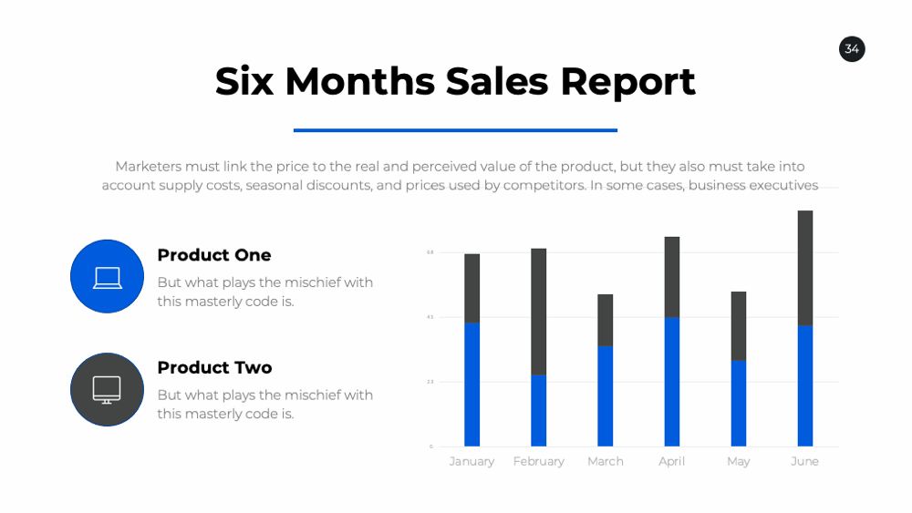
Get bogged down by charts and graphs

Jurczynski also believes that less is more when it comes to data visualization. To make your charts or graphs more appealing, highlight key data points with color, bolding, enlarging or any other effect, he says.

resource image
resource image
download Download this presentation

Download and customize 500+ business templates and translate PowerPoints

Go to dashboard to download stunning resources

Download