


Introduction
How to spark action and inspire decisions with data? Numbers and information alone rarely move the audience, but the way they are presented does. Our Infographic Collection shares various creative ways for data storytelling and turns information into momentum. Infographics focus attention, simplify complexity, and create intuitive ways to compare, sequence, and contextualize data. The Infographic Collection deck brings those capabilities together with designs across key types of infographics: statistical, procedural, comparative, and informational. Customize these slides to make your data work beyond simple reporting and transform raw content and metrics into patterns and insights that drive conviction.

Beyond their aesthetic advantage, infographics can shift the dynamics of business communication. They highlight the most pertinent evidence that can be used to make arguments and business cases more persuasive. At the same time, their simplicity enhances comprehension and information retention from the audience. And because infographics can be easily shared, they amplify the reach and influence of your key message across teams and stakeholders.
Statistical Infographics
In business environments where decisions hinge on clarity and speed, the ability to show scale, proportion, or trajectory through numbers is critical. Statistical infographics allow audiences to see both the magnitude of a challenge and the opportunity it represents, without wading through dense spreadsheets or fragmented datasets.


Consider the market overview chart that contrasts current and projected values across industries. Its structure emphasizes growth gaps and signals where capital or focus should be directed. A graphic like this not only communicates scale but also frames strategic context. By translating numbers into easily graspable visuals, the presenter eliminates ambiguity and creates space for discussion about implications rather than raw interpretation.


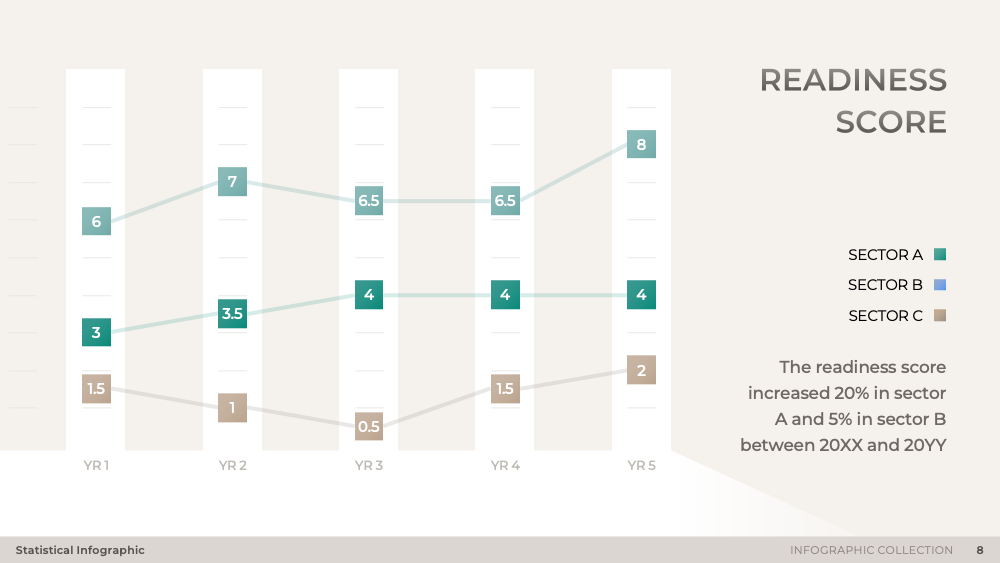
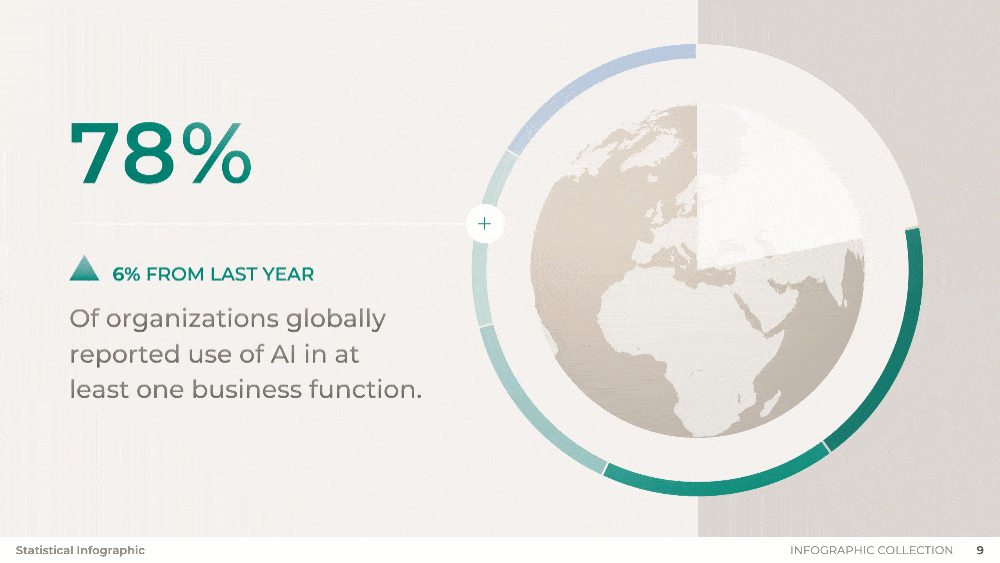
Numbers can be about more than just financials. For example, global adoption data illustrated in a radial chart does more than highlight a headline percentage. It shows progress relative to prior benchmarks, which is particularly powerful when making a case for acceleration or change. Similarly, progression visuals that compare today's state with future outlook create a narrative arc that moves an audience from current reality to projected impact.

Whether showcasing revenue growth, operational efficiency, sustainability metrics, or adoption trends, statistical infographics provide a flexible language for data-driven storytelling. By positioning numbers as both evidence and narrative, these infographics funnel conversations from reporting to insight, and from insight to decision.

Procedural Infographics
Unlike static data points, procedural infographics illustrate processes, milestones, and dependencies as they unfold. As time is often the hidden variable in business discussions, procedural infographics surface it in a clear line of sight from planning to execution.

Benchmark tracking, for instance, is not simply about showing whether targets are met. It demonstrates cadence, consistency, and the buildup of progress across time. The emphasis shifts from isolated achievements to the broader rhythm of performance. Similarly, sequencing events around a clock can bring attention to the compression of activities within a cycle, or simply agenda items that need to be checked off across the hours.

Tools like the calendar infographic can be used to strengthen operational visibility. For example, when capacity and workload are mapped directly against time, it becomes easier to spot imbalances and address them before they escalate into inefficiencies or burnout.

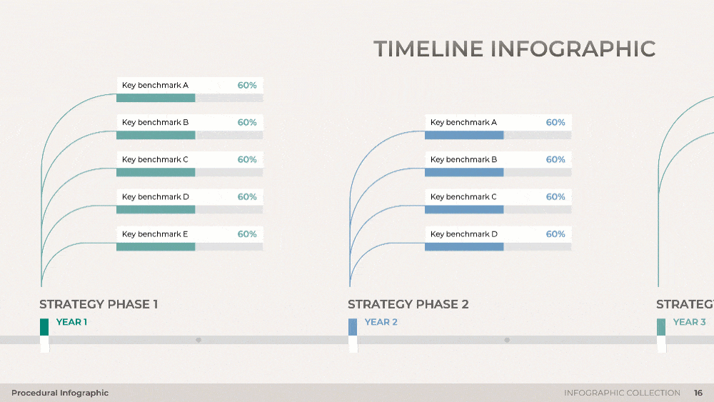
The tried-and-true timeline design can go a step further than its traditional structure by integrating progress bars and benchmarks at each time period or milestone. This links short-term deliverables with long-term ambition.
Ultimately, procedural infographics aren't just about literal scheduling, they create narratives that tie action to time and time to results. By showing process as a dynamic sequence rather than static checkpoints, these infographics make the progression of work tangible.
Comparative Infographics
Comparative infographics focus not only on absolute figures, but on how options, platforms, or outcomes measure against one another. In competitive environments, the ability to compare directly is often more persuasive than showcasing numbers in isolation. These visuals allow audiences to grasp trade-offs and relative performance in a matter of seconds, cutting through the risk of selective interpretation or data overload.

For example, a bubble chart that shows transaction growth across platforms exemplifies how comparisons reveal scale over time. Rather than presenting a raw figure, it communicates acceleration, relative dominance, and the point where one option clearly outpaces another. In this case, the conversation is reframed from whether growth exists to where momentum is concentrated, which has direct implications for resource allocation and strategic bets.
If one option demonstrates consistent advantages across dimensions, decision makers can prioritize it with greater confidence, while also understanding where alternative investments might still hold value.
Comparative infographics can be used to analyze competitors, assess regional performance, evaluate product features, or weigh policy outcomes. The visual form turns subjective preference into objective choice, which enables faster and more credible decisions at both team and enterprise levels.
Informational Infographics
Informational infographics bring structure to ideas and patterns that often resist simple quantification. While statistical and procedural infographics emphasize evidence and time, informational layouts turn abstract concepts into tangible frameworks that not only present knowledge but also intellectually organize it.

Take the influence matrix. Rather than describing stakeholder importance in words, it positions each group within a grid of vulnerability and power. The map makes visible which voices shape outcomes most decisively and which groups require careful monitoring.

The depiction of AI use cases, for example, ranked and projected across years, not only clarifies current applications but signals where adoption momentum is heading. For leadership teams debating investment focus, a chart like this moves the conversation from speculation to evidence-backed prioritization.


Classic node-based diagrams help illustrate complex processes and summarize frameworks in a way that feels intuitive. The segmentation and arrangement of key components provide an operational blueprint that is both comprehensive and easy to follow. To get the most out of the adaptability of node-based infographics, rearrange the graphic components to convey different formations. For example, when arranged in a triangular setup, the initial infographic becomes a layered pyramid or funnel diagram.

Conclusion
When used with intention, infographics are more than decorative tools that elevate the look of presentations. As they organize numbers, processes, comparisons, and ideas into accessible visuals, infographics accelerate decision-making and amplify the reach of critical messages.


