


Introduction
How can you contextualize or assign significance to volumes of seemingly disparate data points? The practice of Data Storytelling reimagines data as a cohesive narrative, so that even static numbers can take up a point of view and express persuasion. Our Data Storytelling presentation shares a unique variety of visualizations to amplify the central message behind numbers. Categorized by the storytelling angle of each design – whether it's to illustrate change over time, ranks and tiers, spread of variation, relationships and connections, or contributing elements – these creative slides supplement traditionally quantitative reasoning with qualitative input, decode statistical complexity, and provide your intended audience a more user-friendly way to absorb information.

Effective data storytelling uncovers the nuanced observations needed to sharpen business foresight. It decodes large pools of analytics to serve the strategic focus of teams and organizations. The accessible delivery of data also enables more democratic participation from team members to ultimately yield better-informed decisions.


Change Over Time
In a creative iteration of the proportional area chart, different data factors are clustered around a central point. Both current and future states are displayed in one connected frame to prompt anticipation and adaption. The interplay of elements in varied shades or sizes communicates that certain forces may escalate while others wane. As a result, viewers can quickly compare the relative momentum of these drivers and prioritize strategic responses. Because the design shows each factor in a way that accentuates its trajectory, it spurs teams to ask deeper questions about cause and effect.

The before-after comparison can show how certain metrics transform after new processes or systems. By arranging two time periods side by side, the layout provides a clear time-based contrast that goes beyond simple tabular data. This structure underscores the importance of tracking not just outcomes, but also how supporting details might evolve to support those outcomes. Such a display of progress – or lack thereof – can spark discussions about resource deployment, training needs, or even cultural shifts in the organization. As divergence between past and present stands out, teams are guided to question whether changes have been adequately institutionalized and what follow-up steps might be needed.

Multiple time points can also be positioned along a single arc to showcase broad trajectories without unnecessary minutiae. This design choice reinforces the concept of viewing change as a continuum rather than a series of disjointed snapshots. And the real insight emerges not from the specific data points but from the comparative perspective.

The slope chart is especially useful when multiple offerings or consideration areas need to be tracked simultaneously, each with its own growth or decline pattern. The chart forgoes the common fixation on precise numerical amounts, and instead emphasizes the relative movement of each stream across key checkpoints. Moreover, its transitional nature nudges stakeholders to consider the next pivot or opportunity.

The win-loss sparkline embodies the notion that performance is not static, and that fluctuations can occur due to seasonal patterns. This structure helps to identify emerging trends, and whether those are consistent growth, intermittent spikes, or sudden drops. By organizing the timeline in a matrix-like form, one can immediately see how different categories compare at any given moment, which makes it easier to spot potential correlations or anomalies.

Ranking and Tiers
A storytelling angle founded on comparative standing showcases how tier-based data organization can reveal patterns and priorities that might otherwise remain hidden. The sequence chart, for example, heavily relies on the overall hierarchy that emerges once data is grouped. By highlighting clear gaps between top and lower tiers, the visualization pushes stakeholders to question why certain products or platforms thrive.

A radial design can layer multiple metrics in a single, centralized view. This allows teams to spot correlations or discrepancies with minimal effort. A solution that appears high on one axis might still require closer examination if it falls short on another. Rather than focusing on a single data point, the layout steers attention toward how each option sits relative to others in terms of both usage and overall return.

In a more customer-centric context, the Likert Scale ranks various touchpoints or satisfaction elements to pinpoint areas of strength and vulnerability. Rather than presenting raw satisfaction scores in isolation, the display layers them in a comparative fashion to illustrate how each facet stacks up against the others. This approach encourages decision-makers to prioritize improvements that will have the greatest impact on overall customer perception. Additionally, the tiered structure facilitates conversation around how different segments of the customer base might value these touchpoints differently.

Spread of Variation
Sometimes, the narrative convergence of data is actually based on just how unevenly spread, divergent, and varied the data points are. For example, the modified proportional area chart shows what's robust and what's lagging. These glaring discrepancies also encourage a shift away from one-size-fits-all solutions.

When it comes to data variation, a common use case involves location-based gaps. Similarly to the previous visualization, the explicit spread of variation here calls attention to the fact that not all markets are equally receptive to the same strategies. At a deeper level, variations in market regions encourage decision-makers to consider cultural, economic, or competitive factors. It could even spark further investigation into local consumer behaviors or regulatory environments that either facilitate or hinder growth.

Relationships and Connections
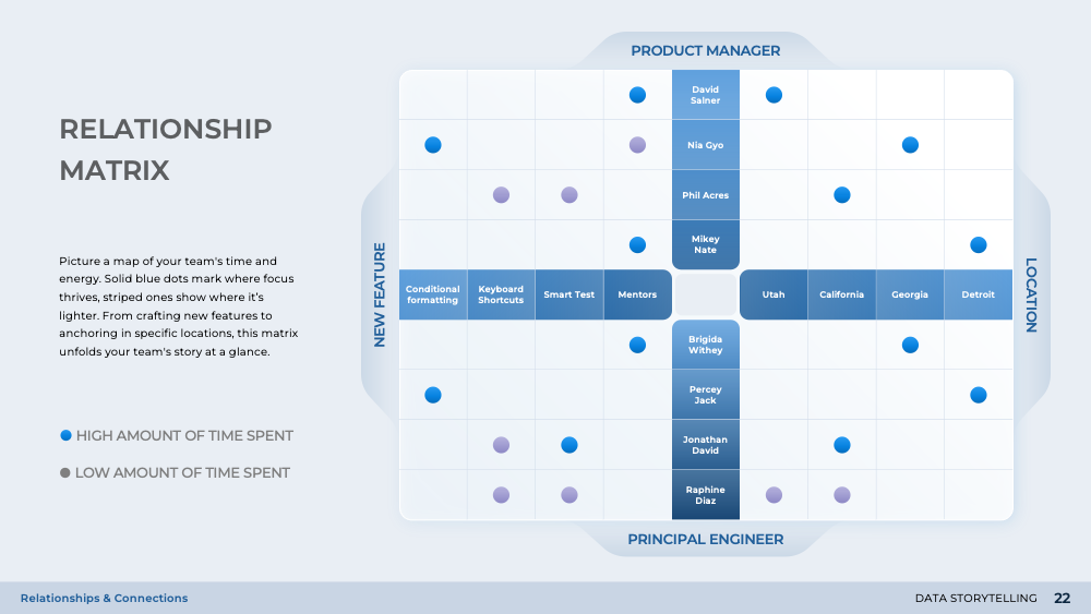
The Venn diagram matrix maps out overlapping attributes, points of intersection, and commonality. For example, two groups that each have strong analytical capabilities might discover that they could pool those resources to tackle a complex project more efficiently. Moreover, seeing gaps where no overlap exists can also be valuable, as it highlights areas in which the organization may be vulnerable or under-resourced.

Another illustration to show how data can be used to tell a story of relationships and interconnectivity is through the use of the chord diagram. Take project management as a use case, the chord diagram shines light on organizational interdependencies, which depict how various tasks or processes intertwine across multiple roles. Different contributors may be involved at multiple stages, and their inputs can loop back in ways that aren't immediately obvious in a standard project plan. This perspective is invaluable for leaders who want to identify where bottlenecks or misalignments might occur. On the other hand, understanding interdependencies can reveal unexpected alliances, where two roles that rarely interact might benefit from more direct collaboration.

Here, we're reminded of a broader lesson of data storytelling: numbers and process charts alone can't capture the nuanced relationships that determine success or failure.
Contributing Elements
The sunburst diagram segments a broad range of initiatives into a nested, concentric structure that conveys how each element fits within a larger strategic whole. Rather than focusing on discrete line items or siloed tasks, the layout spotlights how various priorities interact and, collectively, drive high-level goals. The arcs in the center branch out into more granular components with relative weight assigned to each slice, a progression that signifies both the breadth of major undertakings and the depth of sub-initiatives that fuel them.

The parallel set shifts the lens from basic categorical breakdowns to reveal more dynamic relationships. The graph draws lines between two categorical axes, such as "department" on one side and "project" on the other. Each line's thickness can indicate the magnitude of contribution or the level of involvement, prompting immediate questions about resource allocation, workload balance, and potential bottlenecks.

The dissection view further refines the idea of mapping out contributing elements by visually "peeling back" the layers of a complex undertaking, such as a product launch or major strategic rollout. While many organizations resort to lengthy checklists or convoluted workflow diagrams, this approach compresses multiple dimensions of information into a single, multidimensional illustration. It shows each functional layer in its own stratum, underscoring how these components stack together to form a cohesive whole. By doing so, the diagram prompts a deeper conversation about the dependencies that exist between layers.

Conclusion
Anchored in strategic visualization, Data Storytelling enables deeper understanding, drives collaboration, and ignites informed action. By bridging the gap between raw analytics and compelling narratives, the designs featured in this presentation unify teams, spotlight meaningful insights, and shape better decisions. Ultimately, it transforms data from static figures into catalysts for purposeful ongoing organizational progress.


