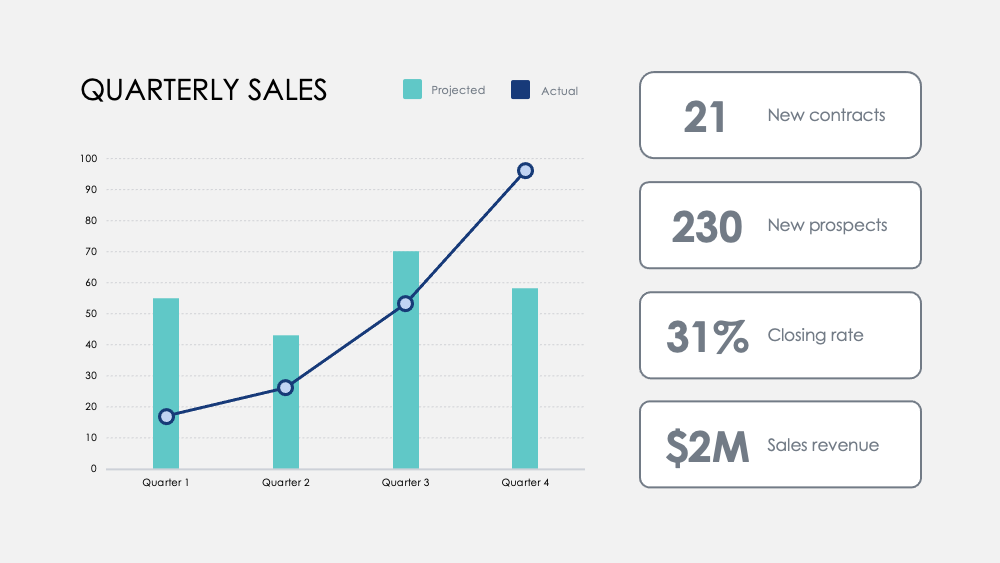
Department success can be correlated across key activities by measuring the contributions of each activity to the overall success. This can be done by tracking key performance indicators (KPIs) such as revenue, new subscribers, and average customers. Comparing these metrics with those of competitors can also provide valuable insights. Additionally, user feedback and customer distribution data can be used to understand how customers perceive the products and services, and where the key markets are. Tracking revenue across new accounts, projects, or partnerships, and comparing revenues across years can help identify growth trends and potential issues.
This question was asked on the following presentation:

Communicate your data effectively without spending hours to draw and design charts from scratch. This Charts Collection features some of the most comm...
Go to dashboard to download stunning resources
Download


Text this question was asked on:
Competitive analysis: compare your company's revenue, new subscribers and average customers to your competition. Visualizes the competitive landscape and analyze your rival's gross revenue by quarter to your own. Department and product advantages: Correlate department success across key activities and measure contributions to its overall success. Contrast product advantages with simple visual analysis. User feedback: Survey users and visualize key discoveries to learn how your customers perceive your products and services. Customer distribution: Discover customer demographics with sales data to visualize your key markets. Revenue: Track revenue across new accounts, projects, or partnerships. Track margins across products and compare revenues across years to discover the most significant growth increases and revenue drops. Treemap: Compare relationships between business ventures in a branched hierarchy and visualize ratios by scale. Option Comparison: Weigh potential business moves and ...
 PowerPoint
 Apple Keynote