Some other types of charts commonly used in business presentations include bar charts, pie charts, line graphs, scatter plots, area charts, doughnut charts, waterfall charts, and radar or spider charts. These charts help in visualizing data, comparing values, showing trends over time, and displaying distribution or composition of data.

This question was asked on the following presentation:

resource preview

Charts Collection (Part 2)

Communicate your data effectively without spending hours to draw and design charts from scratch. This Charts Collection features some of the most comm...

download Download this presentation

Download and customize 500+ business templates and translate PowerPoints

Go to dashboard to download stunning resources

Download

presentation Preview

View all chevron_right

Text this question was asked on:

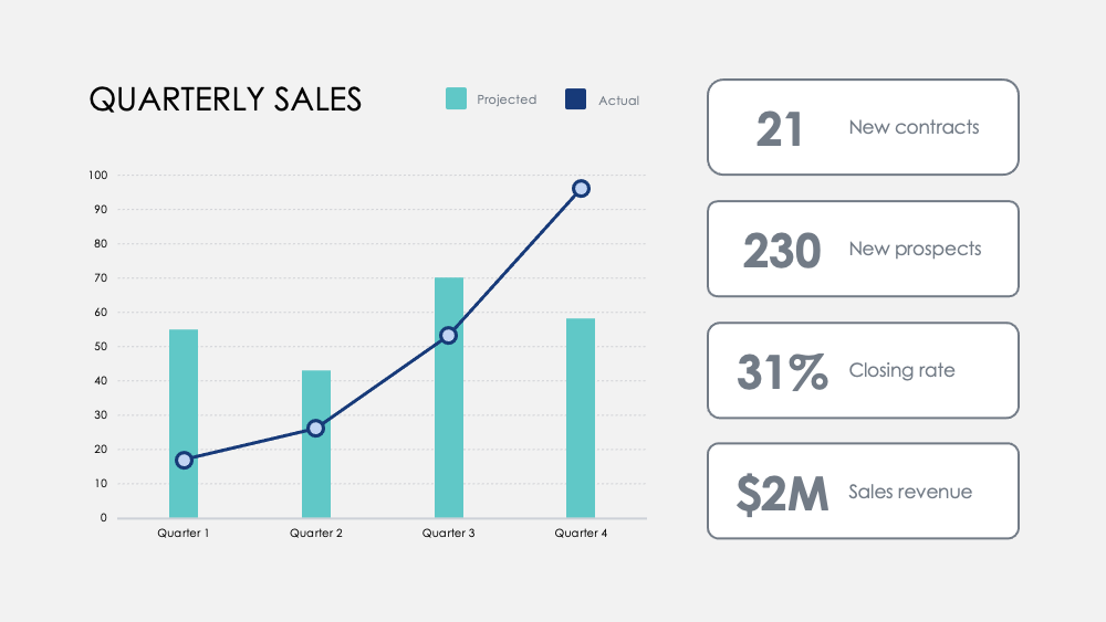
Use this Regional Revenue Growth chart to break down revenue goals by locations or markets across multiple years. Chart revenues across existing products, those in development, and those not yet developed. Highlight milestones with this Monthly Numbers chart. Track metrics across quarters and add optional quarterly goals to visualize how a focus on certain activities influences your revenue data. Compare strengths and weaknesses between product features with this Product Comparison chart. Visualize data from customer surveys and overlay two or three products to weigh them against each other.

stars icon
Questions and answers
info icon

There are several ways to visualize and compare business metrics. Some of them include using a dashboard to display key performance indicators (KPIs), using a scatter plot to compare two variables, using a bar chart to compare different categories, using a line chart to show trends over time, using a pie chart to show proportions, and using a heat map to show patterns or correlations. Additionally, you can use a histogram to show frequency distributions, a box plot to show the distribution of data, and a bubble chart to compare three variables.

These charts can be used to influence business strategy in several ways. The Regional Revenue Growth chart can be used to set and track revenue goals across different locations or markets, which can help in making strategic decisions about where to focus resources. The Monthly Numbers chart can be used to track metrics and set quarterly goals, which can provide insights into how focusing on certain activities influences revenue. The Product Comparison chart can be used to compare the strengths and weaknesses of different product features, which can inform product development and marketing strategies.

View all questions
stars icon Ask another question