The implications of wasting 63% of time on designing graphs and finalizing layouts are significant. It means that a large portion of time that could be used for data analysis, brainstorming, and generating insights is instead spent on the aesthetics of data presentation. This could lead to less time for critical thinking and decision making, potentially affecting the quality of the outcomes. It also implies inefficiency in the process, as the time could be better utilized if there were pre-designed and customizable visual tools available.
This question was asked on the following presentation:

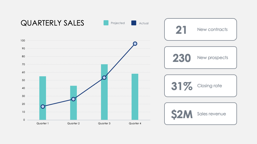
Communicate your data effectively without spending hours to draw and design charts from scratch. This Charts Collection features some of the most comm...
Go to dashboard to download stunning resources
Download


Text this question was asked on:
As we visualize data, it helps spark new ideas. But over 63% of time spent developing visual presentations is wasted just to design graphs and finalize their layouts. Save your most precious resource with our , which includes pre-designed charts, graphs, data maps, and visualizations that are easy to use, fully customizable, and ready to tell your story.
 PowerPoint
 Apple Keynote