Synopsis
Need to make social media platforms generate better business values? Our Social Media Report provides customizable slides traffic analysis, audience engagement and growth, social performance check-in, top posts analysis, plus many more. Use these slides to inspire new ideas to a company's overall business strategies.
Traffic analysis
Social media analytics help you create performance reports that can be shared between teams or with any stakeholders. They help companies figure out what works and what doesn't, when it comes to a social media strategy. This slide analyzes where visitors to your web page come from, which pages they go to, and where they interact the most. Those three important metrics are laid out in a Sankey diagram that flows from left to right. It's a useful tool to pinpoint your weak spots. For example, if there aren't many visitors from Yelp or Twitter, it might not be worth it for your business to keep posting there. On the other hand, if a certain page on your site gets a lot of traffic, it's a good idea to invest more time and energy into making it the best page possible. (Slide 10)
Engagement by time
Every marketer that posts on social media wants to know the best time to post content for maximum engagement. On this heat map, viewers can tell by the differences in color saturation which times of the day have the most visitors. It's good to know what times users typically assign to your brand, so marketers and creators can base upload times around those. The heat map can be used for engagement with a specific platform or even a specific type of post. (Slide 11)
Every brand is unique, so it's best to find out early what the peak times are to help build a strategy. The best times to post depend on a variety of factors, and there's no one-size-fits-all approach. For example, studies show the best times for tech brands like Apple or Sony to post are Monday and Tuesday mornings, while CPG companies like Red Bull or Nestle get the most engagement mid-day Thursday and Friday.
Audience growth
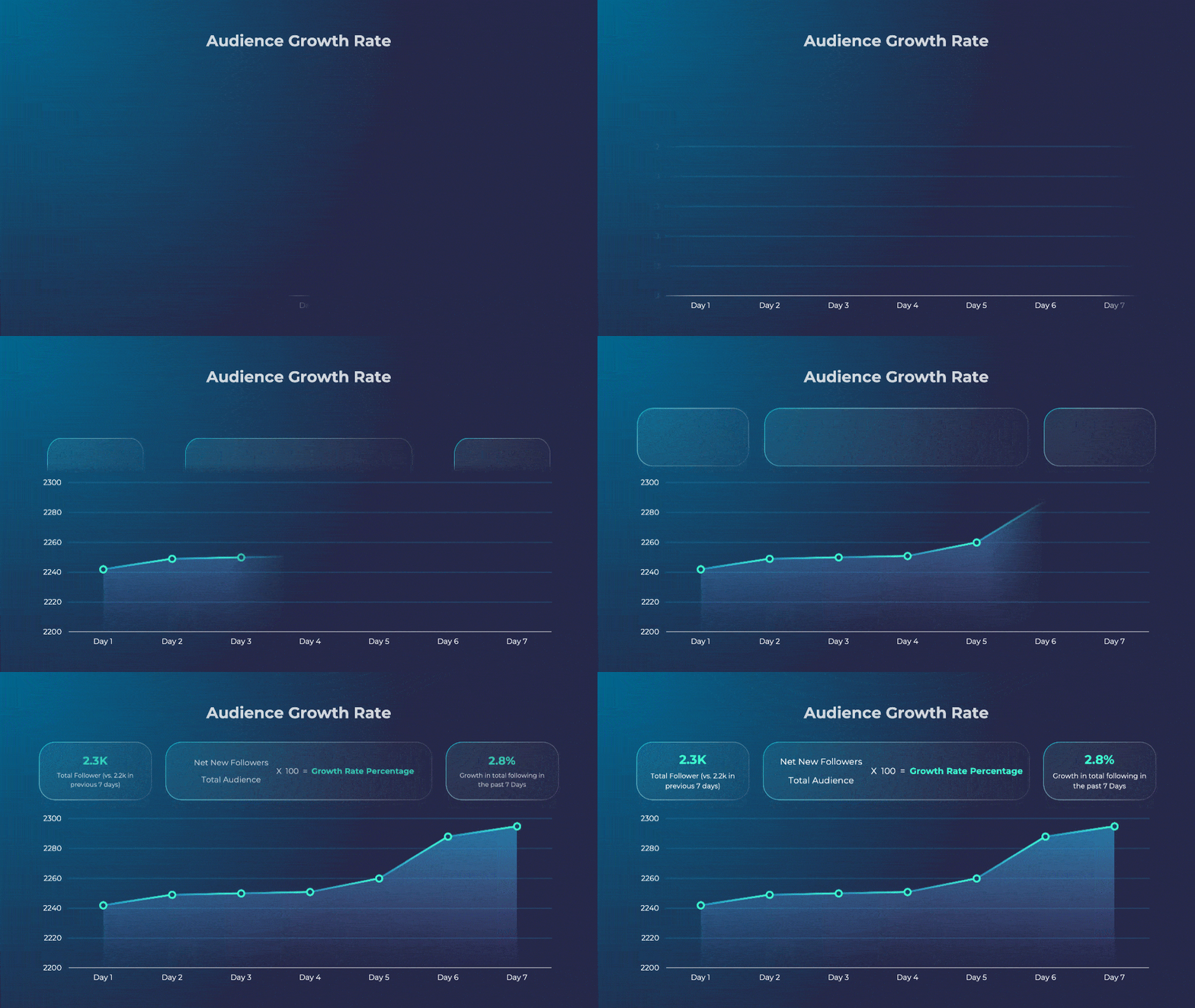
If everything goes according to plan, your audience and follower count should grow steadily over time. This slide shows the total follower count and the growth rate in a given period. It provides a snapshot look at the numbers that matter. This is especially useful for when a company is still in the earlier stage to build an online presence and needs to prove continuous growth over a few months. It can also be used to show audience growth during a giveaway or a similar outreach event, which usually lead to visible growth spikes. Remember, social media reports should be easy to follow, especially for decision makers. Don't go overboard with formatting and let the most important data tell the story. (Slide 13)
This dashboard slide highlights, including engagement rate, total number of sessions, and audience growth. Use it to measure progress and benchmark against periodic goals. The percentages show progress relative to goals. (Slide 14)
This dashboard separates web traffic by whether it comes from paid or organic sources. Ideally, an effective social media strategy should lead to more and more organic or even viral growth over time. (Slide 15)
Top posts
Marketers and strategists rely on a variety of engagement metrics like these to figure out which posts are the top performers. Here we can show the top posts against metrics like interaction or "email open rates". This way you can see what posts or tools get the most engagement, what features work, and draw patterns and insights from the commonalities across these successful examples. With that, it could be a good bet to replicate what works for even more audience growth. (Slide 27)
This slides zooms in on one high-performing post. This way you can show off the best content to stakeholders or your marketing team. In the middle template image, you can change the image to the content of the post, or easily embed a video on powerpoint. You can also hyperlink the template section to the social media post itself, so that when it's clicked, the actual post will display. (Slide 29)
Competitive benchmarking is used to measure your company's social media campaigns against other players in the industry. When you know how the competition is doing, it can help set more actionable, realistic goals. This table maps out the competition in four distinct zones. The Leaders experience the highest growth rate and get the most traffic, while niche players have the most room to grow. (Slide 32)
Conclusion
As always, feel free to mix and match the tools that work best for your intended audience and reporting needs. Uncover new ways to visualize processes, organize teams, improve existing workflows, and envision new ways of doing things with this Social Media Report presentation.


