Question
Some other ways to visualize and compare customer survey data include using bar graphs, pie charts, line graphs, or scatter plots. These can help to highlight trends, compare different groups, or show relationships between different variables. Additionally, heat maps can be used to visualize complex data sets and highlight areas of interest. Data tables are also useful for comparing raw numerical data. Finally, infographics can be used to present data in a more engaging and visually appealing way.
This question was asked on:
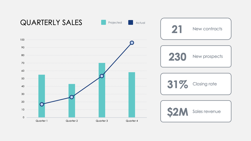
Use this Regional Revenue Growth chart to break down revenue goals by locations or markets across multiple years. Chart revenues across existing products, those in development, and those not yet developed. Highlight milestones with this Monthly Numbers chart. Track metrics across quarters and add optional quarterly goals to visualize how a focus on certain activities influences your revenue data. Compare strengths and weaknesses between product features with this Product Comparison chart. Visualize data from customer surveys and overlay two or three products to weigh them against each other.


Receive new free presentations every Monday to your inbox.
Full content, complete versions — No credit card required.
