Question
Histograms are beneficial in data visualization as they provide a visual representation of data distribution. They work by separating data into groupings called bins, which helps in understanding the count, distribution, and pattern of the data. This can be particularly useful in various fields, such as science or warehouse management, where data can be organized and analyzed based on specific parameters like gender, height, or size of parts.
This question was asked on:
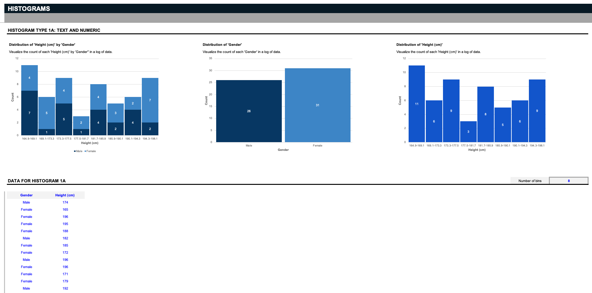
Say you're a scientist, and you have a list of data that involves a specific gender and height. The first three histograms visualize the count of each height by gender, the distribution of the two genders, or the distribution of all the heights. But remember: these inputs can be customized to anything you want; say you run a warehouse, and you want to organize related parts by their respective sizes; delete the inputs in blue, and replace them with your specifications. Histograms work by separating data into groupings called bins. Here, we provide a simple filter to decide how to slice the data.


Receive new free presentations every Monday to your inbox.
Full content, complete versions — No credit card required.
