Question
Bubble charts and histograms are both graphical representations of data. They are used to display and compare the frequency, count, or proportion of data points in different categories. Both can be used to visualize large amounts of data, and they can both be customized to fit specific data sets. However, they represent data in different ways: histograms use bars to represent data, while bubble charts use circles.
This question was asked on:
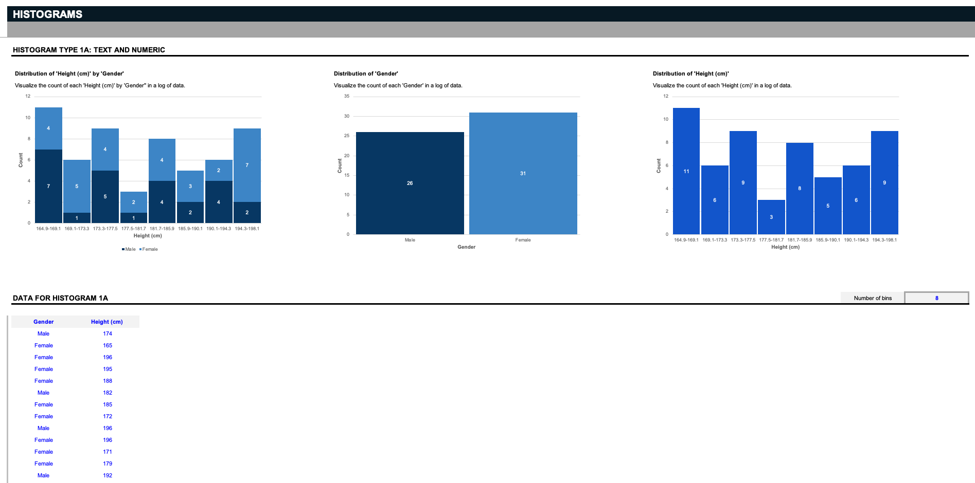
Say you're a scientist, and you have a list of data that involves a specific gender and height. The first three histograms visualize the count of each height by gender, the distribution of the two genders, or the distribution of all the heights. But remember: these inputs can be customized to anything you want; say you run a warehouse, and you want to organize related parts by their respective sizes; delete the inputs in blue, and replace them with your specifications. Histograms work by separating data into groupings called bins. Here, we provide a simple filter to decide how to slice the data.


Receive new free presentations every Monday to your inbox.
Full content, complete versions — No credit card required.
