Enter your email address to download and customize presentations for free
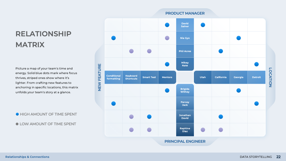
Visualizations play a crucial role in data storytelling as they help to amplify the central message behind numbers. They shift the lens from basic categorical breakdowns to reveal more dynamic relationships. For instance, a graph can draw lines between two categorical axes, such as department and project. The thickness of each line can indicate the magnitude of contribution or the level of involvement, prompting immediate questions about resource allocation, workload balance, and potential bottlenecks. Thus, visualizations make it easier to understand and interpret complex data.
Question was asked on:
The shifts the lens from basic categorical breakdowns to reveal more dynamic relationships. The graph draws lines between two categorical axes, such as "department" on one side and "project" on the other. Each line's thickness can indicate the magnitude of contribution or the level of involvement, prompting immediate questions about resource allocation, workload balance, and potential bottlenecks.
Asked on the following presentation:

Do you struggle to make sense of volumes of disparate data points? Our Data Storytelling presentation shares a unique variety of visualizations to amp...
Download free weekly presentations
Enter your email address to download and customize presentations for free
Not for commercial use
Download 'Data Storytelling' presentation — 28 slides
+39 more presentations per quarter
that's $3 per presentation
/ Quarterly
Commercial use allowed. View other plans


Need to translate complex data into actionable items? Our collection of data visualization charts addresses this hurdle with a variety of charts, graphs, tables, and infographic designs that translate numbers into digestible insights. These designs not only help the creators better communicate their messages, but also allow viewers to grasp the importance of intricate, numerical details.

What are the best ways to translate data into actionable items? This collection of data visualization charts addresses this hurdle with a variety of charts, graphs, tables, and infographic designs that translate numbers into digestible insights. These designs not only help the creators better communicate their message, but also allow viewers to grasp the importance of intricate, numerical details.

How can a simple presentation be upgraded into assets that capture undivided attention? Our collection of widget designs can be easily copy-pasted into any presentation to convey key ideas efficiently and in a visually appealing manner. Introduce these dynamic widget designs to simplify communication, make data more accessible, and make your next meeting more productive.

Why do so many presentations fail to captivate and persuade? The second part of our Widget Collection offers even more quick copy-paste solutions for any presentation topic or existing slides. These widgets can be applied to a variety of business contexts, such as risk analysis, financial modeling, sales and marketing funnel, option comparison, milestone tracking, calendar planning, and more. Use these designs to simplify complex data and create intuitive visuals that resonate with your target audience.