








Many capital committees approve automation programs on optimism, not proof. Order-to-cash operations that run across a dozen disconnected systems accumulate manual touches, error rates, and quiet cash leakage that rarely reach the board in one place. This framework turns a scattered investment pitch into a governed business case: a decision call, a full ROI model, risk-adjusted returns, and a funding gate structure that releases capital only as evidence accumulates.
Business case discipline has become a board-level concern as automation budgets grow. Seventy percent of major transformations fail to meet their objectives, according to McKinsey research, often because the original case overstated benefits or underestimated cost and timeline. That gap between pitch and performance makes rigorous ROI validation, not enthusiasm, the deciding factor for capital release.
How to Frame the Investment Decision
Executives waste review cycles when a business case buries the ask inside pages of narrative. This feature turns the opening page of the committee review into a single decision surface: the problem stated in one line, the financial ask, and the headline returns side by side. Approval conversations shift from searching for numbers to debating the numbers already in front of the room. A committee that once needed a pre-meeting briefing to understand what it was voting on can instead reach a verdict inside a single session, because the ask, the mechanism, and the payoff sit on the same page rather than scattered across an appendix.
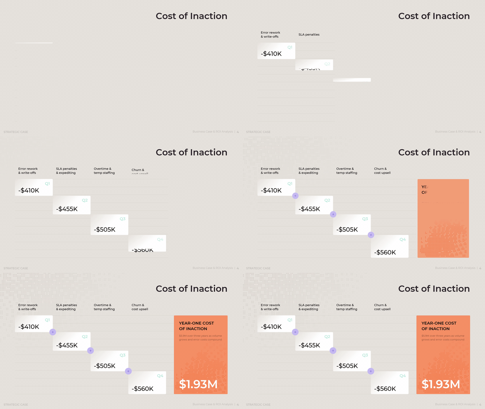
Consider a mid-size operation where order-to-cash spans eleven systems, producing 68 percent manual touches and a 6.2 percent error rate. Left alone, that friction compounds each quarter it continues. A manager preparing for a funding conversation turns to this view first, because it converts a vague sense of urgency into a number a committee cannot set aside. The slide breaks losses into four named drivers, error rework, service penalties, overtime, and customer churn, and stacks them quarter by quarter so the total visibly grows from roughly $410K to $560K across a single year. To adapt it, a manager swaps in the cost categories that fit the situation at hand, whether that means shipping delays, compliance penalties, or lost renewals, and lets the same escalating structure make the case for urgency.
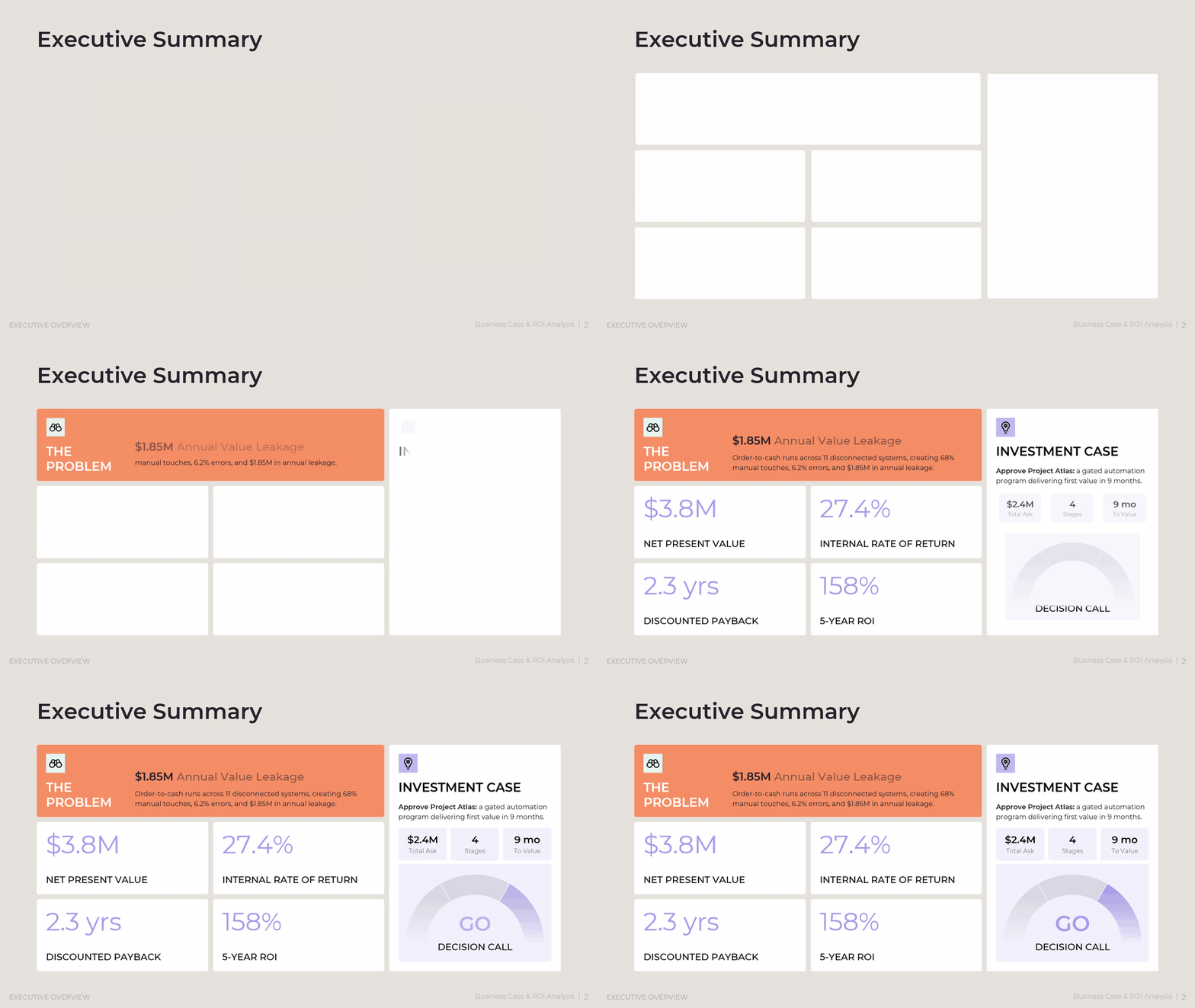
The Executive Overview section opens with a single decision panel that lines up the total ask, net present value, internal rate of return, payback period, and five-year ROI in one row of figures. A manager preparing a board packet leads with this page, since a reviewer who reads nothing else still walks away with the full investment case in view. The panel works by placing the problem statement, the financial ask, and the return figures side by side rather than in sequence, so a reader compares them in a single glance instead of flipping between pages. To use it well, a manager keeps every figure on this page identical to the detailed figures in the pages that follow, since a committee that spots a mismatch between the summary and the supporting detail loses trust in the entire case.
A companion page quantifies why timing matters, translating cost drivers into a quarterly dollar figure, roughly $480K lost every quarter of delay, so waiting carries a visible price tag rather than an abstract sense of urgency. A manager reaches for this slide whenever a committee asks why the request cannot wait for the next budget cycle, since it turns that question into a calculation rather than an opinion. The slide works by pairing a cost escalation figure with a short list of the specific drivers behind it, market pricing pressure, competitive timing, or a compliance deadline, so the urgency reads as evidence rather than pressure. Adapting it only requires updating the driver list and the quarterly figure to match the situation at hand.

A decision arena chart plots each investment option by strategic value against five-year cost, so leaders choose between alternatives such as a minimal fix, a mid-tier upgrade, or a full platform rebuild on the same two axes instead of comparing separate memos written by different teams at different times. A manager builds this slide once several paths forward exist and a committee needs to see the trade-off at a glance rather than read competing proposals. The chart plots each option as a single point, with cost along one axis and strategic value along the other, so the preferred option visibly sits in the upper-left, high value at lower cost, without a single word of justification. Building it well means scoring every option, including the option to do nothing, on the same criteria, so the comparison stays honest rather than pre-weighted toward the option management already favors.

What Belongs Inside the Program, and Why
Automation programs often drift once approved, absorbing every adjacent idea a stakeholder proposes. This feature protects program scope before work starts, and it ties every proposed capability back to a named corporate objective. Instead of "improve operations" as a rationale, each element states which objective it moves and by how much, so scope decisions become measurable rather than political. A warehouse robotics proposal or a CRM replacement can sound appealing in a hallway conversation, but neither survives the same scoring discipline applied to the core initiative, and that consistency is what keeps a program from becoming three unrelated projects wearing one budget line.
The Objectives and Key Results method, first developed at Intel and later popularized at Google, links every initiative to a specific, measurable organizational goal rather than a vague aspiration. Applied to a business case, an order accuracy target of 99.5 percent only earns program inclusion once it is shown to move a named objective by a specific, scored amount, not because it sounds beneficial in isolation. A capability that cannot point to a weighted contribution against a stated corporate objective becomes a candidate for the excluded list, regardless of how reasonable it sounds when raised on its own.
A scope universe diagram places the core initiative at the center, surrounds it with related capability domains such as document capture, workflow orchestration, and exception management, and marks explicitly excluded items like warehouse robotics or a full CRM replacement. A manager reaches for this slide at the start of a program, before scope drifts, since a single diagram settles arguments that would otherwise resurface every month as a new stakeholder proposes an addition. The diagram works by drawing a boundary: items inside it belong to the funded program, items outside it are named and dismissed rather than left ambiguous. Building one well means listing the excluded items as deliberately as the included ones, since a scope diagram that only shows what is in scope invites the same additions it was meant to prevent.

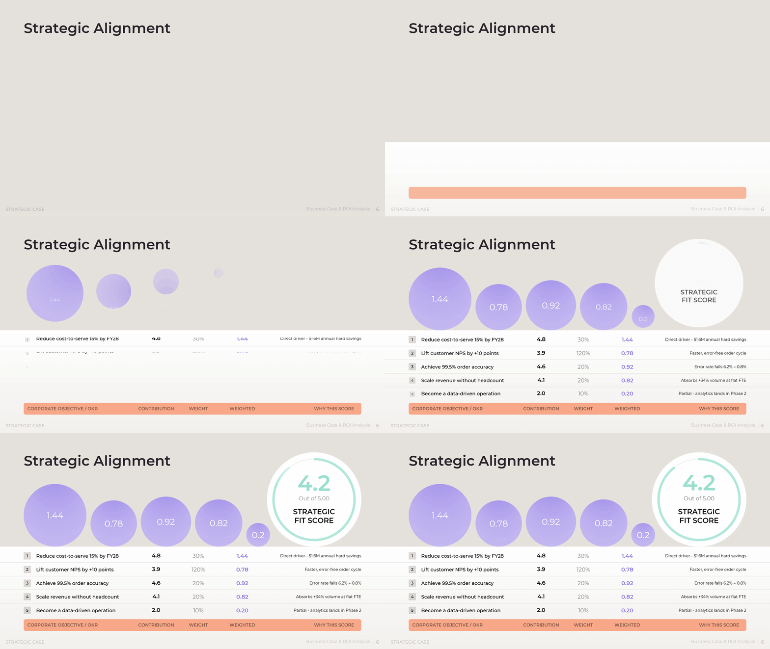
A strategic alignment table scores each corporate objective, from reducing cost-to-serve to lifting customer satisfaction, by weight, contribution, and weighted value, rolling up into a single strategic fit score out of five that the steering committee can defend in one line rather than defending five separate justifications. A manager fills this table in once the program's objectives are known, scoring each on how directly the program moves it, then multiplying that score by the objective's assigned weight to produce a contribution figure. Reading the table means checking the weighted total, not the individual scores, since a program with one strong contribution and several weak ones can still earn a defensible fit score, while a program with five mediocre contributions may not.
Download presentation

Business Case & ROI Analysis
PowerPoint
20 Slides
To continue, enter your email:
How the Investment Turns Into Measurable Value
A number without a build path is just an assertion. This feature shows how an investment figure connects, step by step, to the capabilities it funds, the operational changes those capabilities produce, and the financial outcomes that follow, so a board can trace $2.4M in spend all the way to $3.8M in net present value without a leap of faith. Each layer of the chain, capability, operational change, business outcome, financial impact, sits next to the one before it, so a skeptical reviewer can follow the logic instead of accepting the final figure on faith.
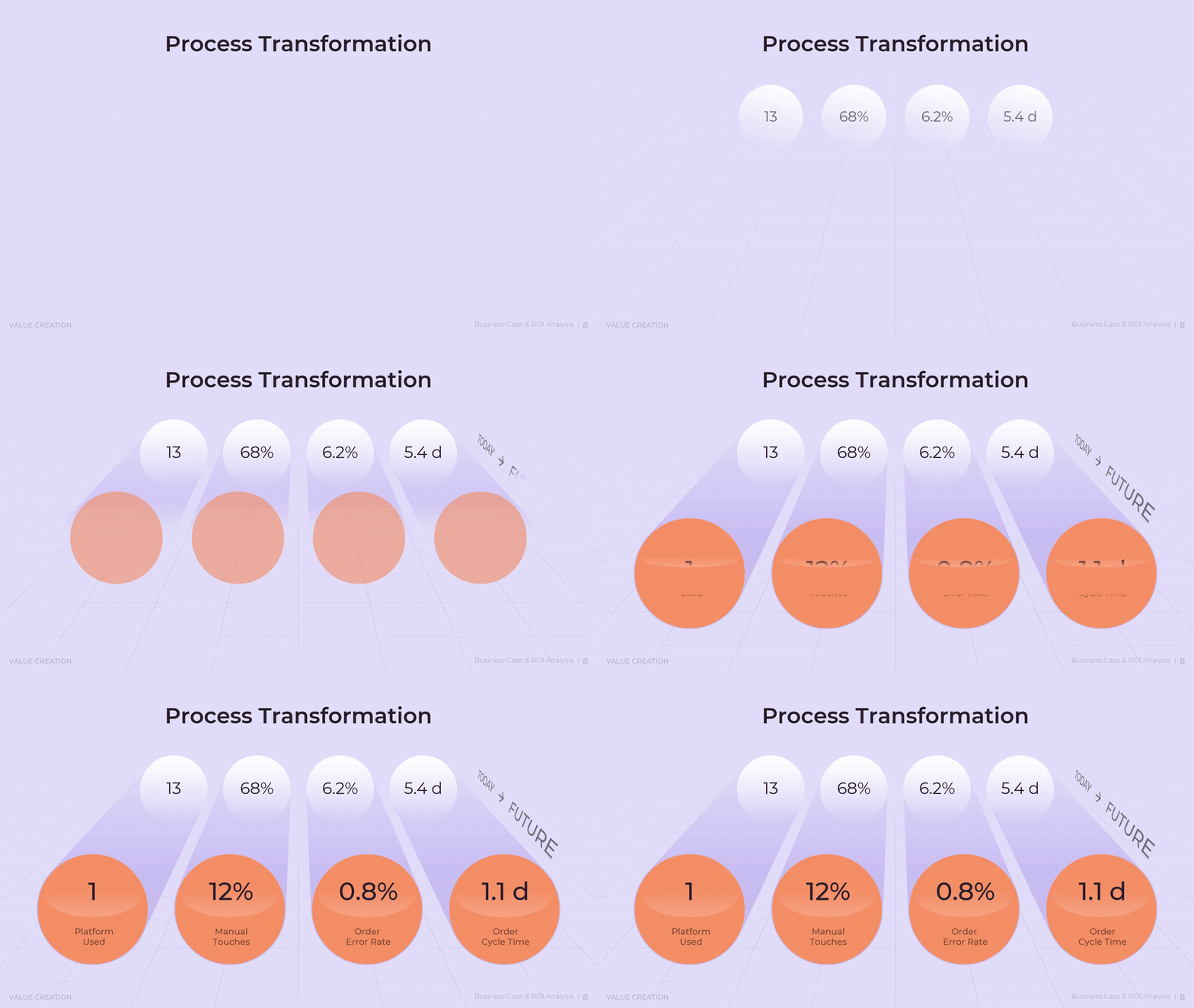
In a representative case, intelligent document capture and workflow orchestration free the equivalent of 41 FTE-hours per day, cut the error rate from 6.2 percent to 0.8 percent, and shorten order cycle time from 5.4 days to 1.1 days. Those operational shifts convert into $1.6M a year in hard savings, $0.6M in protected revenue, and $0.3M in efficiency gains, a pattern consistent with how mid-size operations typically monetize process automation.
An investment breakdown chart allocates the full $26M spend across data migration, licenses, governance, internal labor, infrastructure, change management, and implementation, and flags that 60 percent of spend lands in the first four quarters. A finance partner turns to this chart when a committee asks where the money actually goes, since a single total figure invites suspicion while a category breakdown invites scrutiny of the right kind. Reading it means checking two things: whether any single category looks disproportionate relative to its peers in similar programs, and whether the timing of spend matches the timing of expected benefit, since a program that spends heavily up front needs an equally clear story about what value arrives first.

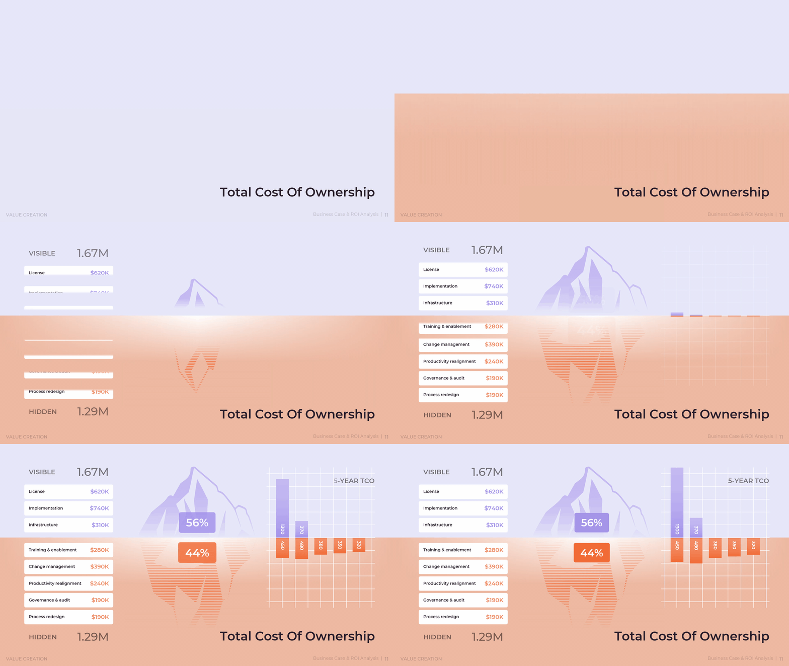
A parallel total cost of ownership view splits five-year cost into visible line items such as licenses and infrastructure and hidden costs such as productivity realignment and process redesign, showing that hidden cost alone can equal 44 percent of total ownership cost. A manager builds this view specifically to counter the common mistake of pricing a program by its license and implementation cost alone, since that number routinely understates the real five-year commitment by close to half. Filling it in means listing every cost a program will incur after go-live, not only the ones a vendor quotes, including training refreshers, governance overhead, and the productivity dip that follows any large process change.
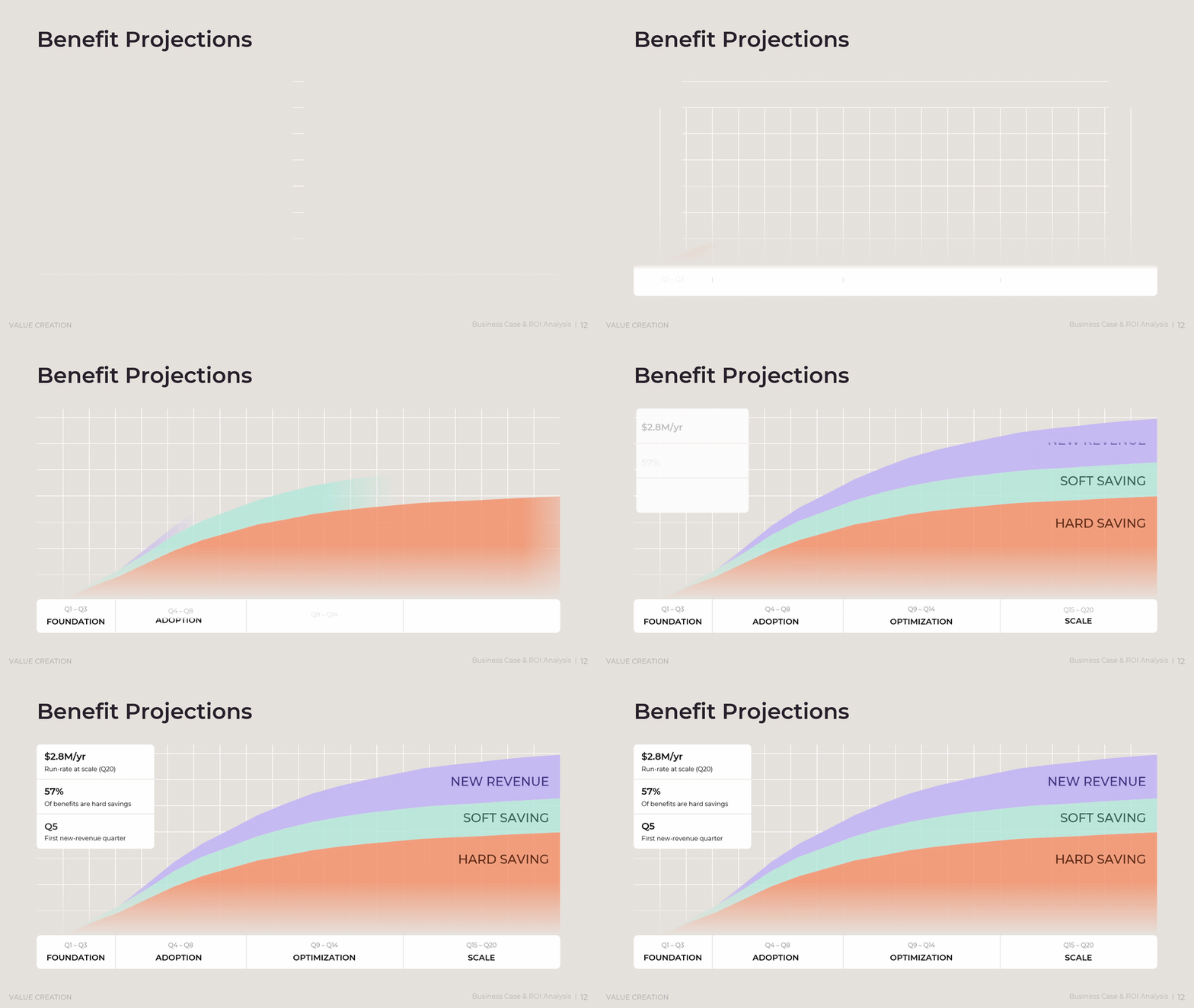
A benefit projections page then phases the payoff across foundation, adoption, optimization, and scale periods, marking when new revenue, soft savings, and hard savings each begin to land and when the program reaches its run-rate benefit of $2.8M a year. A manager uses this page to set realistic expectations with a committee that might otherwise expect full benefit from day one, since most of the value in a phased program arrives only after adoption takes hold. Building the page means mapping each benefit type to the phase in which it realistically starts, hard savings typically first, new revenue typically last, so the projection reads as disciplined rather than optimistic.
How to Stress-Test the Numbers Before Asking for Money
A single ROI figure invites the question every finance team eventually asks: what happens if assumptions are wrong. This feature answers that question before it is asked, by running the model across conservative, moderate, and aggressive scenarios and by showing the committee a range of outcomes instead of one hopeful number. Rather than defending a single $3.8M figure against every possible objection, the case presents a spread of outcomes and lets the committee choose how much confidence it needs before it commits capital.
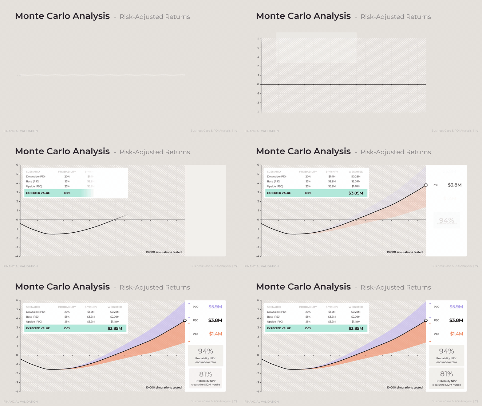
Net present value is the standard measure for weighing an investment's worth, and the Corporate Finance Institute notes that it carries a known weakness: the result is sensitive to small changes in assumptions and can be manipulated to produce a desired outcome. A Monte Carlo simulation run across 10,000 trials addresses that weakness directly, since it expresses uncertainty as a probability distribution instead of a single number. Applied here, it shows a 94 percent chance the program returns a positive net present value and an 81 percent chance it clears a $1.2M hurdle rate.
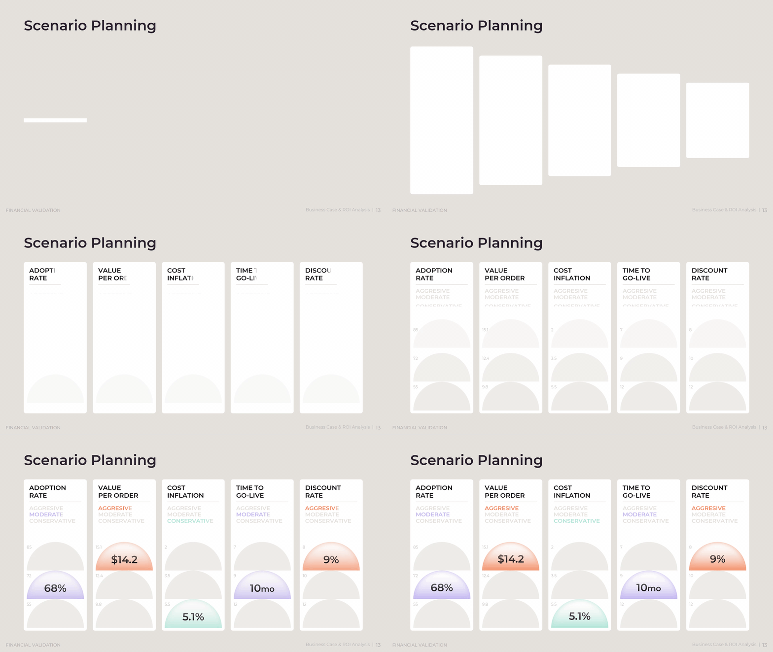
A scenario planning grid varies five drivers, adoption rate, value per order, cost inflation, time to go-live, and discount rate, across conservative, moderate, and aggressive assumptions. A manager builds this grid before presenting a single ROI figure, since a committee that only sees one number will ask what happens if that number is wrong, and this slide answers the question in advance. Reading the grid means comparing the conservative case, not the moderate one, against the minimum return the organization requires, since a program that only clears its hurdle rate under aggressive assumptions carries more risk than the summary figure suggests.
An investment journey chart then tracks net cash flow by quarter against cumulative discounted value to mark the breakeven point. A manager includes this chart specifically to answer the question a CFO asks before any other: how long before the organization gets its money back. The chart works by plotting two lines, quarterly cash flow that dips negative during the investment period and a cumulative value line that crosses zero at the breakeven point, so the timing of return is visible rather than buried in a single payback figure. Reading it well means checking how long the cash flow line stays negative, since a longer investment period raises the bar for how confident a committee needs to be before approving.

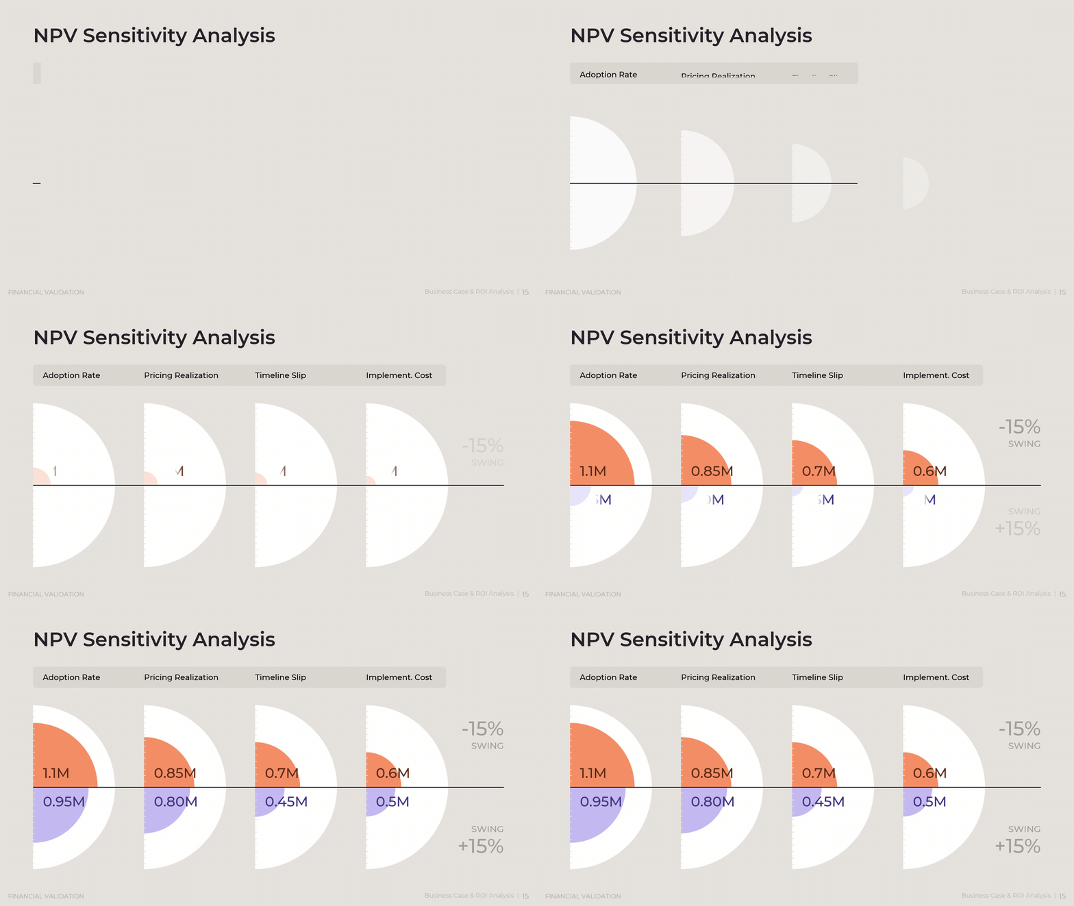
An NPV sensitivity tornado chart ranks which variable, from adoption rate to pricing realization, swings the outcome most, a technique the Corporate Finance Institute recommends for isolating the assumptions that matter most. A manager builds this chart to direct a committee's attention toward the two or three assumptions that actually determine the outcome, rather than letting the conversation drift across every input in the model equally. The chart works by testing each variable's swing independently, holding all others constant, then sorting the resulting bars from widest to narrowest so the shape resembles a tornado. Reading it well means focusing follow-up questions and risk mitigation on the top two or three bars, since the remaining variables move the outcome too little to justify the same scrutiny.
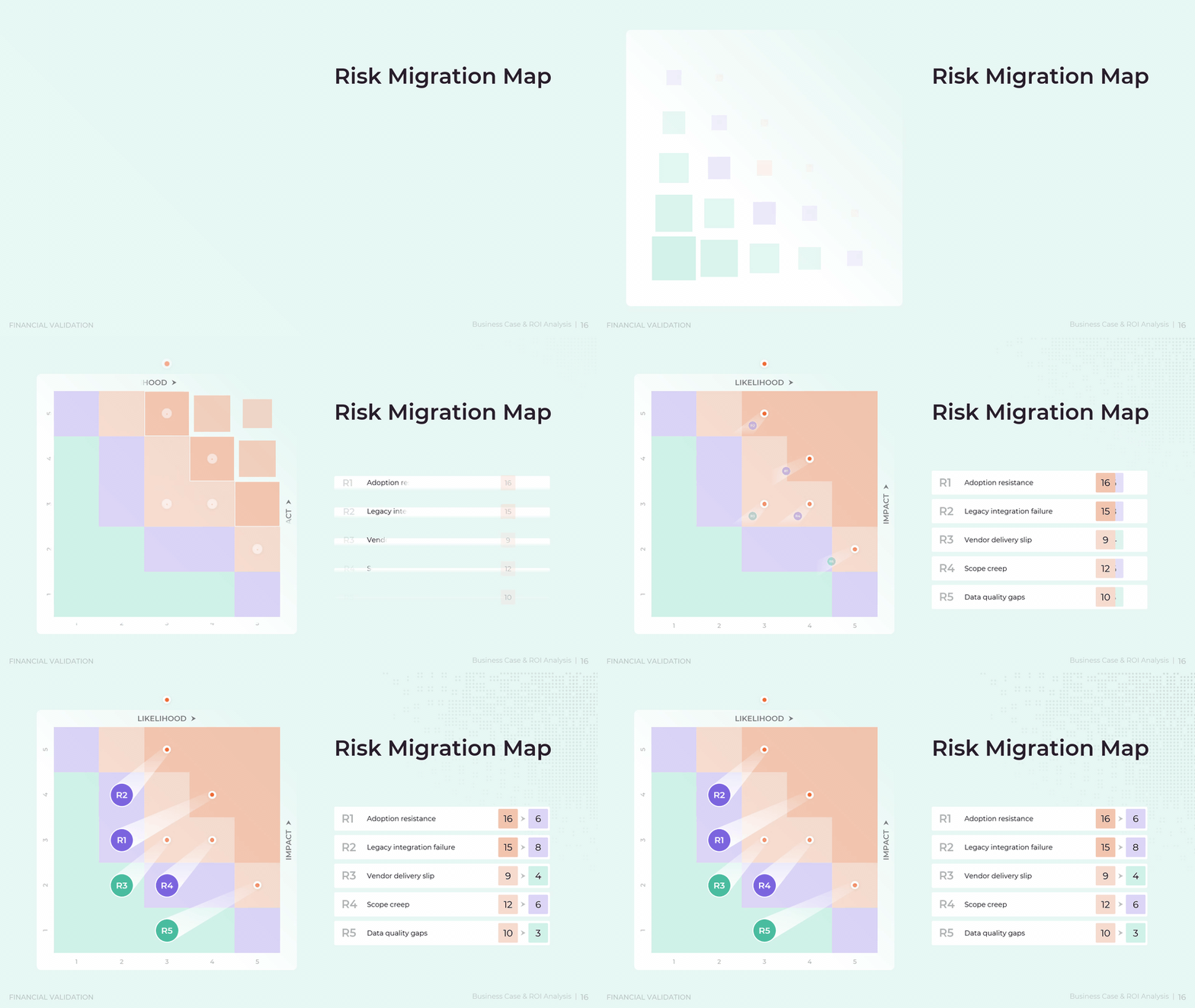
A risk migration map plots each program risk by likelihood and impact, so the steering committee can see at a glance which risks demand active mitigation and which can simply be monitored. A risk owner builds this map by placing every identified risk, from adoption resistance to vendor delivery slip, on a grid according to how likely it is to occur and how much damage it would do if it did. Reading the map means prioritizing the risks that land in the upper right, high likelihood and high impact, for active mitigation plans, while risks in the lower left can be logged and reviewed on a lighter cadence rather than competing for the same attention.
Finally, a Monte Carlo analysis page reports downside, base, and upside outcomes alongside their probability-weighted expected value, giving the committee a single defensible number that already accounts for uncertainty. A manager includes this page after the sensitivity analysis, once the key variables are known, since running thousands of simulated outcomes across those variables produces a probability distribution rather than a single guess. Reading the page means checking two figures specifically: the probability that the program clears zero, and the probability it clears the organization's actual hurdle rate, since both numbers matter more to a risk-aware committee than the base-case return by itself.
Download presentation
Business Case & ROI Analysis
PowerPoint
20 Slides
To continue, enter your email:
How Funding Releases Stay Tied to Proof
Capital committed once and released all at once removes the committee's ability to stop a program that is not delivering. This feature ties every tranche of funding to a verified milestone, so money keeps flowing only while the evidence keeps supporting it. A sponsor who approves the full $2.4M on day one has no natural point to pause if adoption stalls or costs run over, while a gated structure builds that pause directly into the funding calendar.
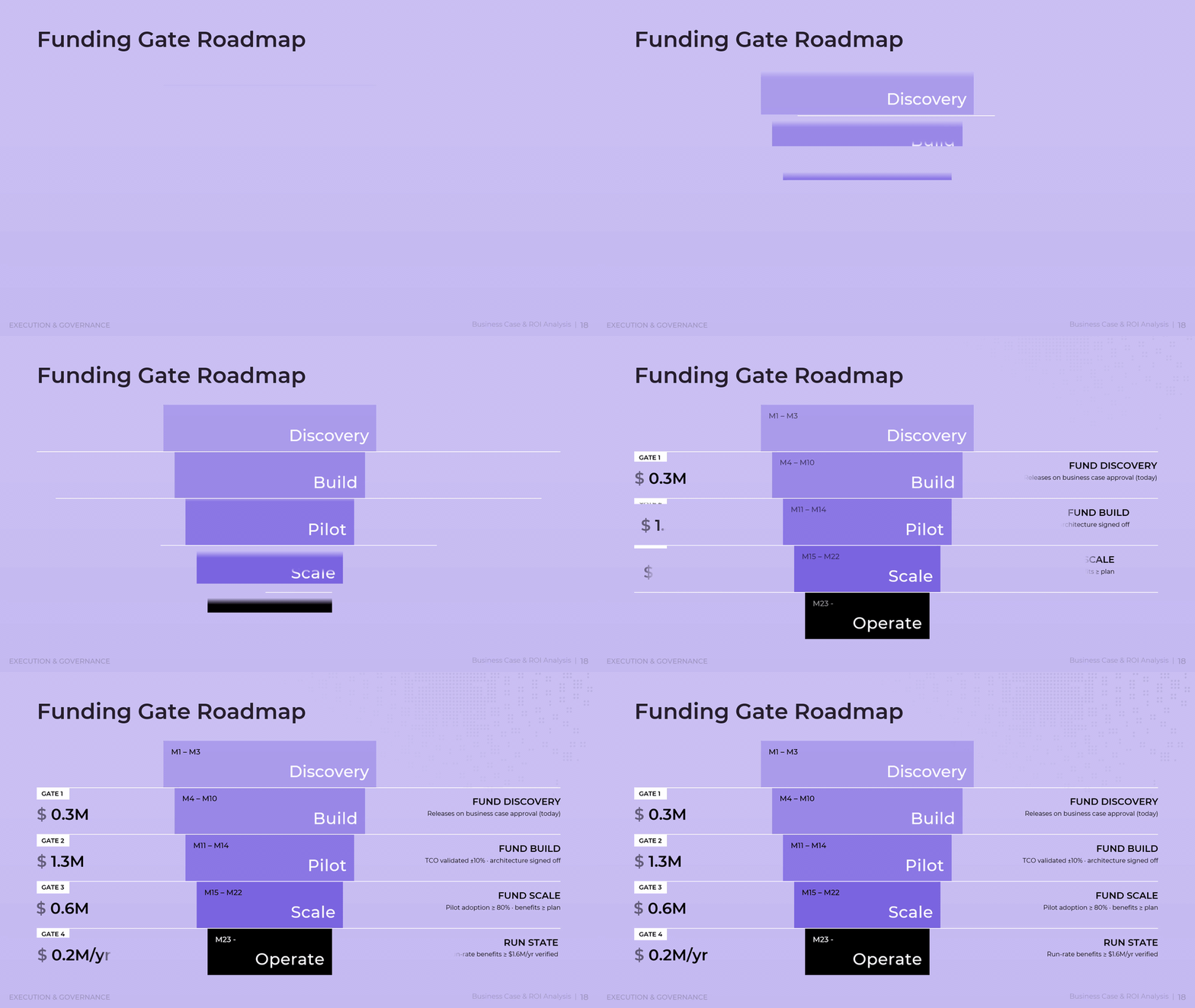
A staged funding structure, often called a phase-gate or stage-gate process, is a governance pattern used across engineering, product, and capital-intensive programs, where each gate releases a defined budget only after specific proof points are met. Here, discovery funding of $0.3M releases on approval, while later gates require run-rate benefits of at least $1.6M a year, a total cost of ownership validated within 10 percent of plan, or pilot adoption of 80 percent before further capital moves.
A funding gate roadmap lays out five phases, discovery, build, pilot, scale, and operate, each with its own budget release and go or no-go criteria. A program sponsor builds this roadmap to replace a single funding request with a series of smaller, evidence-based ones, since a committee that approves the full amount at once has no natural point to reconsider if early results disappoint. Reading the roadmap means checking the criteria attached to each gate, not just the dollar amount, since a gate that releases funding without a clear proof point defeats the purpose of staging the investment in the first place.
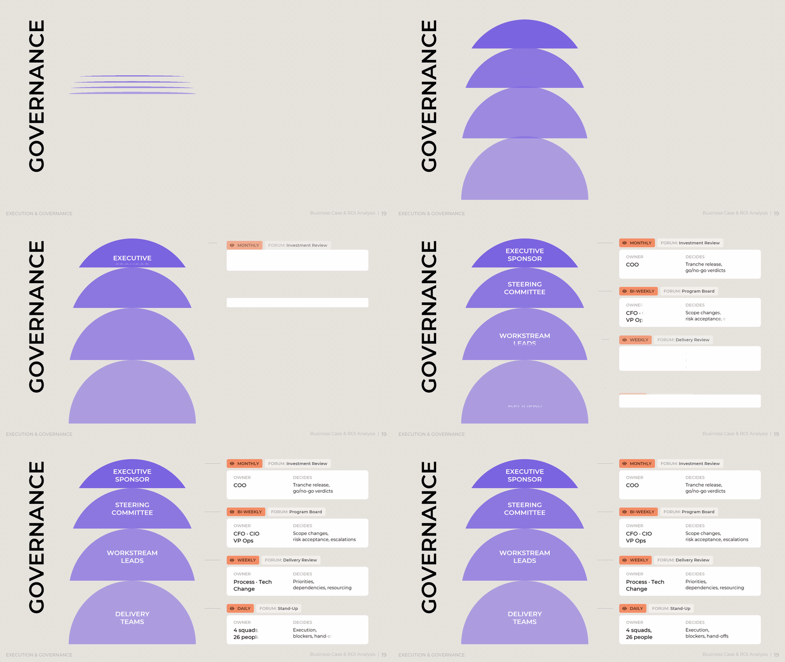
A governance page maps decision rights across a steering committee, an executive sponsor, workstream leads, and delivery teams, and pairs each layer with its own review forum, from daily stand-ups among delivery squads to a monthly investment review with the executive sponsor. A program sponsor builds this page to answer a question that otherwise surfaces mid-program as a conflict: who actually has the authority to approve a scope change or accept a new risk. Reading the page means matching the size of a decision to the layer authorized to make it, so a workstream lead resolves a scheduling conflict without escalation while a scope change or risk acceptance moves up to the steering committee where it belongs.
A closing benefits realization tracker compares planned cumulative benefit against actual results, quarter by quarter, flagging whether the program sits ahead of or behind its committed trajectory, so the program's promised value stays visible long after the money is approved. A program owner updates this tracker every quarter after go-live, since a business case that stops being measured the day funding is approved loses the accountability that justified staged funding in the first place. Reading it means comparing the actual line against the planned line at each checkpoint, and treating any quarter where actual falls meaningfully behind plan as a trigger for the same governance forum that approved the funding in the first place.

A business case is only as strong as the discipline behind it. The gap between a $2.4M ask and a validated $3.8M in net present value closes only when the problem, the scope, the financial build, the risk range, and the governance structure all point to the same numbers. Scattered slides and optimistic assumptions rarely survive a skeptical finance committee, while a case built on named objectives, phased benefits, and probability-weighted returns tends to earn trust in the room. Funding gates then carry that same discipline forward, so capital keeps moving only while the evidence keeps agreeing with the pitch. What starts as a single approval decision becomes an operating rhythm: a steering committee that reviews tranches, a benefits tracker that compares plan against actual, and a program that has to keep proving itself long after the first yes. Business case and ROI analysis, done this way, stops being a one-time pitch and becomes a standing discipline for how an organization decides what deserves its capital.
Download presentation
Business Case & ROI Analysis
PowerPoint
20 Slides
To continue, enter your email: