









Strategy and execution often drift apart mid-year. A 2026 Harvard Business Review Analytic Services study of 522 B2B leaders found that 83% call their go-to-market strategy very important, yet only 38% rate execution as very effective. A structured mid-year review closes that gap before small slips turn into a missed year-end target.
How to Turn Five Priorities into One Scorecard
Strategy loses power when it lives in a slide nobody revisits. Once five priorities sit next to real financial and operational numbers, ownership becomes clear and progress becomes visible to the whole leadership team. A scorecard turns vague ambition, such as grow revenue or improve retention, into a small set of numbers that everyone in the room agrees to track. This closes the gap between what leadership says matters and what teams actually measure week to week. Instead of five separate initiatives competing for attention, the organization works from one shared view of what winning looks like for the half.
This structure follows the logic of the Balanced Scorecard, a management system Robert Kaplan and David Norton introduced through Harvard Business Review in 1992. The Balanced Scorecard argues that financial results alone tell only part of the story, since they describe past performance rather than future direction. More than half of major companies across the United States, Europe, and Asia now use some version of a balanced scorecard to connect daily work to strategic objectives. The same logic applies at half-year: a small set of linked metrics, reviewed together, keeps five priorities from drifting into five unrelated conversations.
A manager reaches for this slide at the start of the review, before any numbers appear, to set the frame for everything that follows. The slide lists five priorities, such as accelerate delivery, expand demand, advance technology, strengthen talent, and optimize conversion, each with a one-line definition of the outcome it targets. To use it well, a manager checks that each priority maps to a specific owner and a specific metric elsewhere in the deck, so no priority sits without proof of progress.

The executive scorecard slide follows right after, and a manager pulls it up when the board or leadership team asks for the numbers behind the story. It works as six boxes: revenue, gross margin, EBITDA margin, operating cash flow, customer retention, and pipeline coverage, each shown as a single hard number for the half. When adapting it, a manager replaces each figure with the organization's own half-year actuals and keeps the same six categories, so the scorecard stays comparable review after review.

The Mid-Year Performance Storyline
Raw numbers rarely persuade a room by themselves. A timeline of monthly wins paired with a short list of headline metrics gives a leadership team a narrative they can repeat outside the meeting, to the board, to investors, or to the wider company. This turns six months of scattered updates into a single storyline: what improved, by how much, and which function drove it. A clear storyline also protects credit where it belongs, so a win in demand generation is not quietly folded into a generic revenue update.
Consider a mid-size services company that closes the first half with 13% revenue growth but a flat headcount. Without a storyline slide, the finance team reports the revenue number and stops there. With a storyline in place, the same review shows that four priority roles got filled in the second quarter and that release cycles shortened by nearly a fifth. That detail links the revenue gain to the specific operational changes behind it. The board leaves with a reason to trust next quarter's plan, not just this quarter's result.
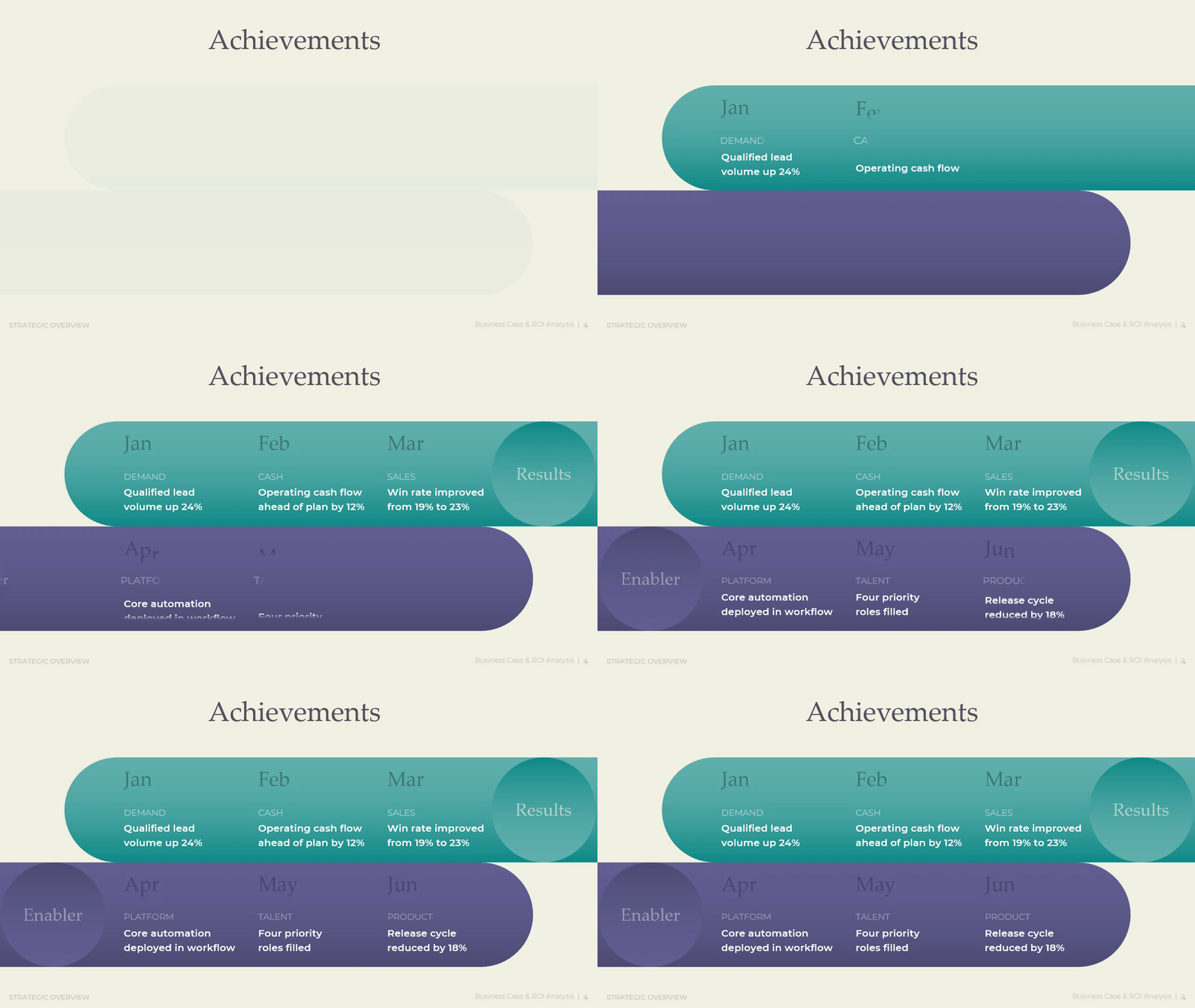
A manager opens this slide right after the scorecard, when the room needs proof that the numbers came from real work and not luck. It runs as a two-row timeline across six months: results such as lead volume, cash flow, and win rate on top, and enablers such as platform, talent, and product underneath, each tied to a specific month. A manager filling this in should place each achievement in the month it became true, not the month it started, so the timeline reads as a record of delivery rather than intention.
This slide is the one a manager exports on its own, for a one-page summary email or a chat message ahead of the full review. It condenses the half into six figures, such as lead volume growth, enterprise cash at close, revenue growth, operating cash flow change, quarterly win rate, and the funding status of H2 investment. When adapting it, a manager keeps every figure tied to a single word label like the original, so the slide reads at a glance without a caption underneath each number.

Download presentation

Mid-Year Performance Review
PowerPoint
19 Slides
To continue, enter your email:
Full Visibility into Profit and Cash
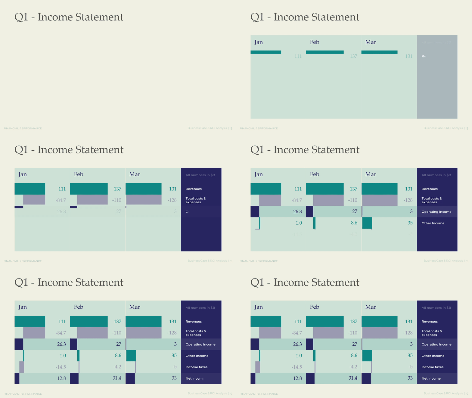
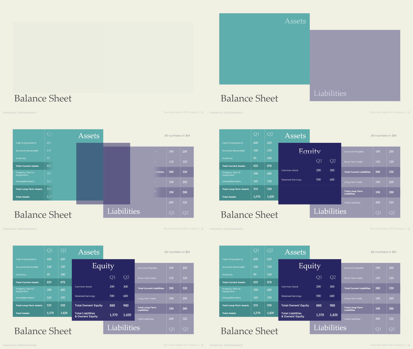
Profit and cash tell two different stories, and a manager who tracks only one gets surprised by the other. A clear view of both, side by side, shows whether growth actually funds itself or quietly drains the bank account. This matters most in a period of expansion, when revenue climbs but working capital gets tied up in receivables, inventory, or new hires before it converts back to cash. Full visibility turns that gap from a surprise at year-end into a tracked, managed number all year.
SCORE, the nonprofit small-business mentoring network backed by the U.S. Small Business Administration, reports that cash flow problems are the top reason small businesses fail, cited in 82% of cases. The pattern does not disappear once a company grows past its early years. Instead it changes shape: working capital gets trapped in receivables or inventory while the income statement still looks healthy. A mid-size organization that reviews only the income statement each month can miss this trap for a full quarter before it turns into an actual cash shortfall.
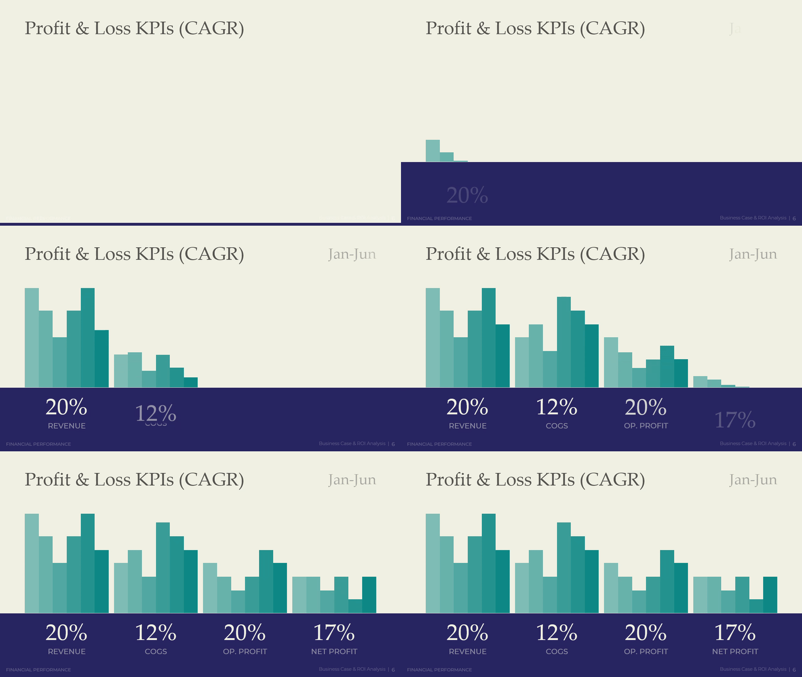
A manager brings up this slide when leadership wants growth rates, not just totals, for revenue, cost, and profit. It runs as a set of four linked figures across the half: revenue growth, cost of goods sold growth, operating profit growth, and net profit growth, each shown as a percentage rate rather than a dollar amount. To use it well, a manager checks that cost growth stays below revenue growth; if the two lines move together, margin is not actually expanding no matter how strong the top-line number looks.
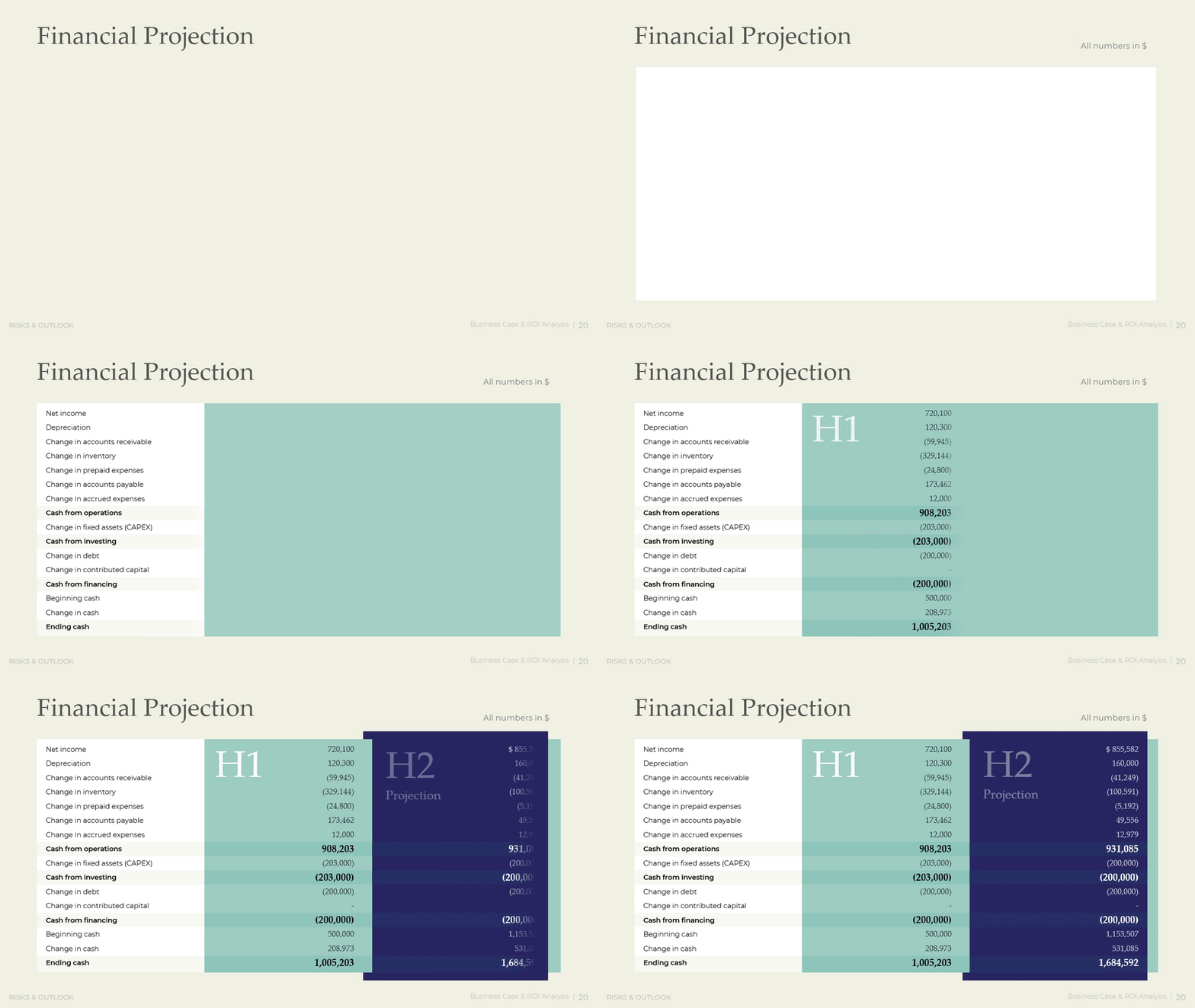
This slide earns its place right after the profit numbers, for the moment a manager needs to explain where the cash actually went. It walks through operating, investing, and financing activities in sequence: net income adjusted for depreciation and working capital changes, then fixed asset purchases, then loan payments, ending in a single beginning-to-ending cash balance. When filling this in, a manager should trace every large swing back to a specific decision, such as a capital purchase or a debt payment, so the ending number is explained rather than just reported.

Commercial Momentum and Competitive Position
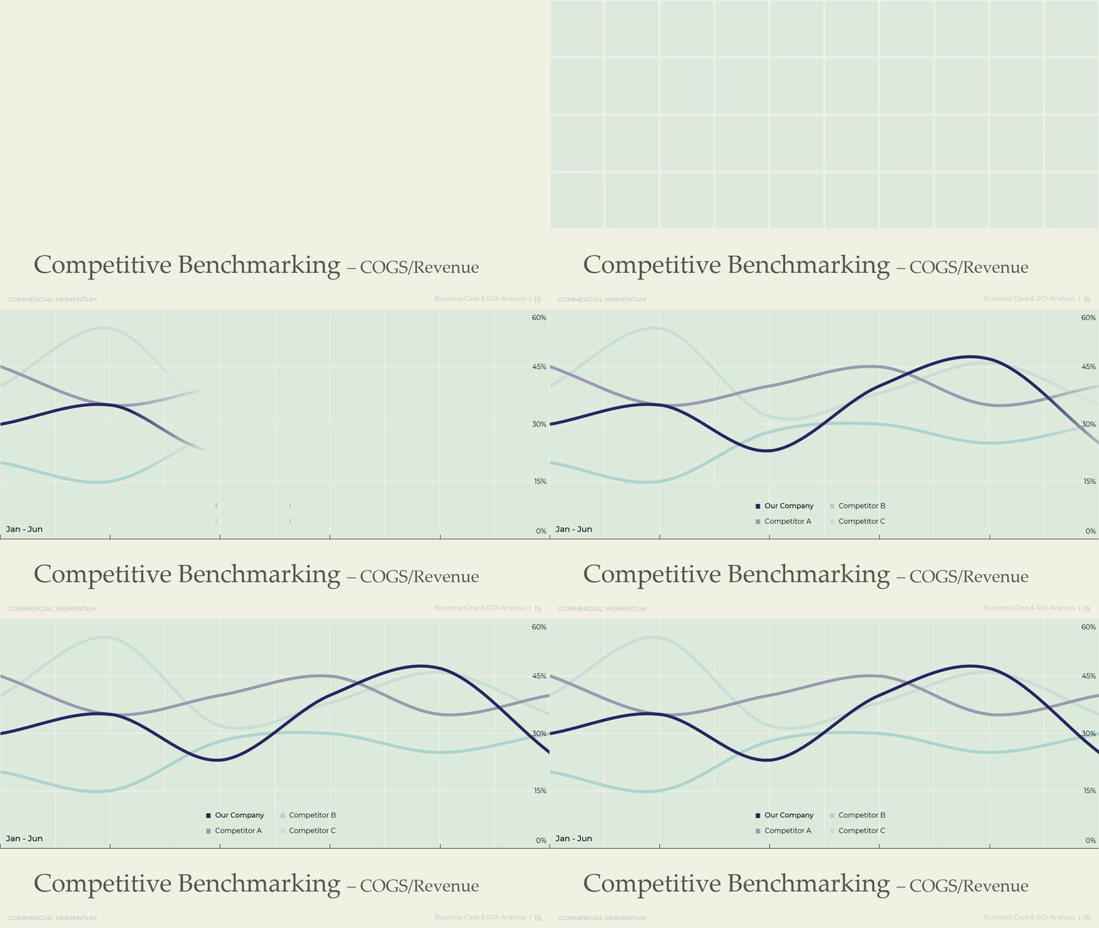
Sales activity alone does not prove commercial health. A manager needs to see booked revenue, committed pipeline, and market position together to judge whether growth for the second half is actually funded or still a hope. This feature turns a list of deals and a market share number into a single read on commercial strength, one that shows whether the company gains ground against named competitors or simply keeps pace with a growing market. It also protects the second-half forecast from wishful thinking by tying every number to something concrete: a named account or a named competitor.
A pipeline coverage ratio of roughly 3x is the long-run benchmark cited by Bain and Salesforce Research for a team that closes about one in three qualified deals. The ratio is not a fixed rule: a team with an 18% to 25% win rate needs four to five times coverage to forecast reliably, while a high-velocity team closing half its deals needs closer to two times. Reading pipeline value next to a real win rate turns a hopeful sales forecast into a testable one.
A manager pulls up this slide when the second-half forecast needs to hold up against direct scrutiny from finance or the board. It breaks pipeline into four categories: booked revenue already signed, committed deals expected to close, upside opportunities still in motion, and deals now at risk, each shown against named accounts. To use it well, a manager keeps the at-risk bucket honest rather than folding weak deals into committed, since an inflated committed number this quarter becomes a missed number next quarter.

This slide comes out when leadership wants a competitive read rather than an internal one. It shows the company's share next to two or three named competitors, drawn as a simple split so the room can see rank at a glance instead of reading a table of percentages. When adapting it, a manager sources the competitor figures from a consistent method each period, whether that is analyst estimates or public filings, so a shift in share reflects real movement and not a change in measurement.

Download presentation
Mid-Year Performance Review
PowerPoint
19 Slides
To continue, enter your email:
An H2 Execution Plan with Stage Gates
A roadmap without checkpoints tends to slip quietly, month by month, until the year-end review reveals how far off track it drifted. Pairing a roadmap with gated checkpoints forces a real decision at fixed points: continue as planned, adjust the approach, or stop and reallocate the investment elsewhere. This gives leadership a way to catch a stalled initiative in month two instead of month eleven, when there is still time to act on what the data shows. It turns the second half from a set of hopeful intentions into a sequence of decisions leadership actually makes, on a fixed schedule, with real consequences attached to each one.
The gate structure follows the logic of the Stage-Gate process, a method Robert Cooper introduced in 1988 and later detailed in Business Horizons. At each gate, a defined decision maker reviews progress against clear exit criteria and chooses to move the initiative forward, hold it, adjust it, or stop it, rather than letting it continue by default. The same discipline applies outside product development: any initiative with a named owner and a hard exit criterion can be gated the same way.
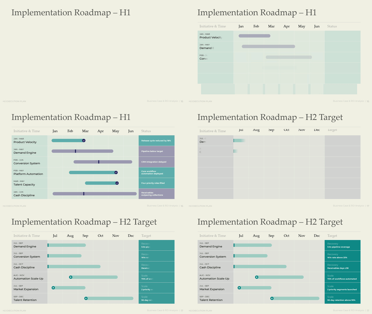
A manager sets this slide next to the H1 results, so the room can see the second half as a direct response to what happened in the first. It lists six initiatives, such as demand engine recovery, conversion system recovery, and automation scale-up, each with a start month, an end month, and one hard target such as a specific pipeline multiple or retention rate. When filling this in, a manager writes each target as a number that can be checked as true or false, not as a general direction like improve or grow.
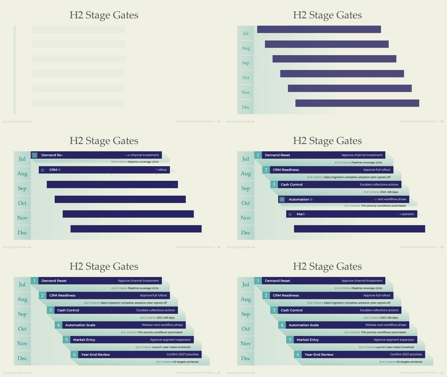
This slide is the one a manager returns to at every monthly checkpoint through the second half, since it turns the roadmap into a sequence of go or no-go decisions. Each of the six gates names a decision to approve, such as channel investment or a CRM rollout, a target month, and an exit criterion the initiative must clear before the next gate opens. To use it well, a manager keeps exit criteria as hard numbers, such as a coverage ratio or a days-outstanding figure, so a gate review cannot turn into a status update in disguise.
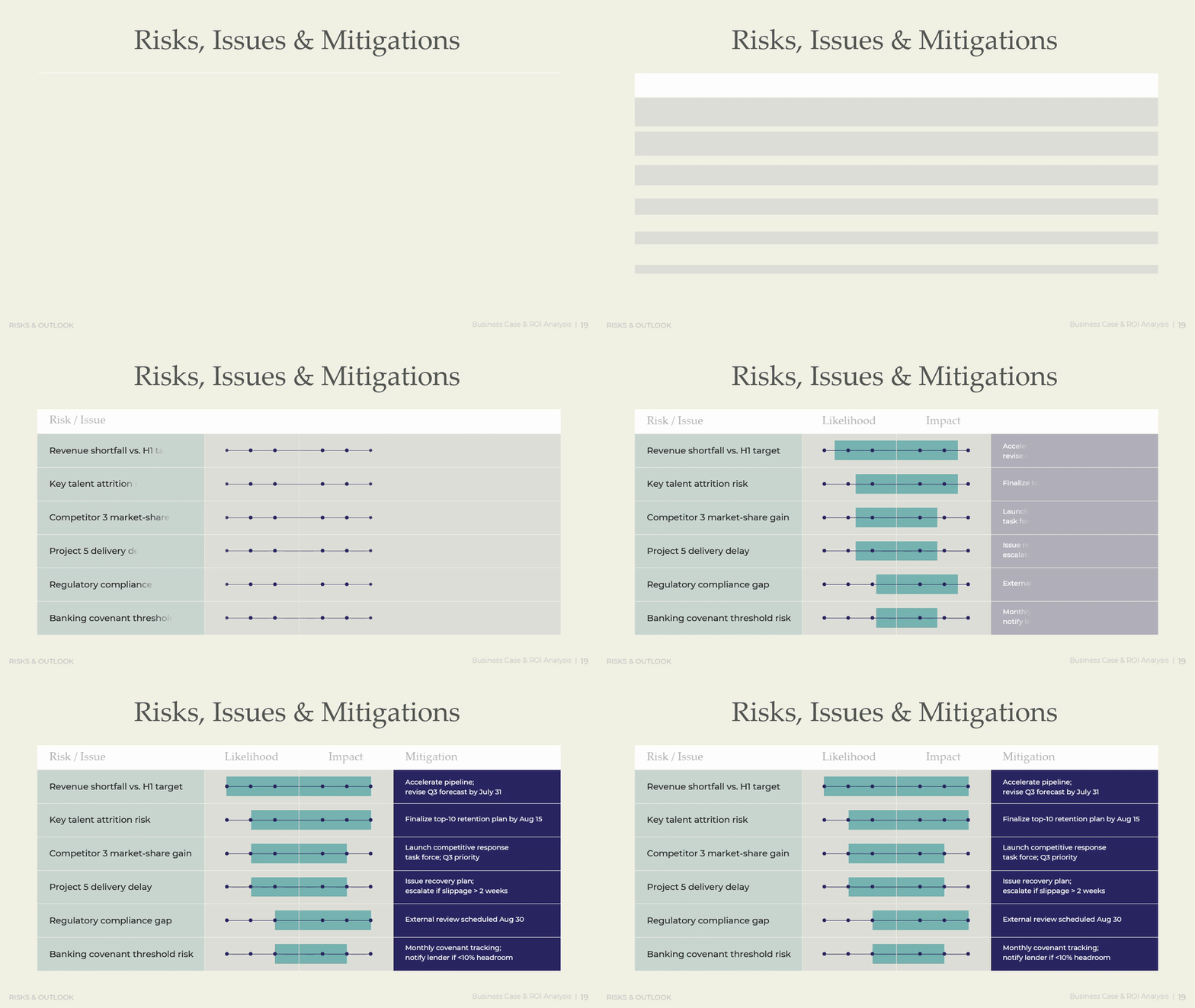
A mid-year review works best when it moves in one direction: from strategy, to proof, to money, to market position, to a plan for what comes next. The scorecard sets what matters. The performance storyline proves it happened. The financial package shows whether growth paid for itself in cash as well as profit. The commercial view checks that position in the market matches the story told internally. The gated H2 plan makes sure none of it fades into a status update nobody reads in December. Organizations that treat the mid-year point as a single structured system, rather than six separate reports stapled together, catch drift while it is still cheap to correct. The five priorities on the strategic priorities slide and the six gates on the stage-gate slide are the same discipline applied twice, once to set direction and once to hold it. That discipline, repeated every half, turns a review from a calendar obligation into the mechanism that keeps strategy and results pointed the same way.
Download presentation
Mid-Year Performance Review
PowerPoint
19 Slides
To continue, enter your email: