Slide of
Data Storytelling Presentation
Corporate Performance
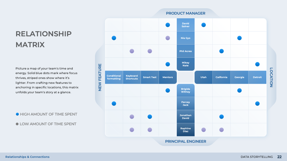
Diving into the realm of corporate performance, this slide offers a comprehensive view of benchmarking and performance levels. It employs a heat map and intensity table to visually represent team performance, distinguishing between above and below average performances. This slide, part of the 'Data Storytelling' presentation, is designed to simplify the understanding of complex statistical data, making it more accessible to the audience. It aids in sharpening business foresight by uncovering nuanced observations and decoding statistical complexity.
Download slide
Data Storytelling
PowerPoint
28 Slides
To continue, enter your email:
OR
Already have an account?
Log in
Preview

Full preview (28 Slides)