Slide of
データストーリーテリング Presentation
企業のパフォーマンス
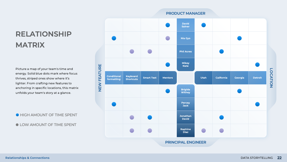
企業のパフォーマンスの領域に深く潜り込むこのスライドは、ベンチマーキングとパフォーマンスレベルの包括的な視点を提供します。ヒートマップと強度表を用いて、平均以上と平均以下のパフォーマンスを視覚的に表現しています。このスライドは、'データストーリーテリング'のプレゼンテーションの一部であり、複雑な統計データの理解を簡素化し、より視聴者にアクセスしやすくするように設計されています。それは、微妙な観察を明らかにし、統計的な複雑さを解読することで、ビジネスの洞察力を研ぎ澄ませるのに役立ちます。
Download slide
データストーリーテリング
PowerPoint
28 Slides
To continue, enter your email:
OR
Already have an account?
Log in
Preview

Full preview (28 Slides)