resource preview
resource preview
resource preview
resource preview
resource preview
resource preview
resource preview
resource preview
resource preview
resource preview
resource preview
resource preview

Download and customize this and 500+ other business templates

Start here ⬇️

Voila! You can now download this Spreadsheet

Download

Explainer

Preview

Синопсис

Нужно визуализировать ваши данные? Мы создали этот новый Ультимативные диаграммы (Часть 3) шаблон таблицы в Excel и Google Sheets, который вы можете скачать и настроить под свои нужды. Он включает настраиваемые диаграммы marimekko для визуализации распределения ресурсов или портфеля продуктов, пузырьковые диаграммы для анализа размера рынка и выручки от продаж, диаграммы Парето для оценки производительности и отзывов клиентов, ящичные диаграммы для анализа акций, вертикальные столбчатые диаграммы для визуализации изменений со временем и гистограммы для визуализации распределения чисел, уникальных значений и диапазонов дат.

stars icon
43 questions and answers
info icon

There are several ways to analyze customer feedback. You can use sentiment analysis to understand the emotions behind the feedback. Text analytics can be used to identify common themes or topics. You can also use customer feedback to create a Net Promoter Score (NPS) which measures customer loyalty. Additionally, you can use customer journey mapping to understand the overall experience of your customers. Finally, you can use data visualization tools to identify trends and patterns in the feedback.

In addition to box and whisker charts, other ways to visualize stock analysis could include line charts to track stock prices over time, candlestick charts to provide detailed information about price movements within a specific time period, volume bars to show the number of shares traded during a certain period, moving average lines to show stock price trends over a specific period, and Bollinger Bands to provide a relative definition of high and low prices.

These charts can be used in market analysis in various ways. Marimekko charts can be used to visualize resource allocation or a product portfolio. Bubble charts can be used to analyze market size and sales revenue. Pareto charts can be used to assess productivity and customer feedback. Box and whisker charts can be used for stock analysis. Vertical bar charts can be used to visualize changes over time. Histogram charts can be used to visualize the distribution of numbers, unique values, and date ranges.

View all 43 questions
stars icon Ask follow up

Гистограммы

Первыми идут Гистограммы. В этой таблице девять уникальных гистограмм; три для оценки распределения текста и числа… Три для оценки распределения двух текстовых значений… и три для оценки распределения текста и значения даты.

resource image
resource image

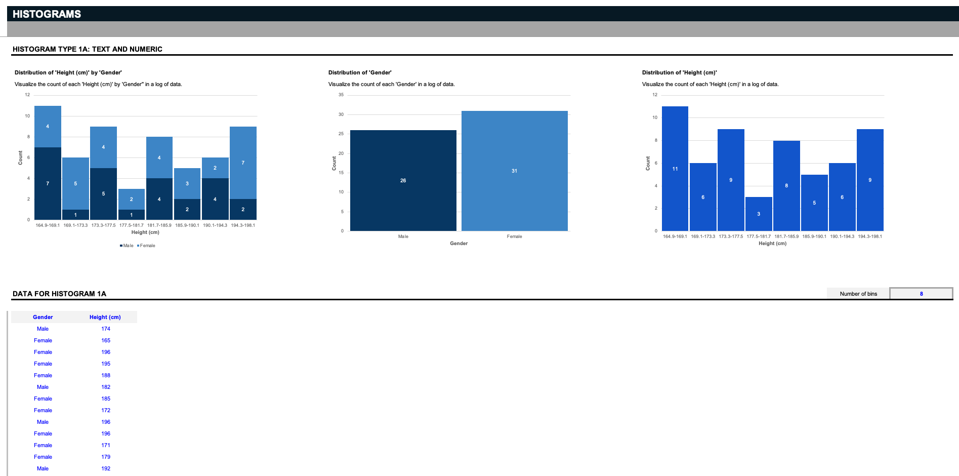
Предположим, вы ученый, и у вас есть список данных, включающий определенный пол и рост. Первые три гистограммы визуализируют количество каждого роста по полу, распределение двух полов или распределение всех ростов.Но помните: эти входные данные можно настроить как угодно; скажем, вы управляете складом и хотите организовать связанные детали по их соответствующим размерам; удалите синие входные данные и замените их на свои спецификации. Гистограммы работают, разделяя данные на группы, называемые корзинами. Здесь мы предоставляем простой фильтр для решения, как разделить данные.

stars icon
43 questions and answers
info icon

Key considerations when deciding how to slice data in a histogram include understanding the nature of the data, the distribution of the data, and the specific information you want to extract from the data. It's also important to consider the size and range of the bins, as these can significantly impact the visualization and interpretation of the data.

Apart from the standard method of slicing data in histograms by separating them into bins, you can also customize the inputs to slice data based on specific criteria. For instance, in a warehouse setting, you could organize parts by their respective sizes. Additionally, you can use filters to decide how to slice the data.

Histograms can be used to visualize the count of each height by gender by separating the data into groupings called bins. Each bin represents a range of heights, and the count of individuals within each bin is represented by the height of the bar. This allows for a visual representation of the distribution of heights within each gender.

View all 43 questions
stars icon Ask follow up
resource image

Все, что вам нужно сделать, это определить, сколько корзин вы хотите видеть, и диаграммы разделит данные на соответствующие группы. Примечание: имейте в виду, что эти гистограммы поддерживают только до двадцати уникальных текстовых значений.

resource image

Теперь предположим, у вас есть список значений - например, у вас есть список данных о поле и цвете глаз, и вы хотите найти распределение каждого уникального цвета глаз по каждому полу. Гистограммы разделяют данные на корзины в зависимости от количества уникальных.

Вертикальные столбчатые диаграммы

Далее идут вертикальные столбчатые диаграммы. Эти два образца наборов данных отслеживают изменения зарплат за два года в обоих типах организаций и ролях, а также изменения доли рынка из года в год для нескольких типов продуктов, выбранных по фильтрам.

resource image
resource image

Как вы можете видеть, два продукта и их соответствующий рыночный долю можно сравнить друг с другом на вертикальных столбчатых диаграммах. Помните - эти данные могут быть полностью настроены в соответствии с вашим конкретным случаем использования.

Диаграммы Парето

Далее идут диаграммы Парето, которые получили свое название от принципа Парето, который утверждает, что для многих результатов 80% последствий происходят от 20% причин. Это инструмент приоритизации, который помогает определить наиболее важный следующий шаг. В образцовых наборах данных у нас есть анализ Парето отзывов клиентов, который подсчитывает количество различных причин, по которым клиенты отписываются, и анализ Парето производительности, который подсчитывает количество ежемесячных узких мест, которые прерывают производительность компании.

stars icon
33 questions and answers
info icon

Pareto charts can be used in strategic planning in various ways. They can help identify the most significant factors in a set of data. For instance, they can be used to prioritize problems or causes in order to take corrective action. They can also be used to highlight the most important factors in a process, project, or product. This can help in focusing on areas that could provide the greatest improvement. They can also be used to compare the before and after effects of changes made in a process or system.

Pareto charts can be used in various ways for process improvement. They can be used to identify and prioritize problem areas in a process, as they visually display which factors are more significant. They can also be used to analyze data collected from different sources to identify patterns of problems or areas for improvement. Additionally, Pareto charts can be used to monitor the effectiveness of process improvement measures by tracking changes in the relative frequency of identified issues over time.

Pareto charts can be used in various ways for problem-solving. They can be used to identify the most common sources of defects, the highest occurring type of defect, or the most frequent reasons for customer complaints. They can also be used to identify the most significant overall factor in a set of data. Other uses include analyzing data collected from different sources to see patterns of similarity and difference, and identifying opportunities for improvement.

View all 33 questions
stars icon Ask follow up
resource image
resource image

Диаграммы «ящик с усами»

Еще один необычный, но полезный тип диаграммы - это диаграмма «ящик с усами». Также известные как "фондовые диаграммы," эти образцовые наборы данных отслеживают объем, открытие, максимум, минимум и закрытие данной акции за определенный период времени, но помните, что эти диаграммы предназначены для полной настройки под ваши потребности.

stars icon Ask follow up
resource image

Пузырьковые диаграммы

Далее идут Пузырьковые диаграммы, с образцами наборов данных для отслеживания дохода по количеству лет на рынке различных компаний, а также процента рентабельности по продажам для серии продуктов и регионов. Для этих или любых предыдущих диаграмм в этом шаблоне, если вам нужно больше строк для ввода дополнительных данных, добавьте новые строки выше серой границы.

stars icon
27 questions and answers
info icon

To add more data to these chart templates, you need to add new rows above the gray borderline.

Bubble charts can be used to track product profitability by representing three dimensions of data. Each entity with its triplet (v1, v2, v3) of associated data is plotted as a disk that expresses two of the vi values through the disk's xy location and the third through its size. For example, in the context of product profitability, the x-axis could represent the number of years in the market, the y-axis could represent the revenue, and the size of the bubble could represent the percent of profitability by sales. This allows for a visual representation of the product's performance in the market.

Bubble charts can be used to visualize a wide range of data. They are particularly useful when data sets have three dimensions: each entity with its triplet (v1, v2, v3) of associated data is plotted as a disk that expresses two of the vi values through the disk's xy location and the third through its size. For example, they can be used to compare and show the relationships between categorized circles, by the use of positioning and proportions. Some examples of data that can be visualized using bubble charts include economic data, poll results, market research results, and population data among others.

View all 27 questions
stars icon Ask follow up
resource image

Диаграммы Маримекко

Наконец, аналогично столбчатым диаграммам с накоплением, есть Диаграммы Маримекко, также известные как "mekko charts,", для отслеживания как распределения ресурсов по магазинам в течение времени, так и разбивки продаж портфеля продуктов по каждому продукту в различных регионах.

resource image

Диаграммы Маримекко, подобные этим, могут сравнивать значения, измерять состав каждого из них и показывать распределение по нескольким измерениям. В отличие от других диаграмм в этом наборе данных, эти диаграммы поддерживают до десяти строк уникальных записей.

Диаграммы являются жизненно важной частью визуализации и анализа данных - без них восприятие информации становится гораздо сложнее. Чтобы использовать все эти диаграммы сегодня, вы можете скачать и настроить этот Ультимативные диаграммы (Часть 3) шаблон таблицы в Microsoft Excel или Google Sheets прямо сейчас.После этого, проверьте наш шаблон электронной таблицы Pricing Strategies для большего количества диаграмм, которые помогут вам визуализировать ваш анализ при ценообразовании вашего следующего продукта.

stars icon Ask follow up

Download and customize this and 500+ other business templates

Start here ⬇️

Voila! You can now download this Spreadsheet

Download