Enter your email address to download and customize spreadsheets for free
क्या आपको अपने डेटा को दृश्यात्मक रूप में दर्शाने की आवश्यकता है? इस नए अंतिम चार्ट्स संसाधन का उपयोग करें जो पूरी तरह से अनुकूलनीय Marimekko चार्ट्स, बबल चार्ट्स, परेटो विश्लेषण चार्ट्स, स्टॉक चार्ट्स, लंबवत बार चार्ट्स, और हिस्टोग्राम चार्ट्स प्रदान करता है जो संख्याओं, अद्वितीय मानों, और तारीख की सीमाओं के वितरण को दृश्यात्मक रूप में दर्शाता है।
Download free weekly spreadsheets
Enter your email address to download and customize spreadsheets for free
Not for commercial use
Download 'अंतिम चार्ट्स (भाग 3)' spreadsheet — 11 sheets
+39 more spreadsheets per quarter
that's $3 per spreadsheet
/ Quarterly
Commercial use allowed. View other plans


क्या आपको अपने डेटा को दृश्यात्मक रूप में दर्शाने की आवश्यकता है? हमने इस नई अंतिम चार्ट्स (भाग 3) स्प्रेडशीट टेम्पलेट को Excel और Google Sheets में बनाया है जिसे आप डाउनलोड करके अपनी आवश्यकताओं के अनुसार अनुकूलित कर सकते हैं। इसमें संसाधन आवंटन या उत्पाद पोर्टफोलियो को दृश्यात्मक रूप में दर्शाने के लिए अनुकूलनीय मरिमेक्को चार्ट्स, बाजार का आकार और बिक्री राजस्व विश्लेषण करने के लिए बबल चार्ट्स, उत्पादकता और ग्राहक प्रतिक्रिया मूल्यांकन करने के लिए परेटो चार्ट्स, स्टॉक विश्लेषण के लिए बॉक्स और व्हिस्कर चार्ट्स, समय के साथ परिवर्तनों को दृश्यात्मक रूप में दर्शाने के लिए लंबवत बार चार्ट्स, और संख्याओं, अद्वितीय मानों, और तिथि सीमाओं के वितरण को दृश्यात्मक रूप में दर्शाने के लिए हिस्टोग्राम चार्ट्स शामिल हैं।
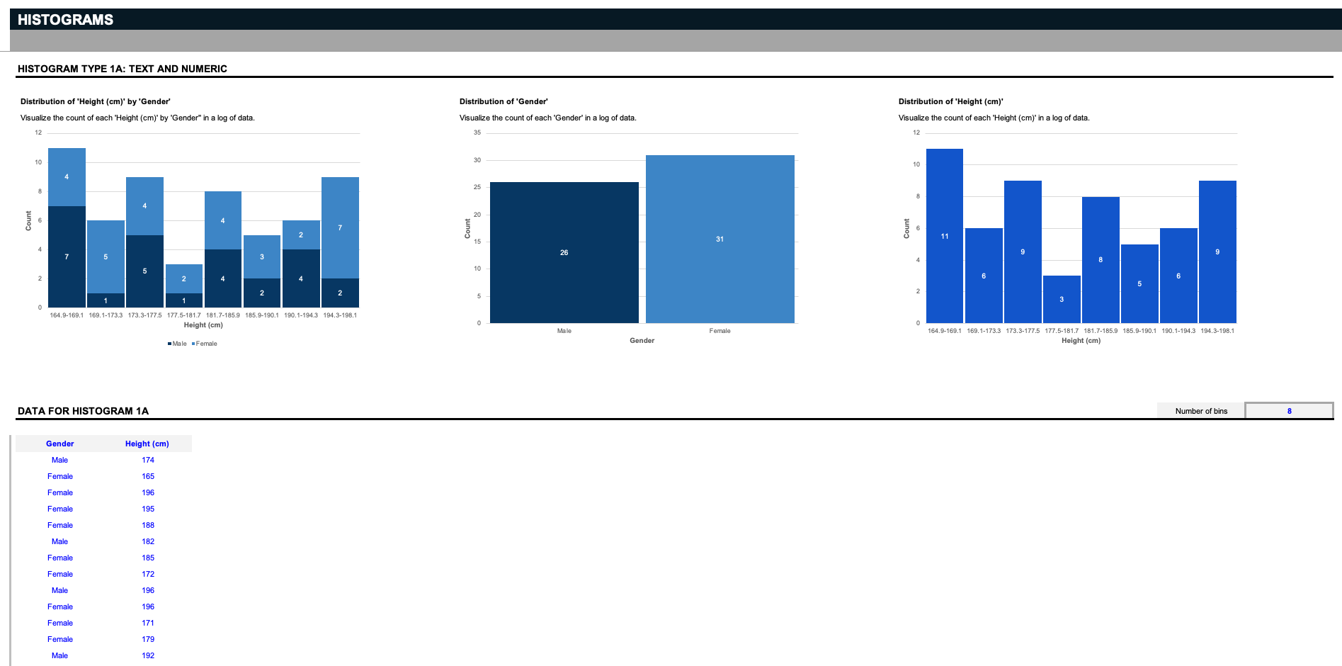
सबसे पहले है हिस्टोग्राम चार्ट्स। इस स्प्रेडशीट में नौ अद्वितीय हिस्टोग्राम हैं; एक पाठ और एक संख्यात्मक के वितरण का मूल्यांकन करने के लिए तीन... दो पाठ मानों के वितरण का मूल्यांकन करने के लिए तीन... और एक पाठ और तिथि मान के वितरण का मूल्यांकन करने के लिए तीन।
मान लीजिए कि आप एक वैज्ञानिक हैं, और आपके पास एक विशिष्ट लिंग और ऊचाई से संबंधित डेटा की एक सूची है। पहले तीन हिस्टोग्राम हर लिंग द्वारा प्रत्येक ऊचाई की गणना, दोनों लिंगों के वितरण, या सभी ऊचाईयों के वितरण को दर्शाते हैं।लेकिन याद रखें: आप इन इनपुट्स को अपनी इच्छा के अनुसार कस्टमाइज़ कर सकते हैं; मान लीजिए आप एक गोदाम चलाते हैं, और आप चाहते हैं कि आप उनके संबंधित भागों को उनके संबंधित आकारों के आधार पर संगठित करें; नीले रंग में दिए गए इनपुट्स को हटाएं, और उन्हें अपनी विशेषताओं के साथ बदलें. हिस्टोग्राम डेटा को बिन्स कहलाने वाले समूहों में अलग करके काम करते हैं। यहां, हम डेटा को कैसे काटना है, इसका निर्णय करने के लिए एक सरल फ़िल्टर प्रदान करते हैं।
आपको बस यह निर्धारित करना होगा कि आपको कितने बिन्स देखने हैं, और चार्ट्स डेटा को उचित समूहों में काट देंगे। नोट: ध्यान दें कि ये हिस्टोग्राम चार्ट्स केवल बीस अद्वितीय पाठ मानों का समर्थन करते हैं।
[/italic]अब मान लीजिए कि आपके पास एक सूची है - जैसे कि आपके पास लिंग और आँख के रंग के डेटा की एक सूची है, और आप हर लिंग द्वारा प्रत्येक अद्वितीय आँख के रंग का वितरण जानना चाहते हैं। हिस्टोग्राम डेटा को अद्वितीय संख्या के आधार पर बिन्स में विभाजित करते हैं।
अगले हैं खड़े बार चार्ट्स. ये दोनों नमूना डेटासेट्स दोनों संगठन प्रकारों और भूमिकाओं में दो वर्षों के दौरान वेतन में परिवर्तनों का ट्रैक करते हैं, साथ ही साल दर साल कई उत्पाद प्रकारों के लिए बाजार हिस्सेदारी में परिवर्तनों का ट्रैक करते हैं, जैसा कि फ़िल्टर्स द्वारा चुना गया है।
जैसा कि आप देख सकते हैं, दो उत्पादों और उनके संबंधित बाजार हिस्सेदारी लाभ को खड़े बार चार्ट में एक दूसरे के खिलाफ तुलना किया जा सकता है। याद रखें - यह डेटा आपके विशिष्ट उपयोग के मामले से मेल खाने के लिए पूरी तरह से अनुकूलित किया जा सकता है।
अगले हैं परेटो चार्ट, जिनका नाम परेटो सिद्धांत से मिलता है, जो कहता है कि कई परिणामों के लिए, 80% परिणाम 20% कारणों से उत्पन्न होते हैं। यह एक प्राथमिकता उपकरण है जो सबसे महत्वपूर्ण अगले कदम की पहचान में मदद करता है। नमूना डेटासेट में, हमारे पास ग्राहक प्रतिक्रिया परेटो विश्लेषण है जो ग्राहकों के अनसब्सक्राइब होने के विभिन्न कारणों की घटनाओं की गिनती करता है, और उत्पादकता परेटो विश्लेषण है जो कंपनी की उत्पादकता में बाधा डालने वाले मासिक बोतलनेक की संख्या की गिनती करता है।
एक अन्य असामान्य लेकिन सहायक चार्ट प्रकार है बॉक्स और व्हिस्कर चार्ट। इन्हें "स्टॉक चार्ट," के रूप में भी संदर्भित किया जाता है, ये नमूना डेटासेट्स एक निर्दिष्ट स्टॉक की मात्रा, खुला, उच्च, निम्न, और समय के साथ बंद का ट्रैक रखते हैं, लेकिन याद रखें, ये चार्ट आपकी जरूरतों के अनुसार पूरी तरह से अनुकूलित होने के लिए होने चाहिए।
अगले हमारे पास बबल चार्ट्स हैं, जिनमें नमूना डेटासेट्स होते हैं जो कई कंपनियों के बाजार में वर्षों की संख्या द्वारा राजस्व का ट्रैक करते हैं, साथ ही उत्पादों और क्षेत्रों की एक श्रृंखला के लिए बिक्री द्वारा लाभक्षेत्रता का प्रतिशत। इनमें से किसी भी पिछले चार्ट के लिए इस टेम्पलेट में, अगर आपको अधिक डेटा दर्ज करने के लिए अधिक पंक्तियां चाहिए, तो ग्रे बॉर्डरलाइन के ऊपर नई पंक्तियां जोड़ें।
अंत में, स्टैक्ड बार चार्ट्स के समान मरिमेक्को चार्ट्स होते हैं, जिन्हें "मेक्को चार्ट्स,[/EDQ] भी कहा जाता है, समय के साथ स्टोर स्थानों द्वारा संसाधन आवंटन का ट्रैक करने के लिए, और एक उत्पाद पोर्टफोलियो की बिक्री का विभाजन प्रत्येक उत्पाद द्वारा कई क्षेत्रों में।
इन जैसे मरिमेक्को चार्ट्स मूल्यों की तुलना कर सकते हैं, प्रत्येक की संरचना को माप सकते हैं, और कई आयामों में वितरण दिखा सकते हैं। इस डेटासेट में अन्य चार्ट्स के विपरीत, ये चार्ट्स दस पंक्तियों के अद्वितीय प्रविष्टियों का समर्थन करते हैं।
चार्ट्स डेटा दृश्यीकरण और विश्लेषण की जीवनरेखा होते हैं - उनके बिना, अंतर्दृष्टि को विश्लेषित करना कहीं अधिक कठिन हो जाता है। इन सभी चार्ट्स का उपयोग आज करने के लिए, आप इस अंतिम चार्ट्स (भाग 3) स्प्रेडशीट टेम्पलेट को माइक्रोसॉफ्ट एक्सेल या गूगल शीट्स में डाउनलोड और अनुकूलित कर सकते हैं।इसके बाद, हमारे Pricing Strategies स्प्रेडशीट टेम्पलेट की जांच करें जिसमें और अधिक चार्ट्स हैं जो आपकी मदद करेंगे जब आप अपने अगले उत्पाद की कीमत तय करते समय अपने विश्लेषण को विज़ुअलाइज़ करने में।
Download free weekly spreadsheets
Enter your email address to download and customize spreadsheets for free
Not for commercial use
Download 'अंतिम चार्ट्स (भाग 3)' spreadsheet — 11 sheets
+39 more spreadsheets per quarter
that's $3 per spreadsheet
/ Quarterly
Commercial use allowed. View other plans

हमने एक नया संग्रह बनाया है जो अधिक उन्नत और दृश्य रूप से आकर्षक स्प्रेडशीट चार्ट्स का, जो घंटों का समय बचाता है। इस संग्रह में शामिल हैं: बार चार्ट विभिन्नताएं, बिक्री फनल विभिन्नताएं, पाई चार्ट विभिन्नताएं, विश्व मानचित्र, स्टेप चेंज चार्ट्स, विभेद चार्ट्स, स्कैटर चार्ट, और रडार चार्ट्स, सभी आसानी से संपादन योग्य और सुविधाजनक रूप से डाटा इनपुट टेबल्स से जोड़े गए।

हमारे गैंट चार्ट संग्रह के साथ हर परियोजना के हर चरण पर योजना बनाएं, ट्रैक करें, नियंत्रण करें और कार्यों को संवादित करें। अपनी टीम को कार्य सौंपें और खेल की शुरुआती चरण में देरी के प्रभाव की पहचान करें, अपनी टीम के समन्वय को बेहतर बनाएं, मील के पत्थरों की निगरानी करें और सुनिश्चित करें कि आपकी टीम की कार्यप्रवाह और प्रदान करने योग्य वस्त्र हमेशा एक अच्छी तरह से तेल लगाए गए मशीन की तरह चलते रहें।

Need new charts and graphs for hard-to-visualize situations? Enter your data into fully customizable sunburst charts, heat maps, bullet charts to visualize top KPIs, thermometer charts, three and four-circle Venn diagrams, filterable bell curves, milestone charts, and combo charts with this Ultimate Charts collection.

क्या आपको एक नई उद्यम या परियोजना के निवेश और पुरस्कार के अवसरों को प्रस्तुत करने की आवश्यकता है? हमारे "अंतिम स्टार्टअप प्रो फॉर्मा" मॉडल का उपयोग करके एक नई प्रस्ताव को प्रदर्शित करें और इसकी लागत, राजस्व, और किस बिंदु पर नकद प्रवाह सकारात्मक होंगे और महत्वपूर्ण "ब्रेक-ईवन बिंदु" तक पहुंचेंगे।

क्या आपने कभी एलन मस्क की तरह एक प्रोजेक्ट चलाने की इच्छा की है? गोल्डमन सैक्स के वित्तीय विश्लेषक की तरह प्रोजेक्ट की सफलता का अनुमान लगाने की क्षमता के बारे में क्या कहना? यहां शुरुआत से ही सफलता सुनिश्चित करने के लिए अंतिम प्रोजेक्ट प्रबंधन उपकरण उपलब्ध हैं। आपको एक प्रोजेक्ट की IRR की गणना करने, जोखिम मूल्यांकन के लिए मोंटे-कार्लो विश्लेषण करने, RACI मैट्रिक्स के साथ टीमों का प्रबंधन, प्रोजेक्ट चार्टर प्रस्तुत करने, डैशबोर्ड और गैंट चार्ट्स के साथ प्रगति का ट्रैक करने, और इसे सभी को फिर से, लेकिन बेहतर, पोस्ट मॉर्टम सर्वेक्षण के साथ करने का ज्ञान प्राप्त होगा।

आप अपने व्यापार योजना को आगे बढ़ाने के लिए संसाधन और समर्थन कैसे प्राप्त करते हैं? ग्राहकों के दर्द बिंदुओं को हल करने वाले एक शानदार विचार के अलावा, एक मजबूत निवेशक पिच डेक आपको सौदा सील करने में मदद कर सकता है। हमारे नवीनतम अंतिम पिच डेक (भाग 3) का उपयोग करें और अपनी कहानी सुनाएं और अपने दृष्टिकोण को सर्वश्रेष्ठ संभव प्रवाह में संचार करें और आपको आवश्यक फंडिंग के करीब ले जाएं।

क्या ऋण चुकतानी भ्रामक और जटिल हैं जिन्हें ट्रैक रखना है? हमारे अंतिम ऋण स्प्रेडशीट का उपयोग करें और अनुमान लगाएं कि एक ऋण का कितना मूलधन बकाया है। इस स्प्रेडशीट का उपयोग करें: घर, कार, छात्र और वाणिज्यिक ऋणों का विश्लेषण करने के लिए। साथ ही, विचार करें कि क्या ऋण का पुनर्वितरण एक लाभ है। बोनस के रूप में, ऋण अमॉर्टाइजेशन ग्राफ विशिष्ट ऋण अमॉर्टाइजेशन अनुसूची को दर्शाते हैं।

क्या आपको शीर्ष KPIs का विश्लेषण और रिपोर्ट करने के लिए बेहतर दृश्यीकरण की आवश्यकता है? इन KPI चार्ट्स का उपयोग करें जिसमें आप एक मिलियन तक की कच्ची डेटा पंक्तियाँ दर्ज कर सकते हैं। फिर एक उपसेट को देखने और बोर्ड स्वचालित रूप से पूर्वनिर्मित चार्ट्स उत्पन्न करता है जिससे डेटा का विश्लेषण और रिपोर्ट के लिए दृश्यीकरण किया जा सकता है। यह बिक्री डेटा, बग या मुद्दों का डेटा, एक परियोजना की कार्य-सूची, लागू करने के लिए सुविधाएं, या यहां तक कि स्टॉक मार्केट विश्लेषण हो सकता है। दो तारीख की श्रेणियों, दो संख्यात्मक मानों, और पांच ड्रॉप-डाउन मानों को पुन: नामकरण करें और अनुकूलित करें जिससे एक दूसरे के खिलाफ फ़िल्टर और तुलना की जा सकती है। फिर विश्लेषण और रिपोर्ट्स के लिए सुंदर KPI चार्ट्स बनाएं।

स्प्रेडशीट विज़ुअलाइज़ेशन से संघर्ष कर रहे हैं? हमारे व्यापक चार्ट्स टेम्पलेट का उपयोग करके समय और काम के घंटों की बचत करें और रिपोर्ट्स और विश्लेषण के लिए सुंदर चार्ट्स और ग्राफ बनाएं। यह टेम्पलेट में आमतौर पर उपयोग किए जाने वाले विभिन्न चार्ट्स के साथ-साथ उत्कृष्ट और त्वरित विज़ुअलाइज़ेशन के लिए डैशबोर्ड्स शामिल हैं।

अपने प्रस्तुतियों को उन क्षेत्रों के विस्तृत मानचित्रों के साथ सुधारें जिनमें आपका व्यापार शामिल है। दुनिया भर के सैकड़ों देशों के मानचित्रों के साथ, महाद्वीपों द्वारा संगठित, आप अपने बाजार के लिए महत्वपूर्ण क्या है उसे हाइलाइट कर सकते हैं और यहां तक कि अपने भविष्य के विस्तार को विज़ुअलाइज़ कर सकते हैं।

Need to create map charts in Excel or Google Sheets? Our Ultimate World Map Collection includes a filterable world map chart, filterable map charts for each major continent, including North America, South America, Asia, Europe, Africa, and Oceania, and a filterable map chart for the United States, which on Excel can be customized to any country.

अपने कर्मचारियों को सिंक करने और उत्पादकता बढ़ाने के लिए अंतिम गैंट संग्रह स्प्रेडशीट डाउनलोड करें। संग्रह में चार प्रकार के गैंट चार्ट्स शामिल हैं। पहले दो उपकरण कार्य और कर्मचारी द्वारा आयोजित परियोजना-आधारित गैंट चार्ट्स हैं। तीसरा उपकरण एक गैंट चार्ट है जिसका उपयोग आरक्षण अनुसूचित करने के लिए किया जाता है। चौथा उपकरण एक गैंट चार्ट है जिसका उपयोग इन्वेंटरी उपयोग और लागतों को ट्रैक करने के लिए किया जाता है।