resource preview
resource preview
resource preview
resource preview
resource preview
resource preview
resource preview
resource preview
resource preview
resource preview
resource preview
resource preview

Download and customize this and 500+ other business templates

Start here ⬇️

Voila! You can now download this Spreadsheet

Download

Explainer

Preview

Zusammenfassung

Müssen Sie Ihre Daten visualisieren? Wir haben diese neue Ultimative Diagramme (Teil 3) Tabellenvorlage in Excel und Google Sheets erstellt, die Sie herunterladen und an Ihre Bedürfnisse anpassen können. Sie enthält anpassbare Marimekko-Diagramme zur Visualisierung der Ressourcenverteilung oder eines Produktportfolios, Blasendiagramme zur Analyse der Marktgröße und des Umsatzes, Pareto-Diagramme zur Bewertung der Produktivität und des Kundenfeedbacks, Box- und Whisker-Diagramme für die Aktienanalyse, vertikale Balkendiagramme zur Visualisierung von Veränderungen im Laufe der Zeit und Histogramme zur Visualisierung der Verteilung von Zahlen, eindeutigen Werten und Datumsbereichen.

stars icon
43 questions and answers
info icon

There are several ways to analyze customer feedback. You can use sentiment analysis to understand the emotions behind the feedback. Text analytics can be used to identify common themes or topics. You can also use customer feedback to create a Net Promoter Score (NPS) which measures customer loyalty. Additionally, you can use customer journey mapping to understand the overall experience of your customers. Finally, you can use data visualization tools to identify trends and patterns in the feedback.

In addition to box and whisker charts, other ways to visualize stock analysis could include line charts to track stock prices over time, candlestick charts to provide detailed information about price movements within a specific time period, volume bars to show the number of shares traded during a certain period, moving average lines to show stock price trends over a specific period, and Bollinger Bands to provide a relative definition of high and low prices.

These charts can be used in market analysis in various ways. Marimekko charts can be used to visualize resource allocation or a product portfolio. Bubble charts can be used to analyze market size and sales revenue. Pareto charts can be used to assess productivity and customer feedback. Box and whisker charts can be used for stock analysis. Vertical bar charts can be used to visualize changes over time. Histogram charts can be used to visualize the distribution of numbers, unique values, and date ranges.

View all 43 questions
stars icon Ask follow up

Histogramme

Zuerst kommen die Histogramme. In dieser Tabelle gibt es neun einzigartige Histogramme; drei zur Beurteilung der Verteilung eines Textes und einer Zahl... Drei zur Beurteilung der Verteilung von zwei Textwerten... und drei zur Beurteilung der Verteilung eines Textes und eines Datums.

resource image
resource image

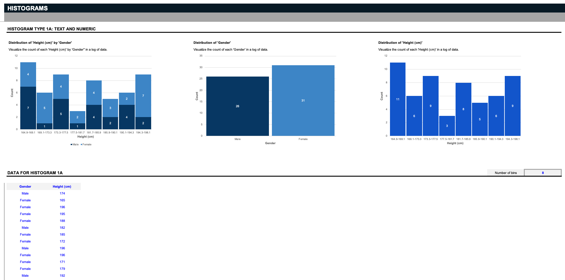
Angenommen, Sie sind Wissenschaftler und haben eine Liste von Daten, die ein bestimmtes Geschlecht und eine bestimmte Größe betreffen. Die ersten drei Histogramme visualisieren die Anzahl jeder Größe nach Geschlecht, die Verteilung der beiden Geschlechter oder die Verteilung aller Größen.Aber denken Sie daran: Diese Eingaben können nach Belieben angepasst werden; sagen wir, Sie betreiben ein Lagerhaus und möchten verwandte Teile nach ihren jeweiligen Größen organisieren; löschen Sie die blauen Eingaben und ersetzen Sie sie durch Ihre Spezifikationen. Histogramme funktionieren, indem sie Daten in Gruppierungen, sogenannte Bins, unterteilen. Hier bieten wir einen einfachen Filter an, um zu entscheiden, wie die Daten geschnitten werden sollen.

stars icon
43 questions and answers
info icon

Key considerations when deciding how to slice data in a histogram include understanding the nature of the data, the distribution of the data, and the specific information you want to extract from the data. It's also important to consider the size and range of the bins, as these can significantly impact the visualization and interpretation of the data.

Apart from the standard method of slicing data in histograms by separating them into bins, you can also customize the inputs to slice data based on specific criteria. For instance, in a warehouse setting, you could organize parts by their respective sizes. Additionally, you can use filters to decide how to slice the data.

Histograms can be used to visualize the count of each height by gender by separating the data into groupings called bins. Each bin represents a range of heights, and the count of individuals within each bin is represented by the height of the bar. This allows for a visual representation of the distribution of heights within each gender.

View all 43 questions
stars icon Ask follow up
resource image

Sie müssen nur definieren, wie viele Bins Sie sehen möchten, und die Diagramme teilen die Daten in die entsprechenden Gruppierungen auf. Hinweis: Beachten Sie, dass diese Histogramm-Diagramme nur bis zu zwanzig eindeutige Textwerte unterstützen.

resource image

Nehmen wir an, Sie haben eine Liste von Werten - wie eine Liste von Daten über Geschlechter und Augenfarben, und Sie möchten die Verteilung jeder einzigartigen Augenfarbe nach Geschlecht ermitteln. Die Histogramme teilen die Daten in Bins auf, basierend auf der Anzahl der Einzigartigen.

Vertikale Balkendiagramme

Als nächstes kommen die Vertikalen Balkendiagramme. Diese beiden Beispieldatensätze verfolgen Gehaltsänderungen über zwei Jahre hinweg in verschiedenen Organisationstypen und Rollen sowie Veränderungen im Marktanteil von Jahr zu Jahr für verschiedene Produkttypen, wie sie von den Filtern ausgewählt wurden.

stars icon Ask follow up
resource image
resource image

Wie Sie sehen können, können zwei Produkte und ihre jeweiligen Marktanteilsgewinne in den vertikalen Balkendiagrammen miteinander verglichen werden. Denken Sie daran - diese Daten können vollständig an Ihren spezifischen Anwendungsfall angepasst werden.

Pareto-Diagramme

Als nächstes kommen die Pareto-Diagramme, die ihren Namen von dem Pareto-Prinzip haben, das besagt, dass bei vielen Ergebnissen 80% der Folgen von 20% der Ursachen herrühren. Dies ist ein Priorisierungswerkzeug, um den wichtigsten nächsten Schritt zu identifizieren. In den Beispieldatensätzen haben wir eine Pareto-Analyse des Kundenfeedbacks, die die Häufigkeit der verschiedenen Gründe zählt, warum Kunden sich abmelden, und eine Pareto-Analyse der Produktivität, die die Anzahl der monatlichen Engpässe zählt, die die Produktivität des Unternehmens unterbrechen.

stars icon
33 questions and answers
info icon

Pareto charts can be used in strategic planning in various ways. They can help identify the most significant factors in a set of data. For instance, they can be used to prioritize problems or causes in order to take corrective action. They can also be used to highlight the most important factors in a process, project, or product. This can help in focusing on areas that could provide the greatest improvement. They can also be used to compare the before and after effects of changes made in a process or system.

Pareto charts can be used in various ways for process improvement. They can be used to identify and prioritize problem areas in a process, as they visually display which factors are more significant. They can also be used to analyze data collected from different sources to identify patterns of problems or areas for improvement. Additionally, Pareto charts can be used to monitor the effectiveness of process improvement measures by tracking changes in the relative frequency of identified issues over time.

Pareto charts can be used in various ways for problem-solving. They can be used to identify the most common sources of defects, the highest occurring type of defect, or the most frequent reasons for customer complaints. They can also be used to identify the most significant overall factor in a set of data. Other uses include analyzing data collected from different sources to see patterns of similarity and difference, and identifying opportunities for improvement.

View all 33 questions
stars icon Ask follow up
resource image
resource image

Box-und-Whisker-Diagramme

Ein weiterer ungewöhnlicher, aber hilfreicher Diagrammtyp ist das Box-und-Whisker-Diagramm. Auch als "Aktiencharts," bezeichnet, verfolgen diese Beispieldatensätze das Volumen, den Eröffnungs-, Höchst-, Tiefst- und Schlusskurs einer bestimmten Aktie über die Zeit, aber denken Sie daran, dass diese Diagramme vollständig an Ihre Bedürfnisse angepasst werden sollen.

stars icon Ask follow up
resource image

Blasendiagramme

Als nächstes kommen Blasendiagramme, mit Beispieldatensätzen zur Verfolgung des Umsatzes nach Anzahl der Jahre auf dem Markt mehrerer Unternehmen, sowie des Prozentsatzes der Rentabilität nach Verkäufen für eine Reihe von Produkten und Regionen. Für diese oder eine der vorherigen Diagramme in dieser Vorlage, wenn Sie mehr Zeilen benötigen, um mehr Daten einzugeben, fügen Sie neue Zeilen oberhalb der grauen Grenzlinie hinzu.

stars icon
27 questions and answers
info icon

To add more data to these chart templates, you need to add new rows above the gray borderline.

Bubble charts can be used to track product profitability by representing three dimensions of data. Each entity with its triplet (v1, v2, v3) of associated data is plotted as a disk that expresses two of the vi values through the disk's xy location and the third through its size. For example, in the context of product profitability, the x-axis could represent the number of years in the market, the y-axis could represent the revenue, and the size of the bubble could represent the percent of profitability by sales. This allows for a visual representation of the product's performance in the market.

Bubble charts can be used to visualize a wide range of data. They are particularly useful when data sets have three dimensions: each entity with its triplet (v1, v2, v3) of associated data is plotted as a disk that expresses two of the vi values through the disk's xy location and the third through its size. For example, they can be used to compare and show the relationships between categorized circles, by the use of positioning and proportions. Some examples of data that can be visualized using bubble charts include economic data, poll results, market research results, and population data among others.

View all 27 questions
stars icon Ask follow up
resource image

Marimekko-Diagramme

Schließlich, ähnlich wie gestapelte Balkendiagramme, sind Marimekko-Diagramme, auch bekannt als "mekko Diagramme,[/EDQ] zur Verfolgung sowohl der Ressourcenverteilung nach Geschäftsstandorten über die Zeit, als auch der Aufschlüsselung des Produktportfolioverkaufs nach jedem Produkt über mehrere Regionen.

stars icon Ask follow up
resource image

Marimekko-Diagramme wie diese können Werte vergleichen, die Zusammensetzung jedes einzelnen messen und die Verteilung über mehrere Dimensionen anzeigen. Im Gegensatz zu anderen Diagrammen in diesem Datensatz unterstützen diese Diagramme bis zu zehn Zeilen einzigartiger Einträge.

Diagramme sind das Lebenselixier der Datenvisualisierung und -analyse - ohne sie werden Erkenntnisse viel schwieriger zu analysieren. Um all diese Diagramme heute zu nutzen, können Sie diese Ultimative Diagramme (Teil 3) Tabellenvorlage in Microsoft Excel oder Google Tabellen sofort herunterladen und anpassen.Danach sollten Sie unsere Pricing Strategies Tabellenvorlage für weitere Diagramme überprüfen, die Ihnen helfen, Ihre Analyse zu visualisieren, während Sie Ihr nächstes Produkt kalkulieren.

stars icon Ask follow up

Download and customize this and 500+ other business templates

Start here ⬇️

Voila! You can now download this Spreadsheet

Download