

Synopsis
Need to visualize your data? We've created this new Ultimate Charts (Part 3) spreadsheet template in Excel and Google Sheets that you can download and customize to your needs. It includes customizable marimekko charts to visualize resource allocation or a product portfolio, bubble charts to analyze market size and sales revenue, Pareto charts to assess productivity and customer feedback, box and whisker charts for stock analysis, vertical bar charts to visualize changes over time, and histogram charts to visualize the distribution of numbers, unique values, and date ranges.
Histogram charts
First up is the Histogram charts. There are nine unique histograms in this spreadsheet; three to assess the distribution of a text and a numeric… Three to assess the distribution of two text values… and three to assess the distribution of a text and date value.

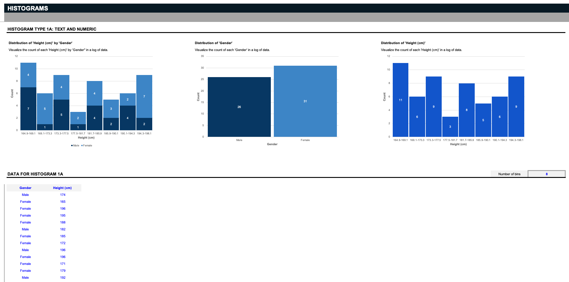
Say you're a scientist, and you have a list of data that involves a specific gender and height. The first three histograms visualize the count of each height by gender, the distribution of the two genders, or the distribution of all the heights. But remember: these inputs can be customized to anything you want; say you run a warehouse, and you want to organize related parts by their respective sizes; delete the inputs in blue, and replace them with your specifications. Histograms work by separating data into groupings called bins. Here, we provide a simple filter to decide how to slice the data.

All you have to do is define how many bins you want to see, and the charts will slice the data into the appropriate groupings. Note: keep in mind that these histogram charts only support up to twenty unique text values.
[/italic]
Now say you have a list of values - like you have a list of data of genders and eye color, and you want to find the distribution of each unique eye color by each gender. The histograms divide the data into bins based on the number of unique.
Vertical bar charts
Next up are Vertical bar charts. These two sample datasets track salary changes over two years across both organization types and roles, as well as changes in Market Share from year to year for multiple product types as selected by the filters.


As you can see, two products and their respective market share gain can be compared against one another in the vertical bars charts. Remember - this data can be fully customized to match your specific use case.
Pareto charts
Next up are Pareto charts, which get their name from the Pareto principle, which states that for many outcomes, 80% of the consequences stem from 20% of the causes. This is a prioritization tool to help identify the most important next step. In the sample datasets, we have a customer feedback Pareto analysis that counts the occurrences of different reasons customers unsubscribe, and a productivity Pareto analysis that counts the number of monthly bottlenecks that interrupt company productivity.


Box and whisker charts
Another uncommon but helpful chart type is the Box and whisker chart. Also referred to as "stock charts," these sample datasets track the volume, open, high, low, and close of a given stock over time, but remember, these charts are meant to be fully customized to your needs.

Bubble charts
Next up are Bubble charts, with sample datasets to track revenue by number of years in the market of multiple companies, as well as the percent of profitability by sales for a series of products and regions. For these or any of the previous charts in this template, if you need more rows to enter more data, add new rows above the gray borderline.

Marimekko charts
Finally, similar to stacked bar charts are Marimekko charts, also known as "mekko charts," to track both resource allocation by store locations over time, and the breakdown of a product portfolio's sales by each product across multiple regions.

Marimekko charts like these can compare values, measure each one's composition, and show the distribution across multiple dimensions. Unlike other charts in this dataset, these charts support up to ten rows of unique entries.
Charts are the lifeblood of data visualization and analysis - without them, insights become much harder to dissect. To use all these charts today, you can download and customize this Ultimate Charts (Part 3) spreadsheet template in Microsoft Excel or Google sheets right now. After that, go check out our [related bracelet="pricesheet"] spreadsheet template for more charts to help you visualize your analysis as you price your next product.


