resource preview
resource preview
resource preview
resource preview
resource preview
resource preview
resource preview
resource preview
resource preview
resource preview
resource preview
resource preview
resource preview
resource preview
resource preview
resource preview
resource preview
resource preview
resource preview
resource preview
resource preview
resource preview
resource preview
resource preview
resource preview
resource preview
resource preview
resource preview
resource preview
resource preview
resource preview
resource preview
resource preview
resource preview
resource preview

Download and customize this and 500+ other business templates

Start here ⬇️

Voila! You can now download this Presentation

Download

Preview

Synopsis

En visualisant les données, cela aide à susciter de nouvelles idées. Cependant, plus de 63% du temps passé à développer des présentations visuelles est gaspillé juste pour concevoir des graphiques et finaliser leurs mises en page. Économisez votre ressource la plus précieuse avec notre Collection de Graphiques (Partie 2), qui comprend des graphiques, des graphiques, des cartes de données et des visualisations préconçus qui sont faciles à utiliser, entièrement personnalisables et prêts à raconter votre histoire.

stars icon
25 questions and answers
info icon

Some future trends in the field of data visualization and presentation could include the increased use of AI and machine learning to automate the creation of visualizations, the development of more interactive and immersive visualizations through technologies like VR and AR, and the rise of data storytelling where data is presented in a narrative format to make it more engaging and understandable. There might also be a greater emphasis on real-time data visualization as the demand for up-to-the-minute information grows.

The use of pre-designed charts and graphs can significantly influence the audience's perception of the presented data. They provide a visual representation of data, making it easier for the audience to understand complex information. They can highlight trends, patterns, and outliers, making the data more digestible. Moreover, well-designed charts and graphs can enhance the credibility of the presentation, as they show a level of professionalism and attention to detail. However, it's important to choose the right type of chart or graph that accurately represents the data, to avoid misleading the audience.

Some effective strategies for telling a story through visual presentations include using pre-designed charts, graphs, data maps, and visualizations that are easy to use and fully customizable. It's also important to ensure that the visuals are relevant to the story you're telling and that they help to enhance the narrative rather than distract from it. Additionally, spending time on designing and finalizing the layout of your presentation can help to make it more engaging and effective.

View all 25 questions
stars icon Ask follow up

Download and customize this and 500+ other business templates

Start here ⬇️

Voila! You can now download this Presentation

Download

Points forts de la diapositive

Utilisez ce graphique Croissance des revenus régionaux pour décomposer les objectifs de revenus par emplacements ou marchés sur plusieurs années. Tracez les revenus à travers les produits existants, ceux en développement et ceux pas encore développés.

resource image

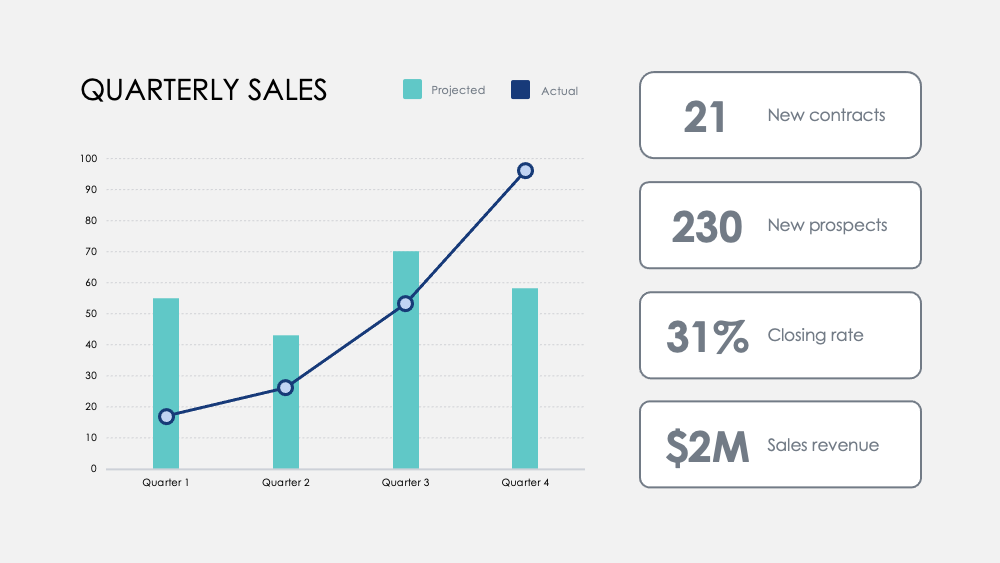
Mettez en évidence les jalons avec ce graphique des chiffres mensuels. Suivez les métriques à travers les trimestres et ajoutez des objectifs trimestriels optionnels pour visualiser comment une concentration sur certaines activités influence vos données de revenus.

resource image

Comparez les forces et les faiblesses entre les caractéristiques des produits avec ce graphique Comparaison de produits. Visualisez les données des enquêtes clients et superposez deux ou trois produits pour les peser les uns contre les autres.

resource image
stars icon
25 questions and answers
info icon

There are several ways to visualize and compare business metrics. Some of them include using a dashboard to display key performance indicators (KPIs), using a scatter plot to compare two variables, using a bar chart to compare different categories, using a line chart to show trends over time, using a pie chart to show proportions, and using a heat map to show patterns or correlations. Additionally, you can use a histogram to show frequency distributions, a box plot to show the distribution of data, and a bubble chart to compare three variables.

These charts can be used to influence business strategy in several ways. The Regional Revenue Growth chart can be used to set and track revenue goals across different locations or markets, which can help in making strategic decisions about where to focus resources. The Monthly Numbers chart can be used to track metrics and set quarterly goals, which can provide insights into how focusing on certain activities influences revenue. The Product Comparison chart can be used to compare the strengths and weaknesses of different product features, which can inform product development and marketing strategies.

There are several ways to visualize and track business goals. One can use a Balanced Scorecard which is a strategic planning and management system used to align business activities to the vision and strategy of the organization. Another method is using Key Performance Indicators (KPIs) which are measurable values that demonstrate how effectively a company is achieving key business objectives. Businesses use KPIs at multiple levels to evaluate their success at reaching targets. Also, one can use a Gantt chart which is a type of bar chart that illustrates a project schedule. Gantt charts illustrate the start and finish dates of the terminal elements and summary elements of a project.

View all 25 questions
stars icon Ask follow up

Résultat

Notre cerveau traite les informations visuelles 60 000 fois plus rapidement que le texte. La durée moyenne des réunions a diminué à 30 minutes ou moins en 2020. La visualisation des données rapide et précise est plus importante que jamais pour communiquer efficacement les idées.

Une meilleure visualisation des données aide également à rendre l'histoire de votre entreprise plus engageante et persuasive. Cela aide votre équipe à comprendre et à identifier les tendances plus rapidement, permet des décisions rapides en réponse aux modèles, capitalise sur les succès, ou se réinvente rapidement pour améliorer ou changer de cap.

stars icon Ask follow up
resource image

Download and customize this and 500+ other business templates

Start here ⬇️

Voila! You can now download this Presentation

Download

Application

Voici quelques utilisations suggérées pour les graphiques dans le cadre de cette collection. Comme toujours, vous pouvez personnaliser ces utilisations et adapter ces diapositives de n'importe quelle manière pour présenter vos propres chiffres.

  • Analyse concurrentielle : comparez le chiffre d'affaires de votre entreprise, les nouveaux abonnés et les clients moyens à ceux de vos concurrents. Visualisez le paysage concurrentiel et analysez le chiffre d'affaires brut de votre rival par trimestre par rapport au vôtre.
  • Avantages du département et du produit : Corrélez le succès du département à travers les activités clés et mesurez les contributions à son succès global. Contrastez les avantages du produit avec une analyse visuelle simple.
  • Retour d'information des utilisateurs : Enquêtez auprès des utilisateurs et visualisez les découvertes clés pour savoir comment vos clients perçoivent vos produits et services.
  • Distribution des clients : Découvrez les données démographiques des clients avec les données de vente pour visualiser vos marchés clés.
  • Revenu : Suivez le chiffre d'affaires à travers de nouveaux comptes, projets ou partenariats. Suivez les marges à travers les produits et comparez les revenus à travers les années pour découvrir les augmentations de croissance les plus significatives et les baisses de revenus.
  • Treemap : Comparez les relations entre les entreprises dans une hiérarchie ramifiée et visualisez les ratios par échelle.
  • Comparaison d'options : Pesez les mouvements commerciaux potentiels et le coût de ces actions pour optimiser votre prise de décision.
stars icon
25 questions and answers
info icon

Some other ways to visualize ratios by scale include using bar graphs, pie charts, scatter plots, and line graphs. These visualizations can help to compare different data points and understand the relationship between them. For example, a bar graph can be used to compare the ratios of different categories, a pie chart can show the proportion of each category in a whole, a scatter plot can show the correlation between two variables, and a line graph can show the trend of a variable over time.

Ratios can be visualized by scale using various methods. One common method is using a treemap. A treemap is a type of diagram that displays hierarchical data as a set of nested rectangles. Each branch of the tree is given a rectangle, which is then tiled with smaller rectangles representing sub-branches. The size of the rectangles can be proportional to a specific dimension of the data, effectively visualizing the ratios by scale.

You can discover the most significant growth increases and revenue drops by tracking revenue across new accounts, projects, or partnerships. Also, track margins across products and compare revenues across years. This will help you identify the areas where there has been significant growth or drop in revenue.

View all 25 questions
stars icon Ask follow up
resource image
resource image

Mise en œuvre

Lorsque vous présentez des données, vous racontez une histoire. Selon la professeure de Stanford Jennifer L. Aaker, les histoires sont les plus optimales lorsqu'elles sont mémorables, impactantes et personnelles.

Présentez votre entreprise à un public. Résumez un rapport plus approfondi pour votre équipe. Fournissez des données critiques pour que vos managers puissent agir. Partagez de nouvelles possibilités pour le développement de produits. Partagez le potentiel de croissance et la vision à long terme avec des investisseurs potentiels. Racontez l'histoire qui façonnera l'avenir de votre entreprise.

stars icon
23 questions and answers
info icon

Some other ways to share a company's growth potential could include hosting investor meetings, publishing annual reports, utilizing social media platforms for updates, creating a section on the company's website dedicated to growth and future plans, and engaging in community outreach programs.

Some other ways to share a company's long-term vision could include hosting town hall meetings, creating a vision statement and sharing it on the company's website and social media platforms, incorporating the vision into employee training and development programs, and discussing it in press releases and media interviews.

Some other ways to provide data for managers to act on could include conducting surveys or polls, utilizing data analytics tools, implementing feedback systems, or conducting market research. These methods can provide valuable insights and data that managers can use to make informed decisions.

View all 23 questions
stars icon Ask follow up

Pour plus de ressources pour vous faire gagner du temps, consultez notre Charts Collection (Part 1), ainsi que notre Graphiques Ultime (Partie 1) et Ultimate Charts (Part 2)

Download and customize this and 500+ other business templates

Start here ⬇️

Voila! You can now download this Presentation

Download