resource preview
resource preview
resource preview
resource preview
resource preview
resource preview
resource preview
resource preview
resource preview
resource preview
resource preview
resource preview
resource preview
resource preview
resource preview
resource preview
resource preview
resource preview
resource preview
resource preview
resource preview
resource preview
resource preview
resource preview
resource preview
resource preview
resource preview
resource preview
resource preview
resource preview
resource preview
resource preview
resource preview
resource preview
resource preview

Download and customize this and 500+ other business templates

Start here ⬇️

Voila! You can now download this Presentation

Download

Preview

Sinossi

Mentre visualizziamo i dati, ciò aiuta a generare nuove idee. Ma oltre il 63% del tempo speso nello sviluppo di presentazioni visive viene sprecato solo per progettare grafici e finalizzare i loro layout. Risparmia la tua risorsa più preziosa con il nostro Collezione di Grafici (Parte 2), che include grafici pre-progettati, mappe di dati e visualizzazioni che sono facili da usare, completamente personalizzabili e pronte a raccontare la tua storia.

stars icon
25 questions and answers
info icon

Some future trends in the field of data visualization and presentation could include the increased use of AI and machine learning to automate the creation of visualizations, the development of more interactive and immersive visualizations through technologies like VR and AR, and the rise of data storytelling where data is presented in a narrative format to make it more engaging and understandable. There might also be a greater emphasis on real-time data visualization as the demand for up-to-the-minute information grows.

The use of pre-designed charts and graphs can significantly influence the audience's perception of the presented data. They provide a visual representation of data, making it easier for the audience to understand complex information. They can highlight trends, patterns, and outliers, making the data more digestible. Moreover, well-designed charts and graphs can enhance the credibility of the presentation, as they show a level of professionalism and attention to detail. However, it's important to choose the right type of chart or graph that accurately represents the data, to avoid misleading the audience.

Some effective strategies for telling a story through visual presentations include using pre-designed charts, graphs, data maps, and visualizations that are easy to use and fully customizable. It's also important to ensure that the visuals are relevant to the story you're telling and that they help to enhance the narrative rather than distract from it. Additionally, spending time on designing and finalizing the layout of your presentation can help to make it more engaging and effective.

View all 25 questions
stars icon Ask follow up

Download and customize this and 500+ other business templates

Start here ⬇️

Voila! You can now download this Presentation

Download

Punti salienti della diapositiva

Utilizza questo grafico Crescita del fatturato regionale per suddividere gli obiettivi di fatturato per località o mercati nel corso di più anni. Grafica i ricavi attraverso i prodotti esistenti, quelli in sviluppo e quelli non ancora sviluppati.

resource image

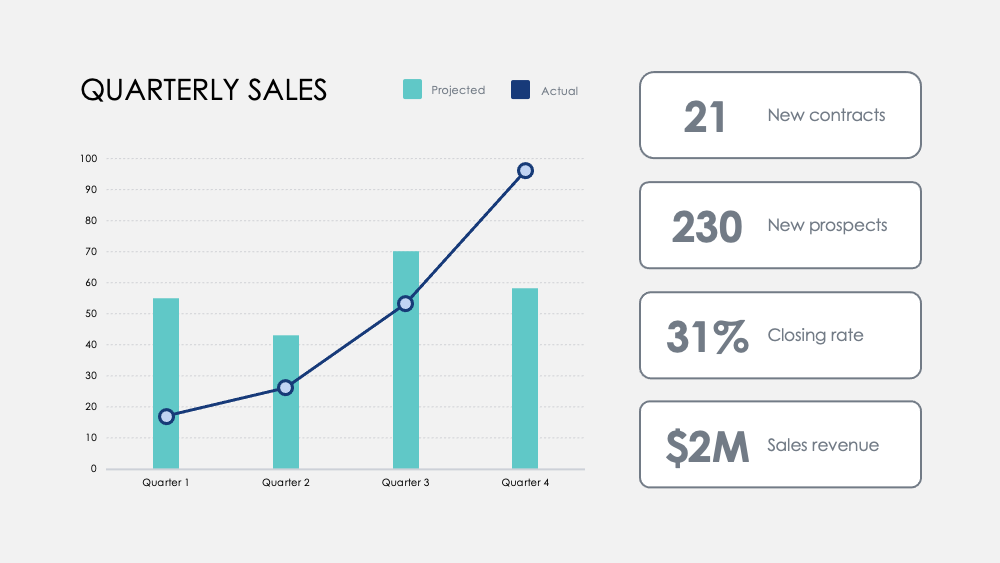
Evidenzia le pietre miliari con questo grafico dei numeri mensili. Traccia le metriche nel corso dei trimestri e aggiungi obiettivi trimestrali opzionali per visualizzare come un focus su determinate attività influisce sui tuoi dati di fatturato.

resource image

Confronta i punti di forza e di debolezza tra le caratteristiche del prodotto con questo grafico Confronto prodotti. Visualizza i dati dei sondaggi dei clienti e sovrappone due o tre prodotti per confrontarli tra loro.

resource image
stars icon
25 questions and answers
info icon

There are several ways to visualize and compare business metrics. Some of them include using a dashboard to display key performance indicators (KPIs), using a scatter plot to compare two variables, using a bar chart to compare different categories, using a line chart to show trends over time, using a pie chart to show proportions, and using a heat map to show patterns or correlations. Additionally, you can use a histogram to show frequency distributions, a box plot to show the distribution of data, and a bubble chart to compare three variables.

These charts can be used to influence business strategy in several ways. The Regional Revenue Growth chart can be used to set and track revenue goals across different locations or markets, which can help in making strategic decisions about where to focus resources. The Monthly Numbers chart can be used to track metrics and set quarterly goals, which can provide insights into how focusing on certain activities influences revenue. The Product Comparison chart can be used to compare the strengths and weaknesses of different product features, which can inform product development and marketing strategies.

There are several ways to visualize and track business goals. One can use a Balanced Scorecard which is a strategic planning and management system used to align business activities to the vision and strategy of the organization. Another method is using Key Performance Indicators (KPIs) which are measurable values that demonstrate how effectively a company is achieving key business objectives. Businesses use KPIs at multiple levels to evaluate their success at reaching targets. Also, one can use a Gantt chart which is a type of bar chart that illustrates a project schedule. Gantt charts illustrate the start and finish dates of the terminal elements and summary elements of a project.

View all 25 questions
stars icon Ask follow up

Risultato

Il nostro cervello elabora le informazioni visive 60.000 volte più velocemente del testo. La durata media delle riunioni si è ridotta a 30 minuti o meno nel 2020. La visualizzazione dei dati rapida e al punto è più importante che mai per comunicare le idee in modo efficiente.

Una migliore visualizzazione dei dati aiuta anche a rendere la storia della tua azienda più coinvolgente e persuasiva. Questo aiuta il tuo team a capire e identificare le tendenze più velocemente, consente decisioni rapide in risposta ai modelli, capitalizza i successi o si reinventa rapidamente per migliorare o cambiare rotta.

stars icon Ask follow up
resource image

Download and customize this and 500+ other business templates

Start here ⬇️

Voila! You can now download this Presentation

Download

Applicazione

Ecco alcuni suggerimenti di utilizzo dei Grafici come parte di questa collezione. Come sempre, puoi personalizzare questi usi e adattare queste diapositive in qualsiasi modo per presentare i tuoi numeri.

  • Analisi competitiva: confronta il fatturato della tua azienda, i nuovi abbonati e i clienti medi con la tua concorrenza. Visualizza il panorama competitivo e analizza il fatturato lordo del tuo rivale per trimestre rispetto al tuo.
  • Vantaggi del dipartimento e del prodotto: Correla il successo del dipartimento attraverso le attività chiave e misura i contributi al suo successo complessivo. Contrasta i vantaggi del prodotto con un'analisi visiva semplice.
  • Feedback degli utenti: Sondaggio agli utenti e visualizza le scoperte chiave per capire come i tuoi clienti percepiscono i tuoi prodotti e servizi.
  • Distribuzione dei clienti: Scopri la demografia dei clienti con i dati di vendita per visualizzare i tuoi mercati chiave.
  • Entrate: Monitora le entrate attraverso nuovi conti, progetti o partnership.Monitora i margini su vari prodotti e confronta i ricavi negli anni per scoprire le maggiori crescite e le più significative diminuzioni di ricavi.
  • Mappa ad albero: Confronta le relazioni tra le imprese in una gerarchia ramificata e visualizza i rapporti in base alla scala.
  • Confronto delle opzioni: Valuta le potenziali mosse aziendali e il costo di tali azioni per ottimizzare il tuo processo decisionale.
stars icon
25 questions and answers
info icon

Some other ways to visualize ratios by scale include using bar graphs, pie charts, scatter plots, and line graphs. These visualizations can help to compare different data points and understand the relationship between them. For example, a bar graph can be used to compare the ratios of different categories, a pie chart can show the proportion of each category in a whole, a scatter plot can show the correlation between two variables, and a line graph can show the trend of a variable over time.

Ratios can be visualized by scale using various methods. One common method is using a treemap. A treemap is a type of diagram that displays hierarchical data as a set of nested rectangles. Each branch of the tree is given a rectangle, which is then tiled with smaller rectangles representing sub-branches. The size of the rectangles can be proportional to a specific dimension of the data, effectively visualizing the ratios by scale.

You can discover the most significant growth increases and revenue drops by tracking revenue across new accounts, projects, or partnerships. Also, track margins across products and compare revenues across years. This will help you identify the areas where there has been significant growth or drop in revenue.

View all 25 questions
stars icon Ask follow up
resource image
resource image

Implementazione

Quando presenti dati, racconti una storia. Secondo la professoressa di Stanford Jennifer L. Aaker, le storie sono più efficaci quando sono memorabili, impattanti e personali.

Presenta la tua azienda a un pubblico. Riassumi un rapporto più approfondito per il tuo team. Fornisci dati cruciali per i tuoi manager su cui agire. Condividi nuove possibilità per lo sviluppo del prodotto. Condividi il potenziale di crescita e la visione a lungo termine con potenziali investitori. Racconta la storia che plasmerà il futuro della tua azienda.

stars icon
23 questions and answers
info icon

Some other ways to share a company's growth potential could include hosting investor meetings, publishing annual reports, utilizing social media platforms for updates, creating a section on the company's website dedicated to growth and future plans, and engaging in community outreach programs.

Some other ways to share a company's long-term vision could include hosting town hall meetings, creating a vision statement and sharing it on the company's website and social media platforms, incorporating the vision into employee training and development programs, and discussing it in press releases and media interviews.

Some other ways to provide data for managers to act on could include conducting surveys or polls, utilizing data analytics tools, implementing feedback systems, or conducting market research. These methods can provide valuable insights and data that managers can use to make informed decisions.

View all 23 questions
stars icon Ask follow up

Per ulteriori risorse che ti faranno risparmiare tempo, consulta la nostra Charts Collection (Part 1), così come il nostro Grafici definitivi (Parte 1) e Ultimate Charts (Part 2)

Download and customize this and 500+ other business templates

Start here ⬇️

Voila! You can now download this Presentation

Download