resource preview
resource preview
resource preview
resource preview
resource preview
resource preview
resource preview
resource preview
resource preview
resource preview
resource preview
resource preview
resource preview
resource preview
resource preview
resource preview
resource preview
resource preview
resource preview
resource preview
resource preview
resource preview
resource preview
resource preview
resource preview
resource preview
resource preview
resource preview
resource preview
resource preview
resource preview
resource preview
resource preview
resource preview
resource preview

Download and customize this and 500+ other business templates

Start here ⬇️

Voila! You can now download this Presentation

Download

Preview

خلاصه

هنگامی که ما داده ها را تجسم می کنیم، این کمک می کند تا ایده های جدیدی را شعله ور کنیم. اما بیش از 63٪ از زمان صرف شده برای توسعه ارائه های بصری فقط برای طراحی نمودارها و تکمیل طرح های آنها تلف می شود. با مجموعه نمودارها (بخش 2) ما که شامل نمودارها، گراف ها، نقشه های داده و تجسم هایی است که از پیش طراحی شده اند، آسان برای استفاده، قابل سفارشی سازی کامل و آماده برای روایت داستان شما هستند، منابع ارزشمند خود را صرفه جویی کنید.

stars icon
25 questions and answers
info icon

Some future trends in the field of data visualization and presentation could include the increased use of AI and machine learning to automate the creation of visualizations, the development of more interactive and immersive visualizations through technologies like VR and AR, and the rise of data storytelling where data is presented in a narrative format to make it more engaging and understandable. There might also be a greater emphasis on real-time data visualization as the demand for up-to-the-minute information grows.

The use of pre-designed charts and graphs can significantly influence the audience's perception of the presented data. They provide a visual representation of data, making it easier for the audience to understand complex information. They can highlight trends, patterns, and outliers, making the data more digestible. Moreover, well-designed charts and graphs can enhance the credibility of the presentation, as they show a level of professionalism and attention to detail. However, it's important to choose the right type of chart or graph that accurately represents the data, to avoid misleading the audience.

Some effective strategies for telling a story through visual presentations include using pre-designed charts, graphs, data maps, and visualizations that are easy to use and fully customizable. It's also important to ensure that the visuals are relevant to the story you're telling and that they help to enhance the narrative rather than distract from it. Additionally, spending time on designing and finalizing the layout of your presentation can help to make it more engaging and effective.

View all 25 questions
stars icon Ask follow up

Download and customize this and 500+ other business templates

Start here ⬇️

Voila! You can now download this Presentation

Download

برجسته های اسلاید

از این نمودار روند رشد درآمد منطقه ای برای تجزیه و تحلیل اهداف درآمد بر اساس مکان ها یا بازارها در سال های متفاوت استفاده کنید. درآمدها را در محصولات موجود، آنهایی که در حال توسعه هستند و آنهایی که هنوز توسعه یافته نیستند، نمایش دهید.

resource image

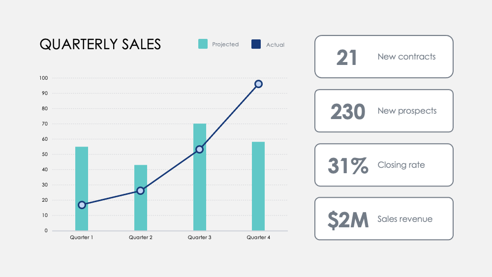
با این نمودار اعداد ماهانه، نقاط عطف را برجسته کنید. معیارها را در سراسر فصول ردیابی کنید و اهداف اختیاری فصلی را اضافه کنید تا ببینید چگونه تمرکز بر فعالیت های خاص تاثیرگذار بر داده های درآمد شما است.

resource image

قوا و ضعف ها را بین ویژگی های محصول با این نمودار مقایسه محصول مقایسه کنید. داده ها را از نظرسنجی های مشتری تجسم بخشید و دو یا سه محصول را برای مقایسه با یکدیگر روی هم قرار دهید.

resource image
stars icon
25 questions and answers
info icon

There are several ways to visualize and compare business metrics. Some of them include using a dashboard to display key performance indicators (KPIs), using a scatter plot to compare two variables, using a bar chart to compare different categories, using a line chart to show trends over time, using a pie chart to show proportions, and using a heat map to show patterns or correlations. Additionally, you can use a histogram to show frequency distributions, a box plot to show the distribution of data, and a bubble chart to compare three variables.

These charts can be used to influence business strategy in several ways. The Regional Revenue Growth chart can be used to set and track revenue goals across different locations or markets, which can help in making strategic decisions about where to focus resources. The Monthly Numbers chart can be used to track metrics and set quarterly goals, which can provide insights into how focusing on certain activities influences revenue. The Product Comparison chart can be used to compare the strengths and weaknesses of different product features, which can inform product development and marketing strategies.

There are several ways to visualize and track business goals. One can use a Balanced Scorecard which is a strategic planning and management system used to align business activities to the vision and strategy of the organization. Another method is using Key Performance Indicators (KPIs) which are measurable values that demonstrate how effectively a company is achieving key business objectives. Businesses use KPIs at multiple levels to evaluate their success at reaching targets. Also, one can use a Gantt chart which is a type of bar chart that illustrates a project schedule. Gantt charts illustrate the start and finish dates of the terminal elements and summary elements of a project.

View all 25 questions
stars icon Ask follow up

نتیجه

مغز ما اطلاعات بصری را 60,000 برابر سریع تر از متن پردازش می کند. متوسط طول جلسات در سال 2020 به 30 دقیقه یا کمتر کاهش یافت. تجسم داده ها به صورت سریع و مستقیم از همیشه مهمتر است تا ایده ها را به طور کارآمد ارتباط دهید.

تجسم بهتر داده ها همچنین کمک می کند تا داستان کسب و کار شما جذاب تر و متقاعد کننده تر شود. این کمک می کند تا تیم شما بتواند روندها را سریع تر درک کند، تصمیمات سریع را در پاسخ به الگوها بگیرد، از موفقیت ها سود ببرد، یا خود را سریع تر برای بهبود یا تغییر مسیر اختراع کنید.

resource image

Download and customize this and 500+ other business templates

Start here ⬇️

Voila! You can now download this Presentation

Download

کاربرد

در اینجا چندین استفاده پیشنهادی برای نمودارها به عنوان بخشی از این مجموعه وجود دارد. همانطور که همیشه، شما می توانید این استفاده ها را سفارشی کنید و این اسلایدها را به هر شکلی که برای ارائه اعداد خود می خواهید، سفارشی کنید.

  • تحلیل رقابتی: درآمد، مشترکین جدید و میانگین مشتریان شرکت خود را با رقبای خود مقایسه کنید. منظره رقابتی را تجسم بخشید و درآمد ناخالص رقیب خود را در هر فصل با خودتان مقایسه کنید.
  • مزایای بخش و محصول: موفقیت بخش را در فعالیت های کلیدی مرتبط کنید و سهم آن را در موفقیت کلی اندازه گیری کنید. مزایای محصول را با تجزیه و تحلیل بصری ساده مقایسه کنید.
  • بازخورد کاربر: کاربران را نظرسنجی کنید و کشفیات کلیدی را برای یادگیری اینکه چگونه مشتریان شما محصولات و خدمات شما را درک می کنند، تجسم بخشید.
  • توزیع مشتری: با داده های فروش، جمعیت مشتریان را کشف کنید تا بازارهای کلیدی خود را تجسم بخشید.
  • درآمد: درآمد را در سراسر حساب های جدید، پروژه ها یا شراکت ها ردیابی کنید.پیگیری حاشیه سود در محصولات و مقایسه درآمدها در سال های مختلف برای کشف افزایش های قابل توجه رشد و کاهش درآمد.
  • نمودار درختی: مقایسه روابط بین کسب و کارها در یک سلسله مراتب شاخه ای و تجسم نسبت ها بر اساس مقیاس.
  • مقایسه گزینه ها: ارزیابی حرکت های تجاری بالقوه و هزینه این اقدامات برای بهینه سازی تصمیم گیری شما.
stars icon
25 questions and answers
info icon

Some other ways to visualize ratios by scale include using bar graphs, pie charts, scatter plots, and line graphs. These visualizations can help to compare different data points and understand the relationship between them. For example, a bar graph can be used to compare the ratios of different categories, a pie chart can show the proportion of each category in a whole, a scatter plot can show the correlation between two variables, and a line graph can show the trend of a variable over time.

Ratios can be visualized by scale using various methods. One common method is using a treemap. A treemap is a type of diagram that displays hierarchical data as a set of nested rectangles. Each branch of the tree is given a rectangle, which is then tiled with smaller rectangles representing sub-branches. The size of the rectangles can be proportional to a specific dimension of the data, effectively visualizing the ratios by scale.

You can discover the most significant growth increases and revenue drops by tracking revenue across new accounts, projects, or partnerships. Also, track margins across products and compare revenues across years. This will help you identify the areas where there has been significant growth or drop in revenue.

View all 25 questions
stars icon Ask follow up
resource image
resource image

پیاده سازی

وقتی شما داده ها را ارائه می دهید، یک داستان را می گویید. بر اساس گفته استاد دانشگاه استنفورد، جنیفر ال. آکر، داستان ها زمانی بهینه هستند که قابل یادآوری، تاثیرگذار و شخصی باشند.

شرکت خود را به مخاطبان معرفی کنید. خلاصه ای از گزارش عمیق تر برای تیم خود ارائه دهید. داده های حیاتی را برای مدیران خود برای اقدام ارائه دهید. امکانات جدیدی برای توسعه محصول به اشتراک بگذارید. پتانسیل رشد و دیدگاه طولانی مدت را با سرمایه گذاران بالقوه به اشتراک بگذارید. داستانی را بگویید که آینده شرکت شما را شکل می دهد.

stars icon
23 questions and answers
info icon

Some other ways to share a company's growth potential could include hosting investor meetings, publishing annual reports, utilizing social media platforms for updates, creating a section on the company's website dedicated to growth and future plans, and engaging in community outreach programs.

Some other ways to share a company's long-term vision could include hosting town hall meetings, creating a vision statement and sharing it on the company's website and social media platforms, incorporating the vision into employee training and development programs, and discussing it in press releases and media interviews.

Some other ways to provide data for managers to act on could include conducting surveys or polls, utilizing data analytics tools, implementing feedback systems, or conducting market research. These methods can provide valuable insights and data that managers can use to make informed decisions.

View all 23 questions
stars icon Ask follow up

برای منابع بیشتری که وقت شما را صرفه جویی می کند، به Charts Collection (Part 1) ما نگاهی بیندازید، همچنین نمودارهای نهایی (بخش 1) و Ultimate Charts (Part 2) ما را بررسی کنید.

Download and customize this and 500+ other business templates

Start here ⬇️

Voila! You can now download this Presentation

Download