resource preview
resource preview
resource preview
resource preview
resource preview
resource preview
resource preview
resource preview
resource preview
resource preview
resource preview
resource preview
resource preview
resource preview
resource preview
resource preview
resource preview
resource preview
resource preview
resource preview
resource preview
resource preview
resource preview
resource preview
resource preview
resource preview
resource preview
resource preview
resource preview
resource preview
resource preview
resource preview
resource preview
resource preview
resource preview

Download and customize this and 500+ other business templates

Start here ⬇️

Voila! You can now download this Presentation

Download

Preview

Sinopse

Ao visualizarmos dados, isso ajuda a despertar novas ideias. No entanto, mais de 63% do tempo gasto no desenvolvimento de apresentações visuais é desperdiçado apenas para projetar gráficos e finalizar seus layouts. Economize seu recurso mais precioso com nosso Coleção de Gráficos (Parte 2), que inclui gráficos pré-projetados, mapas de dados e visualizações que são fáceis de usar, totalmente personalizáveis e prontos para contar sua história.

stars icon
25 questions and answers
info icon

Some future trends in the field of data visualization and presentation could include the increased use of AI and machine learning to automate the creation of visualizations, the development of more interactive and immersive visualizations through technologies like VR and AR, and the rise of data storytelling where data is presented in a narrative format to make it more engaging and understandable. There might also be a greater emphasis on real-time data visualization as the demand for up-to-the-minute information grows.

The use of pre-designed charts and graphs can significantly influence the audience's perception of the presented data. They provide a visual representation of data, making it easier for the audience to understand complex information. They can highlight trends, patterns, and outliers, making the data more digestible. Moreover, well-designed charts and graphs can enhance the credibility of the presentation, as they show a level of professionalism and attention to detail. However, it's important to choose the right type of chart or graph that accurately represents the data, to avoid misleading the audience.

Some effective strategies for telling a story through visual presentations include using pre-designed charts, graphs, data maps, and visualizations that are easy to use and fully customizable. It's also important to ensure that the visuals are relevant to the story you're telling and that they help to enhance the narrative rather than distract from it. Additionally, spending time on designing and finalizing the layout of your presentation can help to make it more engaging and effective.

View all 25 questions
stars icon Ask follow up

Download and customize this and 500+ other business templates

Start here ⬇️

Voila! You can now download this Presentation

Download

Destaques do slide

Use este gráfico de Crescimento de Receita Regional para decompor metas de receita por localizações ou mercados ao longo de vários anos. Trace as receitas em produtos existentes, aqueles em desenvolvimento e aqueles ainda não desenvolvidos.

resource image

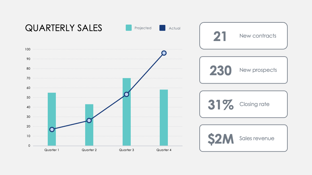
Destaque marcos com este gráfico de Números Mensais. Acompanhe métricas ao longo dos trimestres e adicione metas trimestrais opcionais para visualizar como o foco em certas atividades influencia seus dados de receita.

resource image

Compare pontos fortes e fracos entre recursos de produtos com este gráfico de Comparação de Produtos. Visualize dados de pesquisas de clientes e sobreponha dois ou três produtos para pesá-los uns contra os outros.

resource image
stars icon
25 questions and answers
info icon

There are several ways to visualize and compare business metrics. Some of them include using a dashboard to display key performance indicators (KPIs), using a scatter plot to compare two variables, using a bar chart to compare different categories, using a line chart to show trends over time, using a pie chart to show proportions, and using a heat map to show patterns or correlations. Additionally, you can use a histogram to show frequency distributions, a box plot to show the distribution of data, and a bubble chart to compare three variables.

These charts can be used to influence business strategy in several ways. The Regional Revenue Growth chart can be used to set and track revenue goals across different locations or markets, which can help in making strategic decisions about where to focus resources. The Monthly Numbers chart can be used to track metrics and set quarterly goals, which can provide insights into how focusing on certain activities influences revenue. The Product Comparison chart can be used to compare the strengths and weaknesses of different product features, which can inform product development and marketing strategies.

There are several ways to visualize and track business goals. One can use a Balanced Scorecard which is a strategic planning and management system used to align business activities to the vision and strategy of the organization. Another method is using Key Performance Indicators (KPIs) which are measurable values that demonstrate how effectively a company is achieving key business objectives. Businesses use KPIs at multiple levels to evaluate their success at reaching targets. Also, one can use a Gantt chart which is a type of bar chart that illustrates a project schedule. Gantt charts illustrate the start and finish dates of the terminal elements and summary elements of a project.

View all 25 questions
stars icon Ask follow up

Resultado

Nosso cérebro processa informações visuais 60.000 vezes mais rápido do que o texto. A duração média das reuniões diminuiu para 30 minutos ou menos em 2020. A visualização de dados rápida e direta ao ponto é mais importante do que nunca para comunicar ideias de maneira eficiente.

Uma melhor visualização de dados também ajuda a tornar a história do seu negócio mais envolvente e persuasiva. Isso ajuda sua equipe a entender e identificar tendências mais rapidamente, possibilita decisões rápidas em resposta a padrões, capitaliza sucessos ou se reinventa rapidamente para melhorar ou mudar de rumo.

stars icon Ask follow up
resource image

Download and customize this and 500+ other business templates

Start here ⬇️

Voila! You can now download this Presentation

Download

Aplicação

Aqui estão algumas sugestões de uso para os Gráficos como parte desta coleção. Como sempre, você pode personalizar esses usos e adaptar esses slides de qualquer maneira para apresentar seus próprios números.

  • Análise competitiva: compare a receita da sua empresa, novos assinantes e clientes médios com a sua concorrência. Visualize a paisagem competitiva e analise a receita bruta do seu rival por trimestre em relação à sua.
  • Vantagens do departamento e do produto: Correlacione o sucesso do departamento em atividades-chave e meça as contribuições para o seu sucesso geral. Contraste as vantagens do produto com uma análise visual simples.
  • Feedback do usuário: Pesquise os usuários e visualize as principais descobertas para aprender como seus clientes percebem seus produtos e serviços.
  • Distribuição do cliente: Descubra a demografia do cliente com dados de vendas para visualizar seus principais mercados.
  • Receita: Acompanhe a receita em novas contas, projetos ou parcerias. Acompanhe as margens em produtos e compare as receitas ao longo dos anos para descobrir os aumentos de crescimento mais significativos e as quedas de receita.
  • Treemap: Compare as relações entre empreendimentos comerciais em uma hierarquia ramificada e visualize as proporções por escala.
  • Comparação de opções: Pese possíveis movimentos de negócios e o custo dessas ações para otimizar como você toma decisões.
stars icon
25 questions and answers
info icon

Some other ways to visualize ratios by scale include using bar graphs, pie charts, scatter plots, and line graphs. These visualizations can help to compare different data points and understand the relationship between them. For example, a bar graph can be used to compare the ratios of different categories, a pie chart can show the proportion of each category in a whole, a scatter plot can show the correlation between two variables, and a line graph can show the trend of a variable over time.

Ratios can be visualized by scale using various methods. One common method is using a treemap. A treemap is a type of diagram that displays hierarchical data as a set of nested rectangles. Each branch of the tree is given a rectangle, which is then tiled with smaller rectangles representing sub-branches. The size of the rectangles can be proportional to a specific dimension of the data, effectively visualizing the ratios by scale.

You can discover the most significant growth increases and revenue drops by tracking revenue across new accounts, projects, or partnerships. Also, track margins across products and compare revenues across years. This will help you identify the areas where there has been significant growth or drop in revenue.

View all 25 questions
stars icon Ask follow up
resource image
resource image

Implementação

Quando você apresenta dados, você conta uma história. De acordo com a professora de Stanford Jennifer L. Aaker, as histórias são mais otimizadas quando são memoráveis, impactantes e pessoais.

Apresente sua empresa a uma audiência. Resuma um relatório mais aprofundado para sua equipe. Forneça dados críticos para seus gerentes agirem. Compartilhe novas possibilidades para o desenvolvimento de produtos. Compartilhe o potencial de crescimento e a visão de longo prazo com investidores em potencial. Conte a história que moldará o futuro da sua empresa.

stars icon
23 questions and answers
info icon

Some other ways to share a company's growth potential could include hosting investor meetings, publishing annual reports, utilizing social media platforms for updates, creating a section on the company's website dedicated to growth and future plans, and engaging in community outreach programs.

Some other ways to share a company's long-term vision could include hosting town hall meetings, creating a vision statement and sharing it on the company's website and social media platforms, incorporating the vision into employee training and development programs, and discussing it in press releases and media interviews.

Some other ways to provide data for managers to act on could include conducting surveys or polls, utilizing data analytics tools, implementing feedback systems, or conducting market research. These methods can provide valuable insights and data that managers can use to make informed decisions.

View all 23 questions
stars icon Ask follow up

Para mais recursos que economizam seu tempo, confira nosso Charts Collection (Part 1), bem como nosso Gráficos Definitivos (Parte 1) e Ultimate Charts (Part 2)

Download and customize this and 500+ other business templates

Start here ⬇️

Voila! You can now download this Presentation

Download