resource preview
resource preview
resource preview
resource preview
resource preview
resource preview
resource preview
resource preview
resource preview
resource preview
resource preview
resource preview
resource preview
resource preview
resource preview
resource preview
resource preview
resource preview
resource preview
resource preview
resource preview
resource preview
resource preview
resource preview
resource preview
resource preview
resource preview
resource preview
resource preview
resource preview
resource preview
resource preview
resource preview
resource preview
resource preview

Download and customize this and 500+ other business templates

Start here ⬇️

Voila! You can now download this Presentation

Download

Preview

Zusammenfassung

Wenn wir Daten visualisieren, hilft es, neue Ideen zu entfachen. Aber über 63% der Zeit, die für die Entwicklung visueller Präsentationen aufgewendet wird, wird verschwendet, nur um Diagramme zu entwerfen und ihre Layouts zu finalisieren. Sparen Sie Ihre wertvollste Ressource mit unserer Sammlung von Diagrammen (Teil 2), die vorentworfene Diagramme, Graphen, Datenkarten und Visualisierungen enthält, die einfach zu bedienen, vollständig anpassbar und bereit sind, Ihre Geschichte zu erzählen.

stars icon
25 questions and answers
info icon

Some future trends in the field of data visualization and presentation could include the increased use of AI and machine learning to automate the creation of visualizations, the development of more interactive and immersive visualizations through technologies like VR and AR, and the rise of data storytelling where data is presented in a narrative format to make it more engaging and understandable. There might also be a greater emphasis on real-time data visualization as the demand for up-to-the-minute information grows.

The use of pre-designed charts and graphs can significantly influence the audience's perception of the presented data. They provide a visual representation of data, making it easier for the audience to understand complex information. They can highlight trends, patterns, and outliers, making the data more digestible. Moreover, well-designed charts and graphs can enhance the credibility of the presentation, as they show a level of professionalism and attention to detail. However, it's important to choose the right type of chart or graph that accurately represents the data, to avoid misleading the audience.

Some effective strategies for telling a story through visual presentations include using pre-designed charts, graphs, data maps, and visualizations that are easy to use and fully customizable. It's also important to ensure that the visuals are relevant to the story you're telling and that they help to enhance the narrative rather than distract from it. Additionally, spending time on designing and finalizing the layout of your presentation can help to make it more engaging and effective.

View all 25 questions
stars icon Ask follow up

Download and customize this and 500+ other business templates

Start here ⬇️

Voila! You can now download this Presentation

Download

Höhepunkte der Folie

Verwenden Sie dieses Regionales Umsatzwachstum Diagramm, um Umsatzziele nach Standorten oder Märkten über mehrere Jahre hinweg aufzuschlüsseln. Erfassen Sie Umsätze über bestehende Produkte, solche in Entwicklung und solche, die noch nicht entwickelt wurden.

resource image

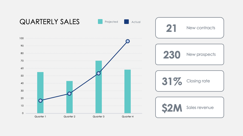
Heben Sie Meilensteine mit diesem Monatszahlen-Diagramm hervor. Verfolgen Sie Kennzahlen über Quartale hinweg und fügen Sie optional Quartalsziele hinzu, um zu visualisieren, wie sich ein Fokus auf bestimmte Aktivitäten auf Ihre Umsatzdaten auswirkt.

resource image

Vergleichen Sie Stärken und Schwächen zwischen Produktmerkmalen mit diesem Produktvergleich Diagramm. Visualisieren Sie Daten aus Kundenumfragen und überlagern Sie zwei oder drei Produkte, um sie gegeneinander abzuwägen.

resource image
stars icon
25 questions and answers
info icon

There are several ways to visualize and compare business metrics. Some of them include using a dashboard to display key performance indicators (KPIs), using a scatter plot to compare two variables, using a bar chart to compare different categories, using a line chart to show trends over time, using a pie chart to show proportions, and using a heat map to show patterns or correlations. Additionally, you can use a histogram to show frequency distributions, a box plot to show the distribution of data, and a bubble chart to compare three variables.

These charts can be used to influence business strategy in several ways. The Regional Revenue Growth chart can be used to set and track revenue goals across different locations or markets, which can help in making strategic decisions about where to focus resources. The Monthly Numbers chart can be used to track metrics and set quarterly goals, which can provide insights into how focusing on certain activities influences revenue. The Product Comparison chart can be used to compare the strengths and weaknesses of different product features, which can inform product development and marketing strategies.

There are several ways to visualize and track business goals. One can use a Balanced Scorecard which is a strategic planning and management system used to align business activities to the vision and strategy of the organization. Another method is using Key Performance Indicators (KPIs) which are measurable values that demonstrate how effectively a company is achieving key business objectives. Businesses use KPIs at multiple levels to evaluate their success at reaching targets. Also, one can use a Gantt chart which is a type of bar chart that illustrates a project schedule. Gantt charts illustrate the start and finish dates of the terminal elements and summary elements of a project.

View all 25 questions
stars icon Ask follow up

Ergebnis

Unser Gehirn verarbeitet visuelle Informationen 60.000 Mal schneller als Text. Die durchschnittliche Besprechungsdauer sank im Jahr 2020 auf 30 Minuten oder weniger. Eine schnelle und prägnante Datenvisualisierung ist wichtiger denn je, um Ideen effizient zu kommunizieren.

Eine bessere Datenvisualisierung macht auch die Geschichte Ihres Unternehmens ansprechender und überzeugender. Dies hilft Ihrem Team, Trends schneller zu verstehen und zu identifizieren, schnelle Entscheidungen in Reaktion auf Muster zu treffen, Erfolge zu nutzen oder sich schnell neu zu erfinden, um sich zu verbessern oder den Kurs zu ändern.

stars icon Ask follow up
resource image

Download and customize this and 500+ other business templates

Start here ⬇️

Voila! You can now download this Presentation

Download

Anwendung

Hier sind einige vorgeschlagene Verwendungen für die Diagramme als Teil dieser Sammlung. Wie immer können Sie diese Verwendungen anpassen und diese Folien auf jede Weise anpassen, um Ihre eigenen Zahlen zu präsentieren.

  • Wettbewerbsanalyse: Vergleichen Sie den Umsatz Ihres Unternehmens, neue Abonnenten und durchschnittliche Kunden mit Ihrer Konkurrenz. Visualisieren Sie die Wettbewerbslandschaft und analysieren Sie den Bruttoumsatz Ihrer Konkurrenten pro Quartal im Vergleich zu Ihrem eigenen.
  • Abteilungs- und Produktvorteile: Korrelieren Sie den Erfolg der Abteilung über Schlüsselaktivitäten hinweg und messen Sie Beiträge zu ihrem Gesamterfolg. Kontrastieren Sie Produktvorteile mit einfacher visueller Analyse.
  • Benutzerfeedback: Befragen Sie Benutzer und visualisieren Sie wichtige Erkenntnisse, um zu erfahren, wie Ihre Kunden Ihre Produkte und Dienstleistungen wahrnehmen.
  • Kundenverteilung: Entdecken Sie Kundendemografien mit Verkaufsdaten, um Ihre Schlüsselmärkte zu visualisieren.
  • Umsatz: Verfolgen Sie den Umsatz über neue Konten, Projekte oder Partnerschaften.Verfolgen Sie die Margen über Produkte hinweg und vergleichen Sie die Umsätze über die Jahre, um die signifikantesten Wachstumssteigerungen und Umsatzrückgänge zu entdecken.
  • Treemap: Vergleichen Sie die Beziehungen zwischen Geschäftsvorhaben in einer verzweigten Hierarchie und visualisieren Sie Verhältnisse nach Maßstab.
  • Optionenvergleich: Bewerten Sie potenzielle Geschäftszüge und die Kosten dieser Maßnahmen, um Ihre Entscheidungsfindung zu optimieren.
stars icon
25 questions and answers
info icon

Some other ways to visualize ratios by scale include using bar graphs, pie charts, scatter plots, and line graphs. These visualizations can help to compare different data points and understand the relationship between them. For example, a bar graph can be used to compare the ratios of different categories, a pie chart can show the proportion of each category in a whole, a scatter plot can show the correlation between two variables, and a line graph can show the trend of a variable over time.

Ratios can be visualized by scale using various methods. One common method is using a treemap. A treemap is a type of diagram that displays hierarchical data as a set of nested rectangles. Each branch of the tree is given a rectangle, which is then tiled with smaller rectangles representing sub-branches. The size of the rectangles can be proportional to a specific dimension of the data, effectively visualizing the ratios by scale.

You can discover the most significant growth increases and revenue drops by tracking revenue across new accounts, projects, or partnerships. Also, track margins across products and compare revenues across years. This will help you identify the areas where there has been significant growth or drop in revenue.

View all 25 questions
stars icon Ask follow up
resource image
resource image

Umsetzung

Wenn Sie Daten präsentieren, erzählen Sie eine Geschichte. Laut Stanford-Professorin Jennifer L. Aaker sind Geschichten am optimalsten, wenn sie einprägsam, wirkungsvoll und persönlich sind.

Stellen Sie Ihr Unternehmen einem Publikum vor. Fassen Sie einen ausführlicheren Bericht für Ihr Team zusammen. Stellen Sie Ihren Managern wichtige Daten zur Verfügung, auf die sie reagieren können. Teilen Sie neue Möglichkeiten für die Produktentwicklung. Teilen Sie das Wachstumspotenzial und die langfristige Vision mit potenziellen Investoren. Erzählen Sie die Geschichte, die die Zukunft Ihres Unternehmens prägen wird.

stars icon
23 questions and answers
info icon

Some other ways to share a company's growth potential could include hosting investor meetings, publishing annual reports, utilizing social media platforms for updates, creating a section on the company's website dedicated to growth and future plans, and engaging in community outreach programs.

Some other ways to share a company's long-term vision could include hosting town hall meetings, creating a vision statement and sharing it on the company's website and social media platforms, incorporating the vision into employee training and development programs, and discussing it in press releases and media interviews.

Some other ways to provide data for managers to act on could include conducting surveys or polls, utilizing data analytics tools, implementing feedback systems, or conducting market research. These methods can provide valuable insights and data that managers can use to make informed decisions.

View all 23 questions
stars icon Ask follow up

Für weitere Ressourcen, die Ihnen Zeit sparen, schauen Sie sich unsere Charts Collection (Part 1) an, sowie unsere Ultimative Diagramme (Teil 1) und Ultimate Charts (Part 2)

Download and customize this and 500+ other business templates

Start here ⬇️

Voila! You can now download this Presentation

Download