resource preview
resource preview
resource preview
resource preview
resource preview
resource preview
resource preview
resource preview
resource preview
resource preview
resource preview
resource preview
resource preview
resource preview
resource preview
resource preview
resource preview
resource preview
resource preview
resource preview
resource preview
resource preview
resource preview
resource preview
resource preview
resource preview
resource preview
resource preview
resource preview
resource preview
resource preview
resource preview
resource preview
resource preview
resource preview
chevron_right
chevron_left
download Download this presentation

Download and customize 500+ business templates and translate PowerPoints

Go to dashboard to download stunning resources

Download

Preview

View all chevron_right

Синопсис

Визуализация данных помогает порождать новые идеи. Однако более 63% времени, затраченного на разработку визуальных презентаций, тратится просто на дизайн графиков и окончательную настройку их макетов. Сэкономьте свое самое ценное ресурс - время, с нашим Коллекция диаграмм (Часть 2), который включает предварительно разработанные диаграммы, графики, карты данных и визуализации, которые легко использовать, полностью настраиваемые и готовые рассказать вашу историю.

stars icon
Questions and answers
info icon

Some future trends in the field of data visualization and presentation could include the increased use of AI and machine learning to automate the creation of visualizations, the development of more interactive and immersive visualizations through technologies like VR and AR, and the rise of data storytelling where data is presented in a narrative format to make it more engaging and understandable. There might also be a greater emphasis on real-time data visualization as the demand for up-to-the-minute information grows.

The use of pre-designed charts and graphs can significantly influence the audience's perception of the presented data. They provide a visual representation of data, making it easier for the audience to understand complex information. They can highlight trends, patterns, and outliers, making the data more digestible. Moreover, well-designed charts and graphs can enhance the credibility of the presentation, as they show a level of professionalism and attention to detail. However, it's important to choose the right type of chart or graph that accurately represents the data, to avoid misleading the audience.

View all questions
stars icon Ask follow up
download Download this presentation

Download and customize 500+ business templates and translate PowerPoints

Go to dashboard to download stunning resources

Download

Основные моменты слайда

Используйте эту диаграмму Роста региональных доходов для разбивки целей по доходам по местам или рынкам на протяжении нескольких лет. Отслеживайте доходы по существующим продуктам, тем, которые находятся в разработке, и тем, которые еще не разработаны.

resource image

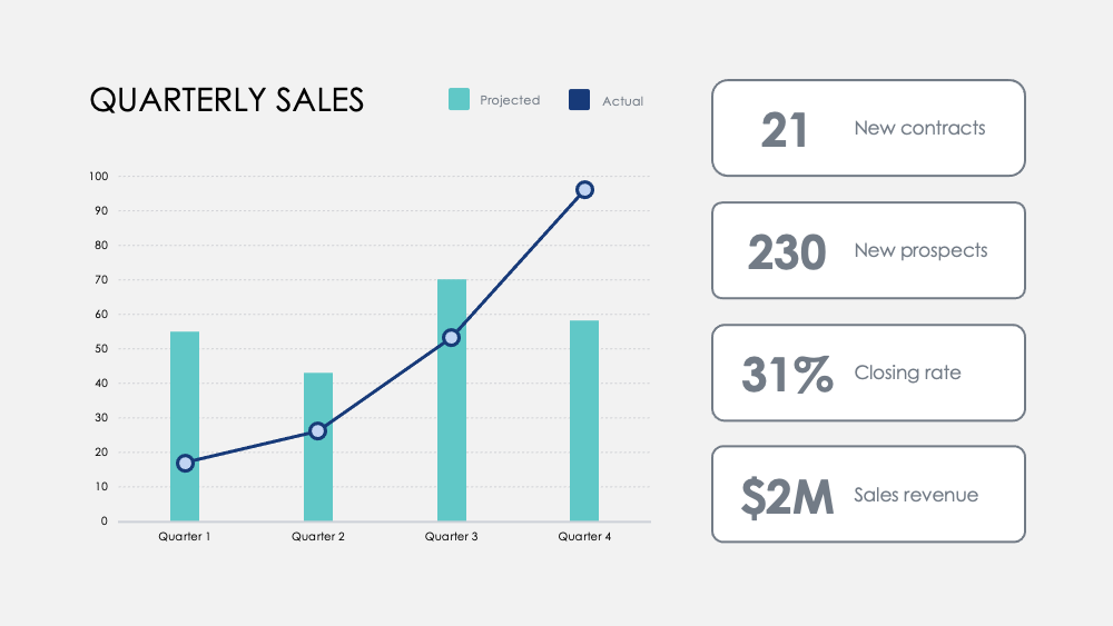
Выделите важные этапы с помощью этой диаграммы Месячных показателей. Отслеживайте метрики по кварталам и добавляйте опциональные квартальные цели, чтобы визуализировать, как концентрация на определенных действиях влияет на ваши данные о доходах.

resource image

Сравните сильные и слабые стороны между функциями продукта с помощью этой диаграммы Сравнения продуктов. Визуализируйте данные из опросов клиентов и наложите два или три продукта, чтобы сравнить их между собой.

resource image
stars icon
Questions and answers
info icon

There are several ways to visualize and compare business metrics. Some of them include using a dashboard to display key performance indicators (KPIs), using a scatter plot to compare two variables, using a bar chart to compare different categories, using a line chart to show trends over time, using a pie chart to show proportions, and using a heat map to show patterns or correlations. Additionally, you can use a histogram to show frequency distributions, a box plot to show the distribution of data, and a bubble chart to compare three variables.

These charts can be used to influence business strategy in several ways. The Regional Revenue Growth chart can be used to set and track revenue goals across different locations or markets, which can help in making strategic decisions about where to focus resources. The Monthly Numbers chart can be used to track metrics and set quarterly goals, which can provide insights into how focusing on certain activities influences revenue. The Product Comparison chart can be used to compare the strengths and weaknesses of different product features, which can inform product development and marketing strategies.

View all questions
stars icon Ask follow up

Результат

Наш мозг обрабатывает визуальную информацию в 60 000 раз быстрее, чем текст. Средняя продолжительность встречи сократилась до 30 минут или меньше в 2020 году. Быстрая и точная визуализация данных стала важнее, чем когда-либо, для эффективного общения идей.

Лучшая визуализация данных также делает историю вашего бизнеса более увлекательной и убедительной. Это помогает вашей команде быстрее понимать и определять тренды, позволяет быстро принимать решения в ответ на обнаруженные закономерности, использовать успехи или быстро измениться для улучшения или изменения курса.

stars icon Ask follow up
resource image

Применение

Вот несколько предложенных вариантов использования диаграмм из этой коллекции. Как всегда, вы можете настроить эти варианты и адаптировать эти слайды любым образом, чтобы представить свои собственные числа.

  • Конкурентный анализ: сравните доходы вашей компании, новых подписчиков и средних клиентов с вашими конкурентами. Визуализируйте конкурентную среду и анализируйте гросс-доходы ваших конкурентов по кварталам по сравнению с вашими.
  • Преимущества отдела и продукта: Сопоставьте успех отдела по ключевым деятельностям и измерьте вклад в его общий успех. Сравните преимущества продукта с помощью простого визуального анализа.
  • Отзывы пользователей: Опросите пользователей и визуализируйте ключевые открытия, чтобы узнать, как ваши клиенты воспринимают ваши продукты и услуги.
  • Распределение клиентов: Изучите демографию клиентов с помощью данных о продажах, чтобы визуализировать ваши ключевые рынки.
  • Доход: Отслеживайте доходы по новым счетам, проектам или партнерствам.Отслеживайте маржи по продуктам и сравнивайте доходы по годам, чтобы обнаружить наиболее значительные увеличения роста и снижения доходов.
  • Древовидная карта: Сравнивайте отношения между бизнес-проектами в иерархической структуре и визуализируйте соотношения по масштабу.
  • Сравнение вариантов: Оценивайте потенциальные бизнес-ходы и стоимость этих действий, чтобы оптимизировать процесс принятия решений.
stars icon
Questions and answers
info icon

Some other ways to visualize ratios by scale include using bar graphs, pie charts, scatter plots, and line graphs. These visualizations can help to compare different data points and understand the relationship between them. For example, a bar graph can be used to compare the ratios of different categories, a pie chart can show the proportion of each category in a whole, a scatter plot can show the correlation between two variables, and a line graph can show the trend of a variable over time.

Ratios can be visualized by scale using various methods. One common method is using a treemap. A treemap is a type of diagram that displays hierarchical data as a set of nested rectangles. Each branch of the tree is given a rectangle, which is then tiled with smaller rectangles representing sub-branches. The size of the rectangles can be proportional to a specific dimension of the data, effectively visualizing the ratios by scale.

View all questions
stars icon Ask follow up
resource image
resource image

Реализация

Когда вы представляете данные, вы рассказываете историю. Согласно профессору Стэнфорда Дженнифер Л. Аакер, истории наиболее эффективны, когда они запоминающиеся, влиятельные и личные.

Представьте вашу компанию аудитории. Суммируйте более глубокий отчет для вашей команды. Предоставьте критические данные для ваших менеджеров для действий. Поделитесь новыми возможностями для разработки продуктов. Поделитесь потенциалом роста и долгосрочной визией с потенциальными инвесторами. Расскажите историю, которая будет формировать будущее вашей компании.

stars icon
Questions and answers
info icon

Some other ways to share a company's growth potential could include hosting investor meetings, publishing annual reports, utilizing social media platforms for updates, creating a section on the company's website dedicated to growth and future plans, and engaging in community outreach programs.

Some other ways to share a company's long-term vision could include hosting town hall meetings, creating a vision statement and sharing it on the company's website and social media platforms, incorporating the vision into employee training and development programs, and discussing it in press releases and media interviews.

View all questions
stars icon Ask follow up

Для большего количества ресурсов, которые помогут вам сэкономить время, ознакомьтесь с нашими Коллекция диаграмм (Часть 1), а также нашими Ультимативные диаграммы (Часть 1) и Ultimate Charts (Part 2)

download Download this presentation

Download and customize 500+ business templates and translate PowerPoints

Go to dashboard to download stunning resources

Download