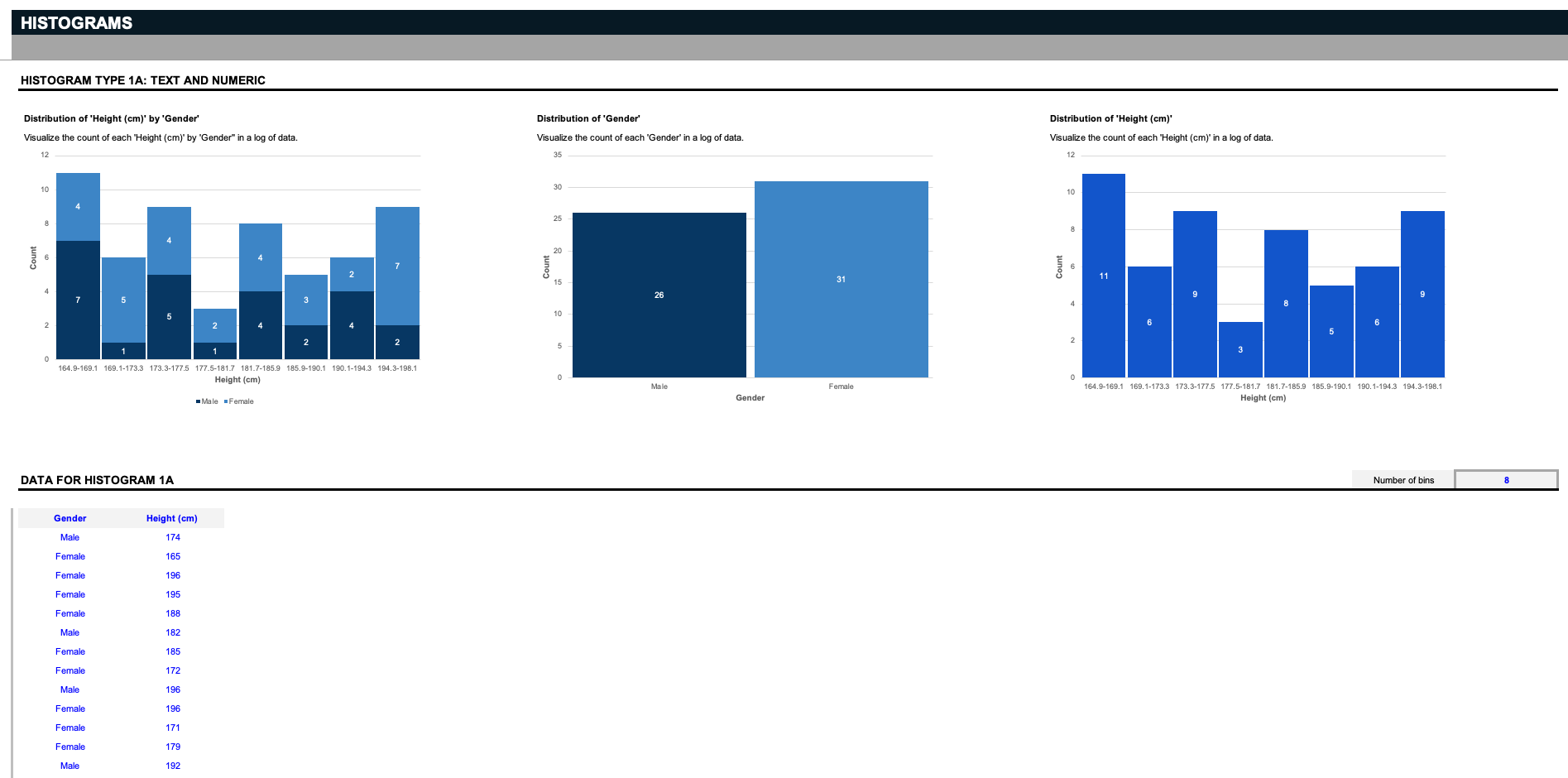
To improve the readability of these charts, you can consider the following:
1. Use clear and concise labels for axes and data series.
2. Choose colors that contrast well to make the data stand out.
3. Keep the design simple and avoid clutter.
4. Use appropriate scales for the axes to accurately represent the data.
5. Include a legend or key if multiple data series are present.
6. Use tooltips or interactive elements for complex charts to provide additional information on hover or click.
7. Consider the audience's familiarity with the type of chart used. Some chart types may be more intuitive to certain audiences than others.
This question was asked on the following spreadsheet:

Need to visualize your data? Use this new Ultimate Charts resource for premade and fully customizable Marimekko charts, bubble charts, Pareto analysis...
Go to dashboard to download stunning resources
Download


Text this question was asked on:
Need to visualize your data? We've created this new spreadsheet template in Excel and Google Sheets that you can download and customize to your needs. It includes customizable marimekko charts to visualize resource allocation or a product portfolio, bubble charts to analyze market size and sales revenue, Pareto charts to assess productivity and customer feedback, box and whisker charts for stock analysis, vertical bar charts to visualize changes over time, and histogram charts to visualize the distribution of numbers, unique values, and date ranges.

We've created a new collection of more advanced and visually appealing spreadsheet charts to save hours of time. Included in this collection are: bar chart variations, sales funnel variations, pie chart variations, world map, step change charts, variance charts, scatter chart, and radar charts, all easily editable and conveniently linked to data input tables.

Plan, track, control and communicate tasks at every stage of every project with our Gantt Charts Collection. Assign tasks to your team and identify the impact of delays early in the game, ameliorate your team’s coordination, monitor milestones and make sure your team's workflow and deliverables always run like a well-oiled machine.

Need new charts and graphs for hard-to-visualize situations? Enter your data into fully customizable sunburst charts, heat maps, bullet charts to visualize top KPIs, thermometer charts, three and four-circle Venn diagrams, filterable bell curves, milestone charts, and combo charts with this Ultimate Charts collection.

Need to present the investment and reward opportunities of a new venture or project? Use our "Ultimate Startup Pro Forma" model to showcase a new proposal and display its cost, revenue, and at what point cash flows will become positive and reach the critical "break-even point."

Have you ever wanted to run a project like Elon Musk? What about the ability to predict a project’s success like a financial analyst at Goldman Sachs? Here are the ultimate project management tools to ensure success from the very start. You’ll gain how to calculate a project's IRR, conduct Monte-Carlo analysis to evaluate risk, manage teams with RACI matrix, present a project charter, track progress with dashboards and Gantt charts, and do it all again, but better, with a post mortem survey.

How do you get the resources and support to take your business plan forward? Besides an epic idea that solves customer pain points, a solid investor pitch deck can help seal the deal. Use our latest Ultimate Pitch Deck (Part 3) to tell your story and communicate your vision in the best possible flow and get closer to the funding you need.

Are loan repayments confusing and complex to keep track of? Use our Ultimate Loan Spreadsheet to track and estimate how much principle of a loan is owed. Use this spreadsheet to analyze: home, car, student and commercial loans. Plus, analyze whether refinancing a loan is an advantage. As a bonus, loan amortization graphs illustrate the specific loan amortization schedule.

Need better visualizations to analyze and report top KPIs? Use these KPI Charts to input up to a million rows of raw data. Then filter a subset to view and the board automatically generate premade charts to visualize the data for reports and analysis. This could be sales data, bug or issues data, a project to-do list, features to implement, or even stock market analysis. Rename and customize up to two date ranges, two numeric values, and five drop-down values to filter and compare against each other. Then create beautiful KPI charts for analysis and reports.

Struggle with spreadsheet visualizations? Use our comprehensive charts template to save time and hours of work and create beautiful charts and graphs for reports and analysis. This template contains a variety of commonly used charts as well as dashboards for excellent and quick visualization.

Enhance your presentations with detailed maps of regions that your business is involved in. With maps of hundreds of countries around the world, organized by continents, you can highlight what’s important to your market and even visualize your future expansion.

Need to create map charts in Excel or Google Sheets? Our Ultimate World Map Collection includes a filterable world map chart, filterable map charts for each major continent, including North America, South America, Asia, Europe, Africa, and Oceania, and a filterable map chart for the United States, which on Excel can be customized to any country.

Download the Ultimate Gantt Collection spreadsheet to sync your employees and increase productivity. The collection includes four types of Gantt charts. The first two tools are project-based Gantt charts organized by task and by employee. The third tool is a Gantt chart used to schedule reservations. The fourth tool is a Gantt chart used to track inventory usage and costs.
 Microsoft Excel
 Google Sheets