resource preview
resource preview
resource preview
resource preview
resource preview
resource preview
resource preview
resource preview
resource preview
resource preview
resource preview
resource preview
resource preview
resource preview
resource preview
resource preview
resource preview
resource preview
resource preview
resource preview
resource preview
resource preview
resource preview
resource preview
resource preview
resource preview
resource preview
resource preview
resource preview
resource preview
resource preview
resource preview
resource preview
resource preview
resource preview

Download and customize this and 500+ other business templates

Start here ⬇️

Voila! You can now download this Presentation

Download

Preview

Sinopsis

Al visualizar datos, se generan nuevas ideas. Pero más del 63% del tiempo dedicado a desarrollar presentaciones visuales se desperdicia solo en diseñar gráficos y finalizar sus diseños. Ahorre su recurso más preciado con nuestro Colección de Gráficos (Parte 2), que incluye gráficos pre-diseñados, mapas de datos y visualizaciones que son fáciles de usar, totalmente personalizables y listos para contar su historia.

stars icon
25 questions and answers
info icon

Some future trends in the field of data visualization and presentation could include the increased use of AI and machine learning to automate the creation of visualizations, the development of more interactive and immersive visualizations through technologies like VR and AR, and the rise of data storytelling where data is presented in a narrative format to make it more engaging and understandable. There might also be a greater emphasis on real-time data visualization as the demand for up-to-the-minute information grows.

The use of pre-designed charts and graphs can significantly influence the audience's perception of the presented data. They provide a visual representation of data, making it easier for the audience to understand complex information. They can highlight trends, patterns, and outliers, making the data more digestible. Moreover, well-designed charts and graphs can enhance the credibility of the presentation, as they show a level of professionalism and attention to detail. However, it's important to choose the right type of chart or graph that accurately represents the data, to avoid misleading the audience.

Some effective strategies for telling a story through visual presentations include using pre-designed charts, graphs, data maps, and visualizations that are easy to use and fully customizable. It's also important to ensure that the visuals are relevant to the story you're telling and that they help to enhance the narrative rather than distract from it. Additionally, spending time on designing and finalizing the layout of your presentation can help to make it more engaging and effective.

View all 25 questions
stars icon Ask follow up

Download and customize this and 500+ other business templates

Start here ⬇️

Voila! You can now download this Presentation

Download

Destacados de la diapositiva

Utilice este gráfico de Crecimiento de Ingresos Regionales para desglosar los objetivos de ingresos por ubicaciones o mercados a lo largo de varios años. Grafique los ingresos de los productos existentes, los que están en desarrollo y los que aún no se han desarrollado.

resource image

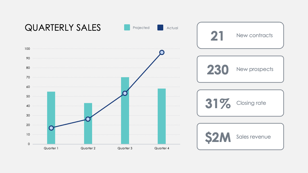
Destaque hitos con este gráfico de Números Mensuales. Rastree métricas a lo largo de los trimestres y agregue objetivos trimestrales opcionales para visualizar cómo un enfoque en ciertas actividades influye en sus datos de ingresos.

resource image

Compare fortalezas y debilidades entre las características del producto con este gráfico de Comparación de Productos. Visualice los datos de las encuestas a los clientes y superponga dos o tres productos para compararlos entre sí.

resource image
stars icon
25 questions and answers
info icon

There are several ways to visualize and compare business metrics. Some of them include using a dashboard to display key performance indicators (KPIs), using a scatter plot to compare two variables, using a bar chart to compare different categories, using a line chart to show trends over time, using a pie chart to show proportions, and using a heat map to show patterns or correlations. Additionally, you can use a histogram to show frequency distributions, a box plot to show the distribution of data, and a bubble chart to compare three variables.

These charts can be used to influence business strategy in several ways. The Regional Revenue Growth chart can be used to set and track revenue goals across different locations or markets, which can help in making strategic decisions about where to focus resources. The Monthly Numbers chart can be used to track metrics and set quarterly goals, which can provide insights into how focusing on certain activities influences revenue. The Product Comparison chart can be used to compare the strengths and weaknesses of different product features, which can inform product development and marketing strategies.

There are several ways to visualize and track business goals. One can use a Balanced Scorecard which is a strategic planning and management system used to align business activities to the vision and strategy of the organization. Another method is using Key Performance Indicators (KPIs) which are measurable values that demonstrate how effectively a company is achieving key business objectives. Businesses use KPIs at multiple levels to evaluate their success at reaching targets. Also, one can use a Gantt chart which is a type of bar chart that illustrates a project schedule. Gantt charts illustrate the start and finish dates of the terminal elements and summary elements of a project.

View all 25 questions
stars icon Ask follow up

Resultado

Nuestros cerebros procesan la información visual 60,000 veces más rápido que el texto. La duración promedio de las reuniones se redujo a 30 minutos o menos en 2020. La visualización de datos rápida y al grano es más importante que nunca para comunicar ideas de manera eficiente.

Una mejor visualización de datos también ayuda a que la historia de su negocio sea más atractiva y persuasiva. Esto ayuda a su equipo a entender e identificar tendencias más rápido, permite tomar decisiones rápidas en respuesta a patrones, capitalizar éxitos o reinventarse rápidamente para mejorar o cambiar de rumbo.

stars icon Ask follow up
resource image

Download and customize this and 500+ other business templates

Start here ⬇️

Voila! You can now download this Presentation

Download

Aplicación

Aquí hay algunas sugerencias de uso para los Gráficos como parte de esta colección. Como siempre, puede personalizar estos usos y adaptar estas diapositivas de cualquier manera para presentar sus propios números.

  • Análisis competitivo: compare los ingresos de su empresa, los nuevos suscriptores y los clientes promedio con su competencia. Visualice el panorama competitivo y analice los ingresos brutos de su rival por trimestre en comparación con los suyos.
  • Ventajas del departamento y del producto: Correlacione el éxito del departamento en actividades clave y mida las contribuciones a su éxito general. Contraste las ventajas del producto con un análisis visual simple.
  • Retroalimentación del usuario: Encueste a los usuarios y visualice los descubrimientos clave para aprender cómo sus clientes perciben sus productos y servicios.
  • Distribución del cliente: Descubra la demografía del cliente con datos de ventas para visualizar sus mercados clave.
  • Ingresos: Rastree los ingresos en nuevas cuentas, proyectos o asociaciones. Rastree los márgenes en los productos y compare los ingresos a lo largo de los años para descubrir los aumentos de crecimiento más significativos y las caídas de ingresos.
  • Treemap: Compare las relaciones entre las empresas en una jerarquía ramificada y visualice las proporciones por escala.
  • Comparación de opciones: Pese las posibles movimientos empresariales y el costo de esas acciones para optimizar cómo toma decisiones.
stars icon
25 questions and answers
info icon

Some other ways to visualize ratios by scale include using bar graphs, pie charts, scatter plots, and line graphs. These visualizations can help to compare different data points and understand the relationship between them. For example, a bar graph can be used to compare the ratios of different categories, a pie chart can show the proportion of each category in a whole, a scatter plot can show the correlation between two variables, and a line graph can show the trend of a variable over time.

Ratios can be visualized by scale using various methods. One common method is using a treemap. A treemap is a type of diagram that displays hierarchical data as a set of nested rectangles. Each branch of the tree is given a rectangle, which is then tiled with smaller rectangles representing sub-branches. The size of the rectangles can be proportional to a specific dimension of the data, effectively visualizing the ratios by scale.

You can discover the most significant growth increases and revenue drops by tracking revenue across new accounts, projects, or partnerships. Also, track margins across products and compare revenues across years. This will help you identify the areas where there has been significant growth or drop in revenue.

View all 25 questions
stars icon Ask follow up
resource image
resource image

Implementación

Cuando presenta datos, cuenta una historia. Según la profesora de Stanford Jennifer L. Aaker, las historias son más óptimas cuando son memorables, impactantes y personales.

Presente su empresa a una audiencia. Resuma un informe más detallado para su equipo. Proporcione datos críticos para que sus gerentes actúen. Comparta nuevas posibilidades para el desarrollo de productos. Comparta el potencial de crecimiento y la visión a largo plazo con posibles inversores. Cuente la historia que dará forma al futuro de su empresa.

stars icon
23 questions and answers
info icon

Some other ways to share a company's growth potential could include hosting investor meetings, publishing annual reports, utilizing social media platforms for updates, creating a section on the company's website dedicated to growth and future plans, and engaging in community outreach programs.

Some other ways to share a company's long-term vision could include hosting town hall meetings, creating a vision statement and sharing it on the company's website and social media platforms, incorporating the vision into employee training and development programs, and discussing it in press releases and media interviews.

Some other ways to provide data for managers to act on could include conducting surveys or polls, utilizing data analytics tools, implementing feedback systems, or conducting market research. These methods can provide valuable insights and data that managers can use to make informed decisions.

View all 23 questions
stars icon Ask follow up

Para obtener más recursos que le ahorren tiempo, consulte nuestro Colección de Gráficos (Parte 1), así como nuestro Gráficos Definitivos (Parte 1) y Gráficos Definitivos (Parte 2)

Download and customize this and 500+ other business templates

Start here ⬇️

Voila! You can now download this Presentation

Download